想練熟 border-radius?與其反覆背語法,不如動手做一個看得見成果的小專案。本文帶你純用 CSS 畫出一枚帶摺角、漸層與陰影的 Word 風格文件圖示,全程不需要一張圖片。
本例主要涉及的屬性有:border-radius、linear-gradient、box-shadow,另外還會用到 :before 與 :after 兩個偽元素選擇器。
提醒:IE 系列對 :before、:after 支援不佳,建議在 Firefox、Opera、Chrome 下預覽與除錯。
先看最終成品:

整體思路
- 定義一個 class,先畫出矩形本體;
- 用 border-radius 做圓角處理;
- 利用偽元素做出右上角摺疊的紙角;
- 用漸層模擬紙上的文字線條。
第一步:畫出矩形
HTML 結構非常單純,一個連結標籤即可:
<a class="docIcon" href="#">Document Icon</a>這裡有個容易忽略的細節:display 預設值是 inline,寬高不會生效,所以要改成 block。
.docIcon {
  background: #eee;
  background: -webkit-linear-gradient(top, #ddd 0, #eee 15%, #fff 40%, #fff 70%, #eee 100%);
  background: -moz-linear-gradient(top, #ddd 0, #eee 15%, #fff 40%, #fff 70%, #eee 100%);
  background: -o-linear-gradient(top, #ddd 0, #eee 15%, #fff 40%, #fff 70%, #eee 100%);
  background: -ms-linear-gradient(top, #ddd 0, #eee 15%, #fff 40%, #fff 70%, #eee 100%);
  background: linear-gradient(top, #ddd 0, #eee 15%, #fff 40%, #fff 70%, #eee 100%);
  border: 1px solid #ccc;
  display: block;
  width: 40px;
  height: 56px;
  position: relative;
  margin: 42px auto;
}
其中 linear-gradient 負責紙面的明暗過渡。接著補上內陰影,讓紙張邊緣有一點厚度感:
.docIcon {
  ...
  -webkit-box-shadow: inset rgba(255,255,255,0.8) 0 1px 1px;
  -moz-box-shadow: inset rgba(255,255,255,0.8) 0 1px 1px;
  box-shadow: inset rgba(255,255,255,0.8) 0 1px 1px;
  text-indent: -9999em;
}
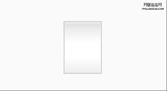
此時的方塊已經有紙張的質感:
第二步:border-radius 做圓角
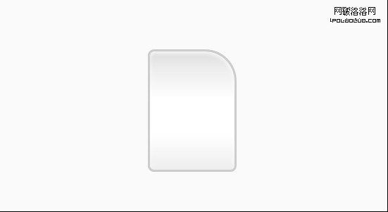
四個值分別對應左上、右上、右下、左下的水平半徑。這裡刻意把右上角放大,為後面的摺角做準備:
.docIcon {
  ...
  -webkit-border-radius: 3px 15px 3px 3px;
  -moz-border-radius: 3px 15px 3px 3px;
  border-radius: 3px 15px 3px 3px;
}
補充一句::before 屬於偽元素選擇器,同樣只有較現代的瀏覽器支援。這兩個選擇器的完整用法我會另文詳談,本例先知道「用來插入裝飾性內容」即可。
第三步:做出摺疊的紙角
先用 :before 在右上角放一個 15×15 的小方塊,並套用 45 度漸層,模擬紙張反面的陰影:
.docIcon:before {
  content: "";
  display: block;
  position: absolute;
  top: 0;
  right: 0;
  width: 15px;
  height: 15px;
  background: #ccc;
  background: -webkit-linear-gradient(45deg, #fff 0, #eee 50%, #ccc 100%);
  background: -moz-linear-gradient(45deg, #fff 0, #eee 50%, #ccc 100%);
  background: -o-linear-gradient(45deg, #fff 0, #eee 50%, #ccc 100%);
  background: -ms-linear-gradient(45deg, #fff 0, #eee 50%, #ccc 100%);
  background: linear-gradient(45deg, #fff 0, #eee 50%, #ccc 100%);
  -webkit-box-shadow: rgba(0,0,0,0.05) -1px 1px 1px, inset white 0 0 1px;
  -moz-box-shadow: rgba(0,0,0,0.05) -1px 1px 1px, inset white 0 0 1px;
  box-shadow: rgba(0,0,0,0.05) -1px 1px 1px, inset white 0 0 1px;
  border-bottom: 1px solid #ccc;
  border-left: 1px solid #ccc;
}
再讓這個小方塊的右上圓角與主體對齊,摺角就自然貼合了:
-webkit-border-radius: 3px 15px 3px 3px;
-moz-border-radius: 3px 15px 3px 3px;
border-radius: 3px 15px 3px 3px;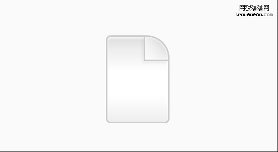
第四步:用 :after 畫出文字線條
最後一步是紙上的橫線。做法是把 :after 定位在紙面內側,寬度取整體的 60%,左右各留 20% 的 margin,這樣線條就會置中且不貼邊:
.docIcon:after {
  content: "";
  display: block;
  position: absolute;
  left: 0;
  top: 0;
  width: 60%;
  margin: 22px 20% 0;
  height: 15px;
}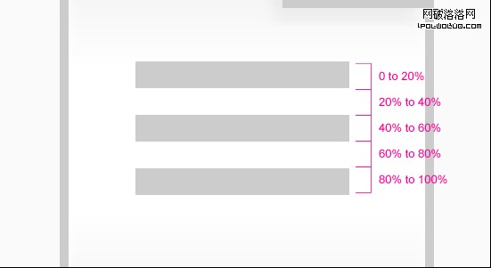
接著用多段色標停在同一起點的技巧,讓一條漸層看起來像好幾條線:
.docIcon:after {
  ...
  background: #ccc;
  background: -webkit-linear-gradient(top, #ccc 0, #ccc 20%, #fff 20%, #fff 40%, #ccc 40%, #ccc 60%, #fff 60%, #fff 80%, #ccc 80%, #ccc 100%);
  background: -moz-linear-gradient(top, #ccc 0, #ccc 20%, #fff 20%, #fff 40%, #ccc 40%, #ccc 60%, #fff 60%, #fff 80%, #ccc 80%, #ccc 100%);
  background: -o-linear-gradient(top, #ccc 0, #ccc 20%, #fff 20%, #fff 40%, #ccc 40%, #ccc 60%, #fff 60%, #fff 80%, #ccc 80%, #ccc 100%);
  background: -ms-linear-gradient(top, #ccc 0, #ccc 20%, #fff 20%, #fff 40%, #ccc 40%, #ccc 60%, #fff 60%, #fff 80%, #ccc 80%, #ccc 100%);
  background: linear-gradient(top, #ccc 0, #ccc 20%, #fff 20%, #fff 40%, #ccc 40%, #ccc 60%, #fff 60%, #fff 80%, #ccc 80%, #ccc 100%);
}
完成,一枚純 CSS 的文件圖示就誕生了:
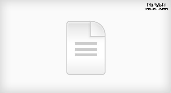
這個範例的價值在於示範了「一個元素 + 兩個偽元素」能榨出多少視覺層次:本體負責形狀與底色,:before 負責摺角,:after 負責細節紋理。把這個思路記下來,做目錄卡片、價目表、對話框時都能派上用場。
- 上一篇文章: data 類型 URL 實戰:把圖片直接嵌進 CSS 裡
- 下一篇文章: IE6 中 line-height 失效的原因與解法