CSS Sprite 實戰:打造超酷的日期顯示效果
編輯:CSS進階教程
LearningjQuery.com 部落格上的日期效果相當漂亮:
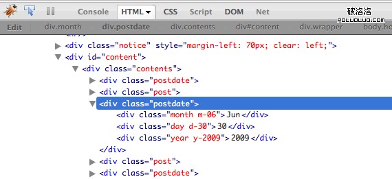
看文字的樣式與那個垂直排列的年份,你就會知道這不是用圖片硬拼出來的。而且在標記語言中,日期資訊是以文字形式出現的,和一般寫法沒兩樣。
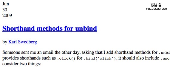
用 Firebug 檢視,程式碼簡潔得令人愉快!
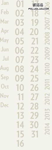
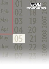
很明顯,每個日期並沒有各自的圖片。它們全部來自同一張圖——也就是 CSS Sprite。圖片的不同區域被放上了不同的內容:天、月、年。如果你記得一年前 Joost de Valk 寫過類似技術,那思路是一致的。
來看看這張漂亮的精靈圖:
HTML 結構
<div class="postdate">
  <div class="month m-06">Jun</div>
  <div class="day d-30">30</div>
  <div class="year y-2009">2009</div>
</div>
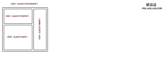
一個外包容器,加上三個區塊。我們就是靠這三層來組出完整日期:
在 WordPress 這類內容管理系統中,背後的程式碼會長這樣:
<div class="postdate">
  <div class="month m-<?php the_time('m') ?>"><?php the_time('M') ?></div>
  <div class="day d-<?php the_time('d') ?>"><?php the_time('d') ?></div>
  <div class="year y-<?php the_time('Y') ?>"><?php the_time('Y') ?></div>
</div>
CSS 才是精靈發揮作用的地方
利用 HTML 中設定的那些特殊類名,我們可以決定要使用精靈圖的哪一個部分。
首先為父元素套用相對定位,再讓三個子區塊絕對定位。三層共用同一張背景圖,各自設定寬高,然後把文字移出畫面:
.postdate {
  position: relative;
  width: 50px;
  height: 50px;
  float: left;
}

.month, .day, .year {
  position: absolute;
  text-indent: -1000em;
  background-image: url(/wp-content/themes/ljq/images/dates.png);
  background-repeat: no-repeat;
}

.month { top: 2px;   left: 0; width: 32px; height: 24px; }
.day   { top: 25px;  left: 0; width: 32px; height: 25px; }
.year  { bottom: 0;  right: 0; width: 17px; height: 48px; }
最後,為每個月(12 種可能)、每一天(31 種可能)、每一年(設定 10 年)分別指定背景圖的偏移位置:
.m-01 { background-position: 0 4px; }
.m-02 { background-position: 0 -28px; }
.m-03 { background-position: 0 -57px; }
... more like this ...

.d-01 { background-position: -50px 0; }
.d-02 { background-position: -50px -31px; }
.d-03 { background-position: -50px -62px; }
... more like this ...

.y-2006 { background-position: -150px 0; }
.y-2007 { background-position: -150px -50px; }
.y-2008 { background-position: -150px -100px; }
... more like this ...
這個做法聰明在哪
關鍵在於「日期的每個部分都是有限集合」:月份只有 12 種、日期只有 31 種、年份的組合更少。既然可能性可以窮舉,就能全部預先畫進一張精靈圖,再用 background-position 做查表。
這樣的收益有三層:
- 不管頁面上有幾篇文章,日期圖示只發一次 HTTP 請求。
- 日期資訊仍是以真實文字呈現,搜尋引擎與螢幕閱讀器都讀得到——
text-indent: -1000em只是把它移出視覺範圍,並未從 DOM 中移除。 - 要換風格,只要替換那張精靈圖,程式碼完全不用動。
這正是 CSS Sprite 最理想的適用場景:元素數量有限、需大量重複、且視覺變化可以窮舉。
希望你能喜歡!