測試浏覽器:IE6 / IE7 / IE8 / Firefox 3 / Opera 10 / Safari 4 / Chrome 2,操作系統 Windows。
先看代碼
<!DOCTYPE html PUBLIC "-//W3C//DTD XHTML 1.0 Transitional//EN" "https://www.w3.org/TR/xhtml1/DTD/xhtml1-transitional.dtd">
<html xmlns="https://www.w3.org/1999/xhtml">
<head>
<meta http-equiv="Content-Type" content="text/html; charset=utf-8" />
<title>利用box-sizing實現div仿框架</title>
<style type="text/css">
* { margin:0; padding:0;}
html {
  -webkit-box-sizing:border-box;
  -moz-box-sizing:border-box;
  box-sizing:border-box;
  padding:100px 0;
  overflow:hidden;
}
html, body { height:100%;}
.top { position:relative; margin-top:-100px; height:100px; background:#f60;}
.side {
  position:relative; height:100%; background:#fc0;
  overflow:auto; width:200px; float:left;
  margin-right:0 !important; margin-right:-3px;
}
.main { position:relative; overflow:auto; height:100%; background:#f30;}
.bottom { position:relative; height:100px; background:#f60; clear:both;}
</style>
</head>
<body>
<div class="top"> top </div>
<div class="side"> side……(內容較長,觸發滾動)…… </div>
<div class="main"> main……(內容較長,觸發滾動)…… </div>
<div class="bottom"> bottom </div>
</body>
</html>
關鍵就一行
html {
  -webkit-box-sizing:border-box;
  -moz-box-sizing:border-box;
  box-sizing:border-box;
  padding:100px 0;
  overflow:hidden;
}
原理
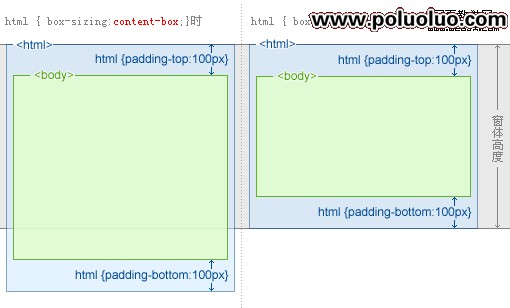
千言萬語抵不過一張圖:對比「整容」前後,box-sizing: border-box 的作用一目了然——padding 被算進了你指定的寬高裡,而不是往外撐。
了解 box-sizing 的同學都知道,它來自 CSS3,理論上 IE6/IE7 並不支持。但這份 demo 在 IE6/IE7 下同樣正常,原因很有意思:IE6/IE7 裡 html 元素的 box-sizing 默認值本來就是 border-box(IE7 有一點點小毛病,加上 overflow: hidden 之後就恢復正常了,不影響本例)。也就是說,我們只需要為現代浏覽器補上標準寫法。
要不要用它?優劣對比
相比用絕對定位來實現同樣的效果,這個方案目前有兩個明顯優勢:
- 各浏覽器用同一套方法,CSS 簡單,易讀、易改;
- 兼容性更穩。絕對定位的方案在 Opera 10 下有個暫時找不到修復辦法的 bug,只能繞道走。
最大的劣勢是不够靈活。如果沒有 IE6,我會毫不猶豫地選絕對定位。
加上 iframe 的實用版本
把主區域換成 iframe,就得到一個真正的「框架式」後台佈局:頭部固定、側邊欄獨立滾動、主視圖承載外部頁面。
<!DOCTYPE html PUBLIC "-//W3C//DTD XHTML 1.0 Transitional//EN" "https://www.w3.org/TR/xhtml1/DTD/xhtml1-transitional.dtd">
<html xmlns="https://www.w3.org/1999/xhtml">
<head>
<meta http-equiv="Content-Type" content="text/html; charset=utf-8" />
<title>利用box-sizing實現div仿框架</title>
<style type="text/css">
* { margin:0; padding:0;}
html {
  -webkit-box-sizing:border-box;
  -moz-box-sizing:border-box;
  box-sizing:border-box;
  padding:100px 0;
  position:relative;
  overflow:hidden;
}
html, body { height:100%;}
.top { position:relative; margin-top:-100px; height:100px; background:#f60;}
.side {
  position:relative; height:100%; background:#fc0;
  overflow:auto; width:200px; float:left;
  margin-right:0 !important; margin-right:-3px;
}
.main {
  position:relative; overflow:hidden; height:100%; background:#f30;
  padding-top:100px; margin-top:-100px; top:50px;
  margin-left:200px; _margin-left:0; z-index:2;
}
.main iframe {
  height:100%; width:100%; background:#fff;
  position:absolute; left:0; top:0;
}
.bottom { position:relative; height:100px; background:#f60; clear:both;}
</style>
</head>
<body>
<div class="top"> top </div>
<div class="side"> side…… </div>
<div class="main">
  <iframe frameborder="0" src="https://www.g.cn/"></iframe>
</div>
<div class="bottom"> bottom </div>
</body>
</html>
注意 _margin-left:0 這條下劃線 hack,是專門留給 IE6 的。
兩個容易踩的點
一個要注意的問題:不要給 body 加 overflow: hidden,它會無情地裁掉一切超出 body 範圍的東西,包括 top 和 bottom。
一個要理解的要點:「100% 再加 N px」的高度是怎麼做出來的——div { height:100%; padding-top: Npx; }。在 border-box 模型下,padding 被計入總高度,所以外層不會溢出;再用負 margin 把多出來的部分拉回來,就能讓內部元素剛好填滿剩下的空間。這正是上面 .main 那幾行代碼在做的事。
- 上一篇文章: IE6 下 div 高度寫不小的真正原因:font-size
- 下一篇文章: CSS 樣式表與 HTML 文檔的繼承關系