CSS 實戰:用列表邊框與背景圖做出優雅選單
編輯:CSS進階教程
這個範例示範如何用 list 的邊框樣式與背景圖片,做出一個乾淨又有設計感的選單。核心技巧在於利用 list 的相對定位,把邊框的位置靈活挪移。這套做法非常自由,邊框與背景的布局都能隨意調整,而且當使用者縮放瀏覽器字級時,選單也不會走形。
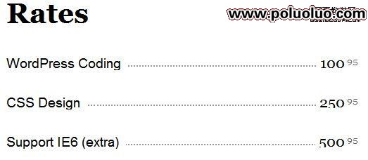
先看 HTML 結構,搭配下圖會更清楚每個元素負責什麼:
<ul>
  <li><strong>CSS Design</strong> <em>250<sup>95</sup></em></li>
</ul>
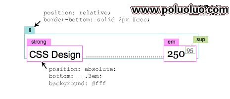
步驟一:建立定位基準
給 <li> 加上 position:relative 與一條底邊框;再讓 <strong> 與 <em> 使用 position:absolute,透過負值把它們壓到邊框之下。間距則用相對單位控制,這樣字級縮放時才不會失衡。
.menu {
  width: 500px;
  list-style: none;
  margin: 0 0 2em;
  padding: 0;
  font: 150%/100% Arial, Helvetica, sans-serif;
}
.menu li {
  clear: both;
  margin: 0;
  padding: 0 0 1.8em 0;
  position: relative;
  border-bottom: dotted 2px #999;
}
.menu strong {
  background: #fff;
  padding: 0 10px 0 0;
  font-weight: normal;
  position: absolute;
  bottom: -.3em;
  left: 0;
}
.menu em {
  background: #fff;
  padding: 0 0 0 5px;
  font: 110%/100% Georgia, "Times New Roman", Times, serif;
  position: absolute;
  bottom: -.2em;
  right: 0;
}
.menu sup {
  font-size: 60%;
  color: #666;
  margin-left: 3px;
}
步驟二:調整 li 的樣式
換成虛線邊框、加大下方留白,視覺層次立刻不同:
li {
  border-bottom: dashed 1px #000;
  padding: 0 0 2.3em 0;
}
步驟三:用背景圖取代實線邊框
如果想讓分隔線更有個性,可以直接換成一張橫向平鋪的圖:
li {
  background: url(images/circle.gif) repeat-x left bottom;
}
步驟四:處理舊版 IE 的布局問題
如果你仍需支持 IE6 或行為不太穩定的 IE6,可能會發現布局跑掉。解法是替 <li> 加上 clearfix:
/* clearfix */
.menu li:after {
  content: ".";
  display: block;
  height: 0;
  clear: both;
  visibility: hidden;
}
.menu li { display: inline-block; }
/* Hides from IE-mac \*/
* html .menu li { height: 1%; }
.menu li { display: block; }
/* End hide from IE-mac */
整個做法的價值在於:所有間距都採用相對單位,因此使用者調大字級時,選單會等比放大而不會破版——這是純圖片切圖做不出來的效果。
- 上一篇文章: 為什麼要推動使用者升級瀏覽器?原因與實踐方法
- 下一篇文章: CSS 實戰:用 display:inline 做出橫向導覽列