之前一直很模糊,他們的水平和垂直方向上的百分比是根據什麼來的?
是根據寬度還是高度呢?
來揭秘一下把。
首先是
margin:
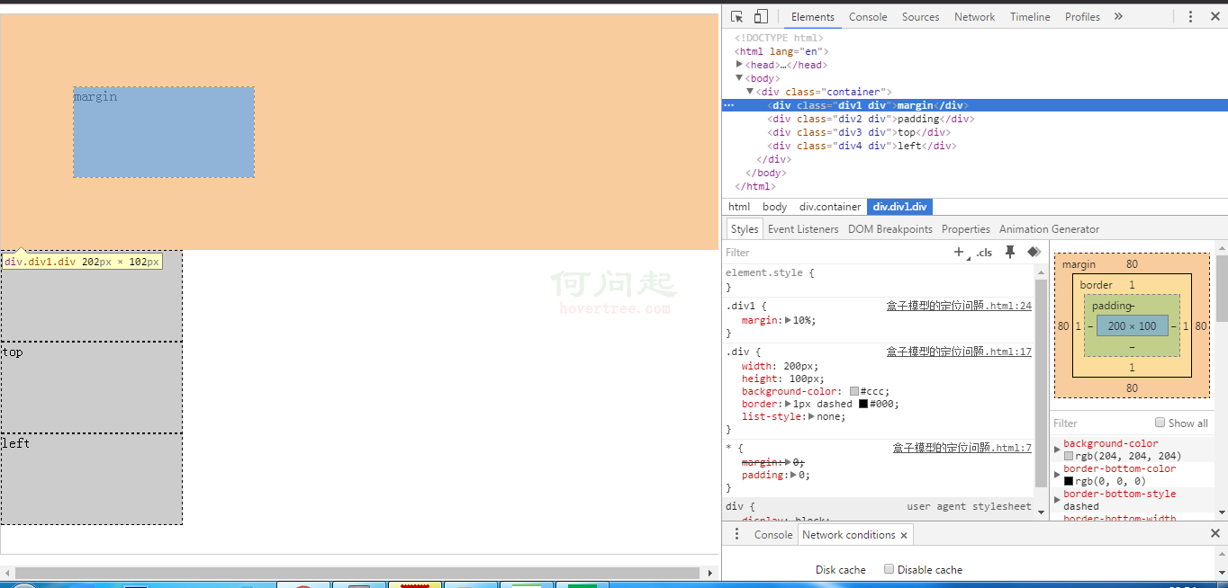
可以看出margin-top和margin-bottom都是根據父容器的寬度來決定的。
比如我這裡的margin:10%
父容器的width:800px;height:600px;
結論:margin百分比也是根據父容器的寬度來決定的。不管margin-top還是margin-bottom。
<!DOCTYPE html>
<html lang="en">
<head>
    <meta charset="UTF-8">
    <title>盒子模型的定位問題</title>
    <style type="text/css">
    *{
        margin: 0;
        padding: 0;
    }
    .container{
        width:800px;
        height:600px;
        margin:10px auto 0;
        border:1px solid #ccc;
        position: relative;
    }
    .div{
        width:100px;
        height:50px;
        background-color:#ccc;
        border:1px dashed #000;
        list-style:none;
    }
    .div1{
        margin:10%;
    }
    </style>
</head>
<body>
    <div class="container">
        <div class="div1 div">margin</div>
    </div>
</body>
</html>
padding:
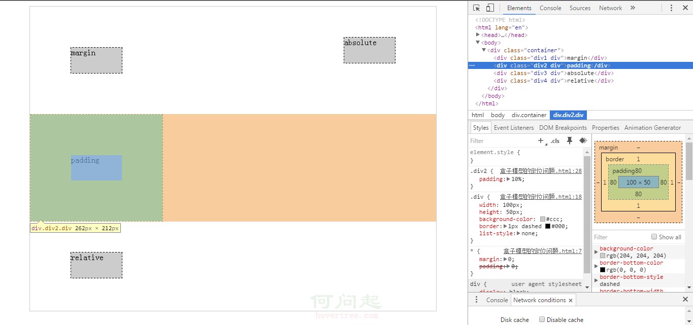
這裡的padding設置的是10%;可以看到padding-top和padding-bottom都是80px;
結論:padding百分比也是根據父容器的寬度來決定的。不管padding-top還是padding-bottom。
<!DOCTYPE html>
<html lang="en">
<head>
    <meta charset="UTF-8">
    <title>盒子模型的定位問題</title>
    <style type="text/css">
    *{
        margin: 0;
        padding: 0;
    }
    .container{
        width:800px;
        height:600px;
        margin:10px auto 0;
        border:1px solid #ccc;
        position: relative;
    }
    .div{
        width:100px;
        height:50px;
        background-color:#ccc;
        border:1px dashed #000;
        list-style:none;
    }
    .div2{
        padding:10%;
    }
    </style>
</head>
<body>
    <div class="container">
        <div class="div2 div">padding</div>
    </div>
</body>
</html>
position:absolute;
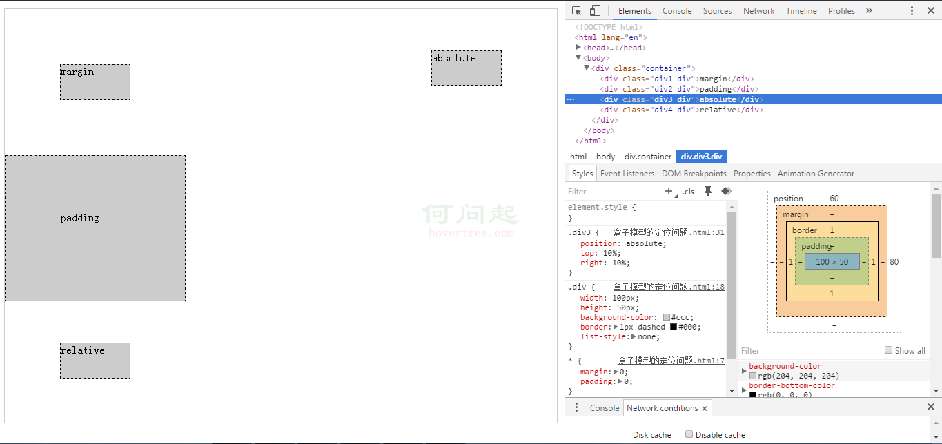
這裡的div3設置的屬性是position:absolute;top:10%;right:10%;
可以看出解析出來之後top:60px;right:80px;
結論:當position:absolute時,top的百分比是根據父容器高度來計算的,left的百分比是根據父容器的寬度來計算的。
<!DOCTYPE html>
<html lang="en">
<head>
    <meta charset="UTF-8">
    <title>盒子模型的定位問題</title>
    <style type="text/css">
    *{
        margin: 0;
        padding: 0;
    }
    .container{
        width:800px;
        height:600px;
        margin:10px auto 0;
        border:1px solid #ccc;
        position: relative;
    }
    .div{
        width:100px;
        height:50px;
        background-color:#ccc;
        border:1px dashed #000;
        list-style:none;
    }
    .div3{
        position: absolute;
        top:10%;
        right:10%;
    }
    </style>
</head>
<body>
    <div class="container">
        <div class="div3 div">absolute</div>
    </div>
</body>
</html>
position:relative;
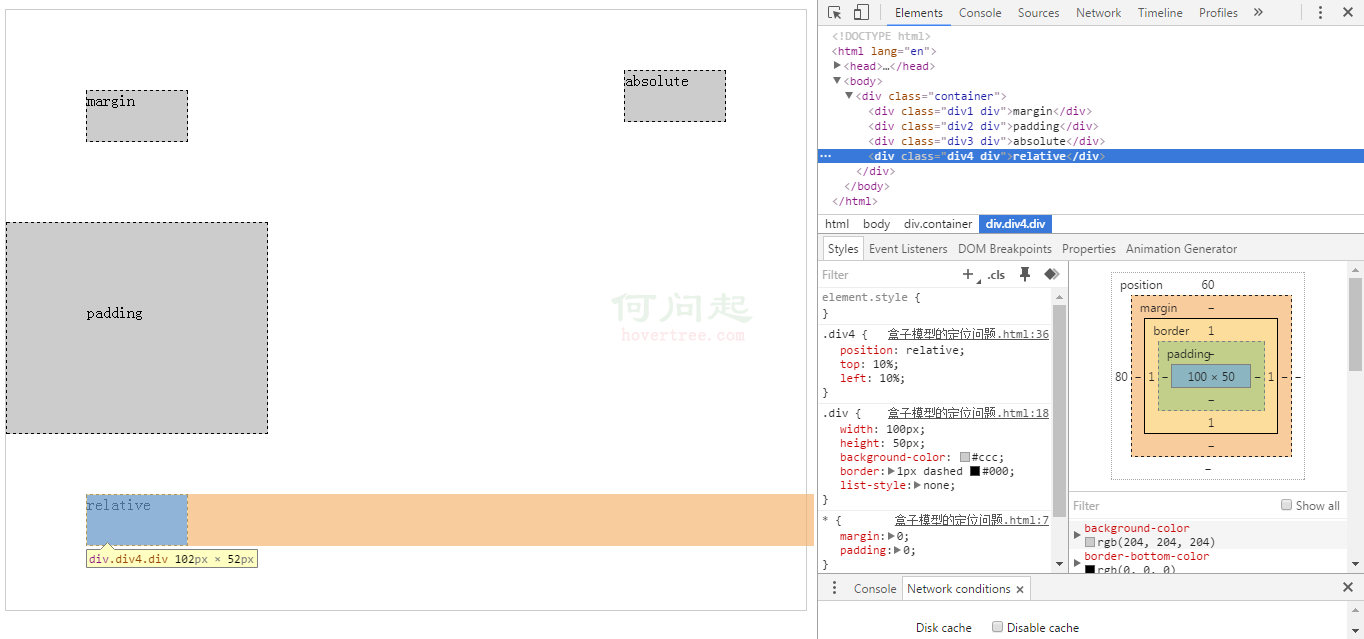
這裡的div4設置的屬性是position:relative;top:10%;left:10%;
可以看出解析出來之後top:60px;left:80px;
結論:當position:relative時,top的百分比是根據父容器高度來計算的,left的百分比是根據父容器的寬度來計算的。
<!DOCTYPE html>
<html lang="en">
<head>
    <meta charset="UTF-8">
    <title>盒子模型的定位問題</title>
    <style type="text/css">
    *{
        margin: 0;
        padding: 0;
    }
    .container{
        width:800px;
        height:600px;
        margin:10px auto 0;
        border:1px solid #ccc;
        position: relative;
    }
    .div{
        width:100px;
        height:50px;
        background-color:#ccc;
        border:1px dashed #000;
        list-style:none;
    }
    .div4{
        position: relative;
        top:10%;
        left:10%;
    }
    </style>
</head>
<body>
    <div class="container">
        <div class="div4 div">relative</div>
    </div>
</body>
</html>
width和height:
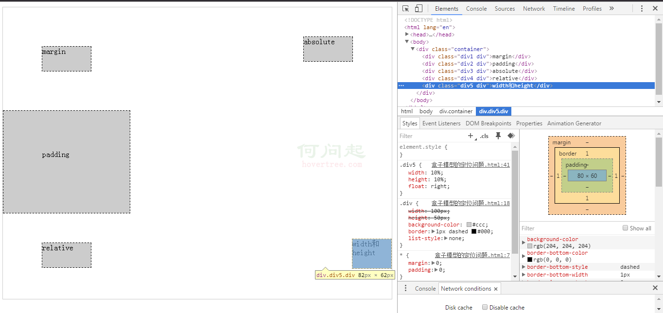
可以看出,設置寬度百分比和高度百分比是根據父容器的寬度和高度來設置的。
<!DOCTYPE html>
<html lang="en">
<head>
    <meta charset="UTF-8">
    <title>盒子模型的定位問題</title>
    <style type="text/css">
    *{
        margin: 0;
        padding: 0;
    }
    .container{
        width:800px;
        height:600px;
        margin:10px auto 0;
        border:1px solid #ccc;
        position: relative;
    }
    .div{
        width:100px;
        height:50px;
        background-color:#ccc;
        border:1px dashed #000;
        list-style:none;
    }
    .div5{
        width:10%;
        height:10%;
        float:right;
    }
    </style>
</head>
<body>
    <div class="container">
        <div class="div5 div">width和height</div>
    </div>
</body>
</html>
總結:height、top兩個值都是根據父容器的高度來設置的。
padding-top/padding-bottom/padding-left/padding-right、margin-top/margin-bottom/margin-left/margin-right、width、left是根據父容器的寬度來設置的。
路徑:http://sandbox.runjs.cn/show/cckc8yek
- 上一頁:標准初始化css樣式表
- 下一頁:css3 變換 transform(2D)