原來 CSS 中的 border 還可以這樣玩
前言:在讀這篇文章之前,你可能覺得 border 只是用來畫邊框的;看完之後,相信你也會跟我一樣感嘆一句「原來 border 還能這麼玩」。本文整理自早前看到別人用純 CSS 畫三角形後的一些思路,會介紹幾種小圖形的做法。
用 border 畫雞蛋形
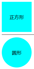
沒看錯,我們要畫一個類似雞蛋的效果。思路是先用 div 畫一個正方形,再設 border-radius:50% 得到圓形:
<div class="div"></div>
.div { width: 100px; height: 100px; line-height: 100px; background-color: aqua; text-align: center; border-radius: 50%; }
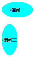
雞蛋有點橢、且分大頭和小頭。先讓圓變成橢圓——改動 width 或 height 其中之一(例如只設 width:50px 或 height:50px):
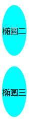
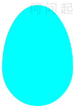
得到橢圓後,再想辦法做出大頭小頭。把 border-radius 的百分比拆成四個值分別控制,關鍵代碼:
border-radius: 50% 50% 50% 50% / 62% 62% 38% 38%;
用 border 畫三角形
大家都知道 border-color 控制邊框顏色,但不一定試過這樣玩:
<div class="div"></div>
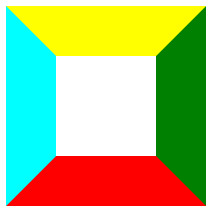
.div { width: 100px; height: 100px; border: 50px solid transparent; border-color: yellow green red aqua; }
結果會得到四個不同顏色的三角形:
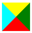
若把 div 的寬高去掉,四塊就合成一個菱形:
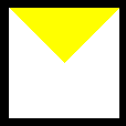
如何只保留一個三角形?的思路是「遮蓋」——把不想要的那三邊設為背景色(白色),例如要上半三角:border-color: yellow white white white;。但若把 body 背景改黑,就會發現那個 div 仍佔著位置,且白色並非最科學的做法:
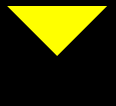
更好的做法是將不想要的顏色設為 transparent:border-color: yellow transparent transparent transparent;
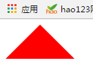
而要不佔空間,就直接把三角形對邊的 border 寬度去掉(以下以下三角為例):
div{
width:0px;
height: 0px;
border-bottom: 50px solid red;
border-left: 50px solid transparent;
border-right: 50px solid transparent;
}
關於三角形的延伸思考
銳角、鈍角、直角、等邊、等腰三角形,都能透過控制底邊與高的大小比例來實現;當三角形與水平線不重合時,就需要結合寬高比與 CSS3 的 transform、rotate 來呈現(涉及一些數學知識)。此外,多個三角形還能拼出更多形狀,例如兩個三角形加一個長方形拼成平行四邊形,甚至用多個 div 拼出小木屋。
補充:前面那張圖中間的幾個其實是梯形,用同樣方法即可得到;透過旋轉,正方形也能變成菱形。
多邊形的製作(以六邊形為例)
六邊形可分解為兩個三角形加一個矩形:
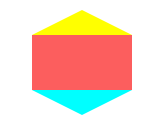
用偽元素 :before、:after 分別繪製上下兩個三角形即可:
<!DOCTYPE html> <html> <head> <meta charset="UTF-8"> <title>六邊形的制作</title> <style type="text/css"> #hexagon { width: 100px; height: 55px; background: #fc5e5e; position: relative; margin: 100px auto; } #hexagon:before { content: ""; width: 0; height: 0; position: absolute; top: -25px; left: 0; border-left: 50px solid transparent; border-right: 50px solid transparent; border-bottom: 25px solid yellow; } #hexagon:after { content: ""; width: 0; height: 0; position: absolute; bottom: -25px; left: 0; border-left: 50px solid transparent; border-right: 50px solid transparent; border-top: 25px solid aqua; } </style> </head> <body> <div id="hexagon"></div> </body> </html>
多角星的製作(以六角星為例)
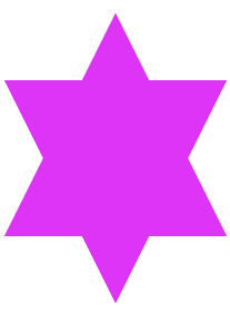
六角星可理解為兩個三角形重疊而成:
<!DOCTYPE html> <html> <head> <meta charset="UTF-8"> <title>六角星</title> <style type="text/css"> div { width: 0; height: 0; display: block; position: absolute; border-left: 100px solid transparent; border-right: 100px solid transparent; border-bottom: 200px solid #de34f7; margin: 10px auto; } div:after { content: ""; width: 0; height: 0; position: absolute; border-left: 100px solid transparent; border-right: 100px solid transparent; border-top: 200px solid #de34f7; margin: 60px 0 0 -100px; } </style> </head> <body> <div></div> </body> </html>
五角星操作起來更複雜些,可先畫一個五角星再分割為三部分,利用前述步驟實現(細節較繁):
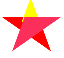
<!DOCTYPE html> <html> <head> <meta charset="UTF-8"> <title></title> <style type="text/css"> #star{ width: 0px; height: 0px; margin: 50px 0; color: red; position: relative; display: block; border-bottom: 70px solid red; border-left: 100px solid transparent; border-right: 100px solid transparent; -webkit-transform: rotate(35deg); } #star:before{ content: ''; width: 0px; height: 0px; margin: 50px 0; color: yellow; position: relative; display: block; border-bottom: 80px solid yellow; border-left: 30px solid transparent; border-right: 30px solid transparent; -webkit-transform: rotate(-35deg); top: -45px; left: -65px; } #star:after{ content: ''; width: 0; height: 0; position: absolute; display: block; top: 3px; left: -105px; color: #fc2e5a; border-right: 100px solid transparent; border-bottom: 70px solid #fc2e5a; border-left: 100px solid transparent; -webkit-transform: rotate(-70deg); -moz-transform: rotate(-70deg); -ms-transform: rotate(-70deg); -o-transform: rotate(-70deg); } </style> </head> <body> <div id="star"></div> </body> </html>
CSS 小圖標:對話框
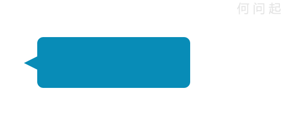
對話框由一個三角形加一個圓角矩形組成:
<!DOCTYPE html> <html> <head> <meta charset="UTF-8"> <title></title> <style type="text/css"> * { margin: 0px; padding: 0px; } div { margin: 100px; } #comment_bubble { width: 300px; height: 100px; background: #088cb7; position: relative; -moz-border-radius: 12px; -webkit-border-radius: 12px; border-radius: 12px; } #comment_bubble:before { content: ""; width: 0; height: 0; right: 100%; top: 38px; position: absolute; border-top: 13px solid transparent; border-right: 26px solid #088cb7; border-bottom: 13px solid transparent; } </style> </head> <body> <p>消息提示框可以先制作一個圓角矩形,然後在需要的地方放置一個三角形。</p> <div id="comment_bubble"></div> </body> </html>
結語
這些效果看起來或許不算酷炫,但記得剛學到時還是興奮了好一陣。當時還做過更多效果(可惜換系統後都沒了),現在能回想的就這些,之後想到了會陸續補充。你有什麼好效果,也歡迎一起分享。
- 上一篇文章: CSS3 新屬性大盤點:圓角、陰影、漸變與 3D 動畫
- 下一篇文章: 純 CSS 繪製 40+ 種幾何圖形大集合