重新認識CSS3中的border-radius
大家可能都知道,CSS3裡的border-radius是用來定義圓角的。以前我用它時,往往只會帶一個參數,最近才發現,透過傳入不同數量的參數,border-radius還能實現各種規則各異的圓角效果。下面就來聊聊border-radius所支援的幾種參數含義。
一、border-radius帶一個參數
帶1個參數時最好理解,這個值會同時作用於四個角。(這裡就不多囉嗦了)
二、border-radius帶兩個參數
帶兩個參數時,第一個參數表示左上與右下,第二個參數表示右上與左下。(我是按「交叉相同」來記憶的)你可以試試下面的代碼來驗證。


<!DOCTYPE html> <html lang="en"> <head> <meta charset="UTF-8"> <title>Document</title> <style> div{ width:200px; height:200px; border-radius: 50px 100px; background:#FB9E84; } </style> </head> <body> <div></div> </body> </html>
View Code
三、border-radius帶三個參數
帶三個參數時,三個值分別表示左上、右上與左下、右下。示例如下:
<!DOCTYPE html> <html lang="en"> <head> <meta charset="UTF-8"> <title>Document</title> <style> div{ width:200px; height:200px; border-radius: 50px 20px 100px; background:#FB9E84; } </style> </head> <body> <div></div> </body> </html>
View Code
四、border-radius帶四個參數
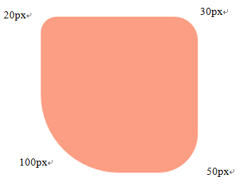
帶四個參數時同樣好理解,四個值分別對應左上、右上、右下、左下——也就是按順時針方向來解析。例如:
border-radius: 20px 30px 50px 100px;
得到的結果是這樣的:
五、border-radius還可以單獨設置各個圓角
如需分別設定單個圓角,方法如下:
左上:border-top-left-radius
右上:border-top-right-radius
右下:border-bottom-right-radius
左下:border-bottom-left-radius
六、定制特殊形狀——以斜槓「/」分隔的參數
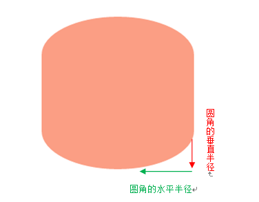
當參數以斜槓分隔時,斜槓前的值表示圓角的水平半徑,斜槓後的值表示圓角的垂直半徑。不太理解的朋友可以看看下面的例子。
<!DOCTYPE html> <html lang="en"> <head> <meta charset="UTF-8"> <title>Document</title> <style> div{ width:200px; height:200px; border-radius: 200px/100px; background:#FB9E84; } </style> </head> <body> <div></div> </body> </html>
View Code
運行這個例子可以看到:
七、為四個圓角分別定制特殊形狀
我們知道可以用斜槓定制特殊圓角,但當要為四個圓角分別定制不同的形狀時,務必注意正確的寫法是border-radius:20px 30px 40px 50px/50px 40px 30px 20px;,而不是border-radius:20px/50px 30px/40px 40px/30px 50px/20px;(後者是不正確的),使用時一定要留意!
最後,使用斜槓定制特殊圓角的解析順序與前面講的相同,按前面的規則推算即可。
(PS:IE9+、Firefox 4+、Chrome、Safari 5+ 以及 Opera 都支援border-radius屬性,而IE8及更低版本則不支援。)
- 上一篇文章: CSS布局核心知識——透徹理解BFC
- 下一篇文章: HTML 前端筆記:CSS 樣式系統整理