說到自適應布局,先前「拋磚引玉之寬度自適應布局」一文的核心思想主要是 float + margin:利用塊狀元素的流體特性,計算 float 元素的寬度並賦到塊狀元素的 margin 上。但這麼做有個缺點——每次都得先知道 float 元素的寬度。
而在「BFC 之淺析篇」中我們學到,BFC 有一特性:BFC 區域不會與外部浮動元素重疊。利用這點即可實現兩欄自適應布局:
<!DOCTYPE html>
<head>
<title>BFC</title>
<meta http-equiv="Content-Type" content="text/html; charset=utf-8"/>
<style>
.leftDiv { width:100px; height:100px; background:green; float:left; }
.normalDiv { height:100px; background:pink; /* 添加 overflow:hidden,觸發 BFC */ overflow:hidden; }
</style>
</head>
<body>
  <div class="leftDiv"></div>
  <div class="normalDiv"></div>
</body>
</html>
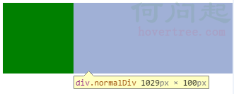
可以發現浮動元素(綠色方塊)與 .normalDiv 並未重疊,而且我沒有加任何 margin,伸縮頁面寬度時也的確是自適應的。
上面是用 overflow: hidden 觸發 BFC。要觸發元素成為 BFC 有以下幾種方法:
1、float 屬性不為 none
2、position 為 absolute 或 fixed
3、overflow 的值不為 visible
4、display 為 table-cell、table-caption、inline-block 之一
那麼,除了第 3 點,其他幾種也適合自適應布局嗎?答案是:不是。
第一點 float:觸發 BFC 後自身仍帶有包裹性,破壞了塊級元素的流體性,不適用。
第二點 position:脫離文件流較嚴重,更不適用。
第四點中的 display: table-cell:當你設定的寬度大到誇張時,它也不會超過容器寬度——這反而完美,只要把寬度設得夠大就能自適應:


<!DOCTYPE html>
<head>
<title>BFC</title>
<meta http-equiv="Content-Type" content="text/html; charset=utf-8"/>
<style>
.leftDiv { width:100px; height:100px; background:green; float:left; }
.normalDiv { height:100px; background:pink; /* display:table-cell,寬度設很大,如 9000px */ display:table-cell; width:9000px; }
</style>
</head>
<body>
  <div class="leftDiv"></div>
  <div class="normalDiv"></div>
</body>
</html>
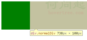
第四點中的 table-caption 直接排除;inline-block 因與 float 一樣具包裹性也排除。但 IE6、7 有 hasLayout,在 IE6、7 中 inline-block 反而具有流體特性,可解決其自適應布局:
.floatElm { float: left; }
.bftContent { display: inline-block; }
能用在自適應布局中的 BFC 觸發方法整理如下:
overflow(hidden/auto)缺點:hidden 內容過多時會裁切;auto 內容過多時會出現捲動軸。
display: inline-block缺點:僅適用 IE6、7。
display: table-cell缺點:僅適用 IE8+ 與其他瀏覽器。
綜合以上,利用 BFC 實現自適應布局的通用寫法為:
.floatElm { float: left; }
.bfcContent {
  display: table-cell;
  width: 9000px; /* 寬度大到螢幕寬度即可 */
  /* hack,針對 IE6、7 */
  *display: inline-block;
  *width: auto;
}
接著用它來實現三欄布局(左右寬 100px,中間自適應):
<!-- 左右寬度為 100px,中間自適應 -->
<!DOCTYPE html>
<head>
<title>BFC</title>
<meta http-equiv="Content-Type" content="text/html; charset=utf-8"/>
<style>
.floatLeft, .floatRight { width:100px; height:100px; }
.floatLeft { float:left; background:green; }
.floatRight { float:right; background:yellow; }
.bfcContent { display:table-cell; width:9000px; /* 寬度大到螢幕寬度即可 */ /* hack,針對 IE6、7 */ *display:inline-block; *width:auto; height:100px; background:pink; }
</style>
</head>
<body>
  <div class="floatLeft"></div>
  <div class="floatRight"></div>
  <div class="bfcContent bfcContentStl"></div>
</body>
</html>
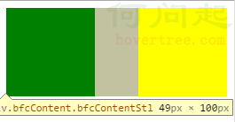
不信可以自己運行看看,拉動瀏覽器視窗便知效果。
- 上一篇文章: DIV+CSS 自適應布局實作大全
- 下一篇文章: 拋磚引玉:div+css 與 table 的寬度自適應布局