面試題解析:CSS 如何讓容器水平垂直置中
編輯:CSS特效代碼
曾在一場面試中被問到:如何讓一個容器在其父層中水平垂直置中?這題看似基礎,但面試者提供的答案往往不夠完整。以下整理幾種可靠的做法。
面試題目
<!DOCTYPE html>
<html>
<head>
<meta charset="UTF-8">
<title>demo</title>
</head>
<body>
<style type="text/css">
.div1 {
  width: 100px;
  height: 100px;
  border: 1px solid #000000;
}

.div2 {
  width: 40px;
  height: 40px;
  background-color: green;
}
</style>
<div class="div1">
  <div class="div2"></div>
</div>
</body>
</html>
問題:如何讓 class 為 div2 的內部容器上下左右都置中?
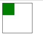
解法一:直接用 margin 計算
.div2 {
  width: 40px;
  height: 40px;
  background-color: green;
  margin-top: 30px;
  margin-left: 30px;
}
計算方式:父容器尺寸的一半減去自身尺寸的一半。父層 100px、自身 40px,因此 (100 − 40) ÷ 2 = 30px。
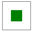
缺點很明顯:尺寸一旦變動就得重算,維護性不佳。
解法二:絕對定位搭配 margin: auto
.div1 {
  width: 100px;
  height: 100px;
  border: 1px solid #000000;
  position: relative;
}

.div2 {
  width: 40px;
  height: 40px;
  background-color: green;
  position: absolute;
  margin: auto;
  left: 0;
  top: 0;
  right: 0;
  bottom: 0;
}
原理是:當絕對定位元素的四個偏移值全部設為 0,且 margin 為 auto 時,瀏覽器會自動把剩下的空間平均分配給四側 margin,結果就是完美置中。這比手算 30px 高明得多,因為它與實際尺寸無關。
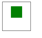
更有趣的是,把其中幾個偏移值改成你要的數字,元素仍會以「置中為基準」偏移。例如:
.div2 {
  width: 40px;
  height: 40px;
  background-color: green;
  position: absolute;
  margin: auto;
  left: 0;
  top: -30px;
  right: 0;
  bottom: 0;
}
此時 div2 會停在垂直中線上方 30px 的位置。
解法三:Flex 佈局
若可以使用現代語法,這是最直觀的寫法:
.div1 {
  display: flex;
  align-items: center;     /* 垂直置中 */
  justify-content: center; /* 水平置中 */
}
解法四:定位加 transform
.div2 {
  position: absolute;
  left: 50%;
  top: 50%;
  transform: translate(-50%, -50%);
}
先用 left/top 把元素左上角推到中線,再用 transform 依「自身尺寸」回退一半。translate 的百分比以元素本身為基準,因此完全不必知道實際寬高。
總結
置中需求在實作中很常見:彈窗、載入提示、圖片預覽都需要。以 JS 動態計算 left/top 是沒有必要的,CSS 已經能提供多種更簡潔且不依賴尺寸的方案。面試時能講出兩三種並說明各自的取捨,通常比只會一種更有說服力。
- 上一篇文章: 修改 input placeholder 文字顏色的寫法
- 下一篇文章: 用 CSS3 skew 與 rotate 打造傾斜旋轉動畫