讓 HTML 圖片自適應手機螢幕大小的 CSS 寫法
編輯:CSS詳解
行動裝置普及後,讓圖片能隨螢幕尺寸自動縮放,幾乎是每個 RWD 頁面的標配。本文示範如何透過 CSS 讓插入的圖片自適應螢幕寬度。
關鍵設定
核心其實只有一行——讓圖片寬度設為 100%,高度設為 auto:
img {
  height: auto;
  width: auto\9;  /* 兼容舊 IE */
  width: 100%;
}
完整的 reset 與基礎樣式
body, button, dd, dl, dt, fieldset, form, h1, h2, h3, h4, h5, h6,
input, legend, li, ol, p, select, table, td, textarea, th, ul {
  margin: 0;
  padding: 0;
}
body {
  min-width: 320px;
  font-family: 'microsoft yahei', Verdana, Arial, Helvetica, sans-serif;
  color: #333;
  -webkit-text-size-adjust: none;
}
fieldset, img { border: 0; }
ol, ul { list-style: none; }
img { height: auto; width: auto\9; width: 100%; }
* {
  -webkit-tap-highlight-color: rgba(0,0,0,0);
  -webkit-box-sizing: border-box;
  -moz-box-sizing: border-box;
  box-sizing: border-box;
}
HTML 結構示例
<meta name="viewport" content="width=device-width; initial-scale=1.0">
...
<div class="doc">
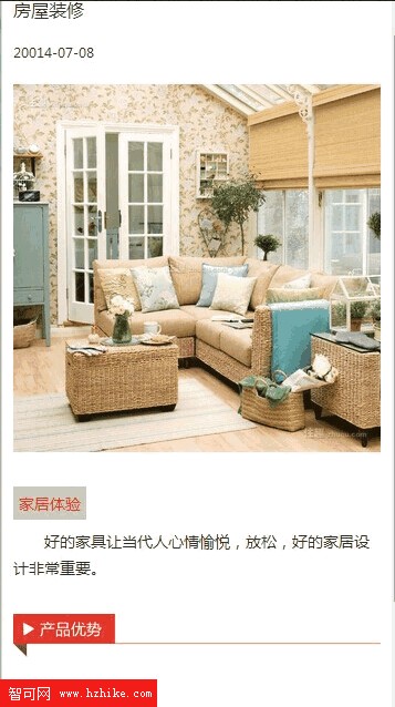
  <h1>房屋裝修</h1>
  <div class="shop-title">
    <img src="style/images/5.jpg" width="640" height="406" alt="" />
  </div>
</div>
重點提醒:要在 HTML 中讓圖片自適應螢幕而非固定寬高,只要在 CSS 裡加上 img { height: auto; width: 100%; } 即可。同時別忘了在 head 中設定 viewport,行動裝置才會以實際裝置寬度來渲染頁面。
- 上一篇文章: 讓 div 背景透明、內部文字不透明的寫法
- 下一篇文章: div 未設背景色時 z-index 看似失效的原因