CSS3 幾乎改寫了網頁的製作方式。熟練掌握之後,過去必須靠圖片切圖、甚至非得動用 JavaScript 才能做出的元件,如今光靠樣式表就能還原。本文依據一份國外深色風格 UI 設計稿,用 CSS3 搭配原生 JS 逐項實作,涵蓋導覽列、表單、按鈕、自訂下拉選單、Tooltip、開關、滑桿、對話框、輪播與 HTML5 播放器。
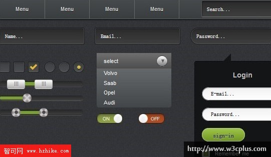
主要用到的特性有:border-radius 圓角、linear-gradient 線性漸變、box-shadow 內外陰影、transition 過渡,以及 font-face 載入圖示字型。
基礎樣式與版面骨架
body {
  background: url(bg.jpg);
  font-family: Arial, Helvetica, Geneva, Verdana, sans-serif;
}
.row { margin: 20px 0; }
.row div[class*="span"] { float: left; }
.row:after, .clearfix:after {
  content: ""; width: 0; height: 0;
  display: block; clear: both; visibility: hidden;
}
.span2  { width: 20%; }
.span4  { width: 33%; }
.span10 { width: 80%; }
.container {
  width: 700px;
  border: 1px dashed #fff;
  margin: 0 auto;
  padding: 50px 20px;
  box-sizing: border-box;
}
@font-face {
  font-family: "icomoon";
  src: url("fonts/icomoon.eot");
  src: url("fonts/icomoon.eot?#iefix") format("embedded-opentype"),
       url("fonts/icomoon.woff") format("woff"),
       url("fonts/icomoon.ttf") format("truetype"),
       url("fonts/icomoon.svg#icomoon") format("svg");
  font-weight: normal;
  font-style: normal;
}
字型檔分成 eot、woff、ttf、svg 四種格式一併提供,是為了讓各家瀏覽器都能挑到自己支援的那一份。這套寫法至今仍是最穩妥的做法。
一、導覽列
結構上參照了 Bootstrap 的寫法,語意清楚,初學者很值得照著學。
<div class="navbar">
  <ul class="nav clearfix">
    <li><a href="">Menu</a></li>
    <li><a href="">Menu</a></li>
  </ul>
  <form class="navbar-search">
    <div class="input-append">
      <input type="text" placeholder="Search..." />
      <span class="icon-search"></span>
    </div>
  </form>
</div>
.navbar {
  border: 1px solid;
  border-color: rgb(102,104,105) rgb(98,100,102) rgb(94,96,97);
  box-shadow: 0 1px 3px rgb(0,0,0);
  border-radius: 2px;
  background: linear-gradient(top, rgb(71,74,75), rgb(58,61,63));
}
.navbar .nav li { float: left; list-style: none; }
.navbar .nav li:first-child { border-radius: 2px 0 0 2px; }
.navbar .nav a {
  color: #fff; text-decoration: none; font-size: 12px;
  border-right: 1px solid rgb(102,104,105);
  line-height: 43px; text-align: center;
  display: inline-block; min-width: 100px;
  box-sizing: border-box; padding: 0 30px;
  text-shadow: 0 1px 0 rgb(0,0,0);
}
.navbar .nav a:hover {
  background: linear-gradient(top, rgb(61,64,66), rgb(49,53,55));
}
.navbar-search .input-append input {
  border: 1px solid;
  border-color: transparent rgb(84,87,88) rgb(113,115,116);
  border-top: none; border-radius: 3px;
  height: 35px; width: 199px; padding: 9px 10px;
  box-shadow: inset 0 1px 2px rgb(17,17,18),
              inset 0 2px 0 rgb(34,34,34),
              0 1px 0 rgb(77,80,82);
  background-color: rgb(51,51,51);
  outline: none;
}
這裡有兩個值得學的技巧:用三層 border-color 模擬上暗下亮的立體切邊;用 inset 陰影在輸入框內做出凹陷感。
二、輸入框、核取方塊與單選鈕
<div class="row">
  <input type="text" placeholder="Name..." />
  <input type="text" placeholder="Email..." />
</div>
<div class="row">
  <span class="checkbox">
    <input type="checkbox" id="checkbox1" />
    <label for="checkbox1" data-on="a"></label>
  </span><span class="checkbox">
    <input type="checkbox" id="checkbox2" checked="checked" />
    <label for="checkbox2" data-on="a"></label>
  </span>
</div>
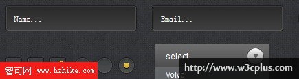
原生 input 用 display: none 藏起來,改由 label 呈現外觀,勾選狀態則靠 input:checked + label 這個相鄰選擇器接管。這是自訂表單控件最標準的做法,同時保住鍵盤可操作與 label 點擊的可用性。
input[type="text"] {
  height: 36px; width: 189px; color: #fff;
  box-shadow: 0 0 0 1px rgba(0,0,0,0.4),
              inset 0 1px 1px rgba(0,0,0,0.3);
  border-radius: 3px;
  border: 1px solid;
  border-color: rgb(57,57,57) rgb(73,73,73) rgb(86,86,86);
  background: linear-gradient(top, rgb(42,42,42), rgb(62,62,62));
}
.checkbox label, .radio label {
  width: 20px; height: 20px; border: 1px solid;
  border-radius: 2px;
  border-color: rgb(63,64,64) rgb(79,80,81) rgb(93,95,96);
  display: inline-block; vertical-align: top;
  line-height: 20px; text-align: center; cursor: pointer;
}
.radio label { border-radius: 50%; }
.checkbox input { display: none; }
.checkbox input:checked + label:before {
  font-family: "icomoon";
  content: attr(data-on);
  color: rgb(236,190,29);
}
.radio input:checked + label:before {
  content: "";
  display: block; width: 8px; height: 8px;
  position: relative; left: 6px; top: 6px;
  border-radius: 50%;
  background: linear-gradient(top, rgb(238,200,63), rgb(207,169,32));
}
勾選後的對勾圖示並不是圖片,而是把字型檔的字符碼寫在 data-on 自訂屬性裡,再用 content: attr(data-on) 取出來。同一套邏輯稍作修改,就能拿來做下一步的開關。
三、滑桿控件
<div class="sliderbar sliderbar-bothway show-value" data-type="bothway">
  <div class="slider-range"></div>
  <a class="slider-handle left-handle"></a>
  <a class="slider-handle right-handle"></a>
</div>
.sliderbar {
  width: 186px; height: 12px; border-radius: 6px;
  box-shadow: inset 0 -1px 0 rgba(0,0,0,0.4),
              0 1px 0 rgba(140,140,140,0.4);
  background: linear-gradient(top, rgb(38,38,38), rgb(63,63,63));
  position: relative;
}
.sliderbar .slider-range {
  width: 33%; height: 60%; border-radius: 4px;
  top: 20%; position: absolute;
  background-color: rgb(122,161,41);
}
.sliderbar-bothway .slider-handle {
  height: 20px; width: 20px; top: -4px;
  margin-left: -10px; border-radius: 50%;
  position: absolute; cursor: pointer;
}
.sliderbar-bothway .left-handle  { left: 20%; z-index: 1; }
.sliderbar-bothway .right-handle { left: 53%; z-index: 2; }
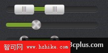
拖曳行為交給 JS:在 mousedown 時掛上 document 的 mousemove 與 mouseup,放開時移除。左右雙控件的版本還要夾住範圍——左把手不得越過右把手,右把手不得越過左把手,並同步更新中間色帶的寬度。
(function () {
  var bars = document.querySelectorAll(".sliderbar");
  for (var i = 0, len = bars.length; i < len; i++) {
    EventUtil.addHandler(bars[i], "mousedown", startDrag);
  }
  function startDrag(e) {
    var e = EventUtil.getEvent(e);
    EventUtil.preventDefault(e);   /* 避免拖曳時出現禁止手勢 */
    var target = EventUtil.getTarget(e);
    if (target.nodeName.toLowerCase() != "a") { return; }
    var parent = target.parentNode;
    var type = getDataAttr(parent, "type");
    var sliderRange = parent.getElementsByTagName("div")[0];
    var origX = e.clientX, origLeft = target.offsetLeft;
    EventUtil.addHandler(document, "mousemove", doDrag);
    EventUtil.addHandler(document, "mouseup", stopDrag);

    function doDrag(e) {
      var e = EventUtil.getEvent(e);
      EventUtil.preventDefault(e);
      var curLeft = e.clientX - origX + origLeft;
      /* 依 type 與目前是否為雙把手夾住上下界,再更新 left 與 range 寬度 */
    }
    function stopDrag() {
      EventUtil.removeHandler(document, "mousemove", doDrag);
      EventUtil.removeHandler(document, "mouseup", stopDrag);
    }
  }
})();
四、自訂下拉選單與開關
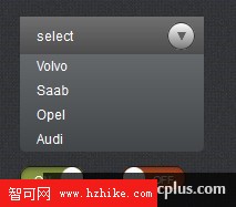
做法是把原生 select 隱藏,另用 ul 畫出面板,選完再把值同步回 select,表單送出時資料才不會遺失。
.select {
  width: 166px; height: 35px; position: relative;
  line-height: 35px; text-indent: 15px; color: #fff;
  background: linear-gradient(top, rgb(111,111,111), rgb(77,77,77));
  cursor: pointer; user-select: none;
}
.select:after {           /* 用 border 畫出向下的小三角 */
  content: ""; position: absolute;
  right: 16px; top: 14px;
  width: 0; height: 0;
  border-style: solid; border-width: 8px 4px;
  border-color: rgb(95,95,95) transparent transparent transparent;
}
.select select { display: none; }
.option:hover {
  background: linear-gradient(top, rgb(161,200,74), rgb(115,153,34));
}
開關則是核取方塊的延伸:label 用兩層不同尺寸的背景漸變重疊,勾選時改動 background-size,再讓:before 的圓形滑塊靠 left 位移,transition 一掛就是滑動動畫。
.switcher label {
  width: 56px; height: 20px; border-radius: 10px;
  display: inline-block; position: relative;
  transition: background-size 500ms ease;
}
.switcher label:before {
  content: ""; position: absolute;
  left: 0; top: 0; height: 20px; width: 20px;
  border-radius: 10px;
  background: linear-gradient(top, rgb(255,255,255), rgb(236,236,236));
  transition: left 300ms ease;
}
.switcher input:checked + label:before { left: 36px; }
.switcher input:checked + label:after  { content: attr(data-on); }
.switcher input { display: none; }
五、登入表單
用 border 拼出上方深色、下方透明的雙色描邊,再用:before 的 border 三角形做出指向指標,一個帶箭頭的浮動登入框就完成了。
.login-form {
  padding: 20px 16px; border: 1px solid;
  border-color: rgb(7,8,8) rgb(13,14,16);
  border-bottom: none;
  border-radius: 5px; background: rgb(20,21,23);
  position: relative;
}
.login-form:before {          /* 向上的箭頭 */
  content: ""; position: absolute;
  bottom: 100%; left: 63px;
  width: 0; height: 0; border: 9px solid;
  border-color: transparent rgb(20,21,23) rgb(20,21,23) transparent;
}
.login-form .sign-in {
  width: 96px; height: 30px; border-radius: 15px;
  background: linear-gradient(top, rgb(159,198,73), rgb(112,150,31));
  cursor: pointer;
}
六、按鈕與 Tooltip
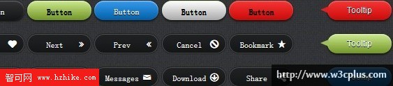
用 class 屬性選擇器批次套色,是這一段最省事的地方:基礎樣式寫一次,色版只改 background 與 box-shadow。
.btn {
  height: 28px; width: 92px; border: none;
  box-shadow: inset 0 1px 1px rgb(105,108,110),
              0 0 0 1px rgba(0,0,0,0.2),
              0 2px 2px 0 rgb(20,20,20);
  border-radius: 15px; color: #fff;
  background: linear-gradient(top, rgb(51,51,53), rgb(19,20,21));
  text-transform: capitalize;
}
.btn.blue  { background: linear-gradient(top, rgb(54,154,238), rgb(1,96,168)); }
.btn.red   { background: linear-gradient(top, rgb(248,53,53), rgb(204,10,10)); }
button[class*="btn-icon-"]:after {     /* 用屬性選擇器統一掛圖示 */
  font-family: "icomoon";
  content: attr(data-icon);
  position: absolute; right: 10px; top: 0;
  line-height: 28px;
}
.tooltip:before {                      /* 左側尖角 */
  content: ""; position: absolute;
  left: -22px; top: 8px;
  width: 0; height: 0;
  border-style: solid; border-width: 5px 12px;
  border-color: transparent;
}
.tooltip.blue:before { border-right-color: rgb(28,126,204); }
七、對話框
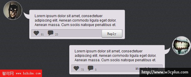
頭像用圓形裁切絕對定位在內容框外側,對話內容的尖角則靠:before 與:after 兩層不同圓角半徑的背景色塊疊出弧度。
.comment-block .content {
  padding: 4px 6px; width: 323px;
  border: 1px solid rgba(0,0,0,0.2); border-left: none;
  background: rgb(227,222,229);
  border-radius: 4px; position: relative;
}
.comment-block .main-block .content:before {
  left: -20px; border-bottom-left-radius: 20px 30px;
}
.comment-block .main-block .content:after {
  left: -22px; border-bottom-left-radius: 22px 16px;
}
.comment-block .avatar {
  position: absolute; top: -30px;
  border-radius: 50%;
  width: 62px; height: 62px;
  border: 1px solid rgb(151,148,153);
}
八、圖片輪播
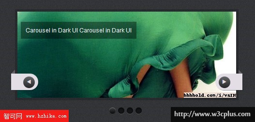
指示點、左右控制鈕、說明文字全部用偽元素與 border 三角形拼出,切換動畫則由 transition 負責。
#myCarousel {
  position: relative; width: 452px; height: 178px;
  border: 5px solid rgba(0,0,0,0.2);
}
.carousel-inner { position: relative; overflow: hidden; }
.carousel-inner .item {
  display: none; position: relative;
  transition: .6s ease-in-out left;
}
.carousel-inner .active { display: block; left: 0; }
.carousel-inner .next        { display: block; left: 100%; }
.carousel-inner .active.left { left: -100%; }
.carousel-indicators li {
  width: 13px; height: 13px; border-radius: 7px;
  box-shadow: inset 0 1px 3px rgb(0,0,0), 0 1px 0 rgb(90,90,90);
  float: left; cursor: pointer;
}
.carousel-control:after {
  content: ""; position: absolute;
  width: 24px; height: 24px; border-radius: 50%;
  font-family: "icomoon"; text-align: center;
  background: linear-gradient(top, rgb(99,100,102), rgb(37,38,40));
}
JS 這邊用一個 isSliding 旗標上鎖,動畫期間忽略點擊,避免連續快點造成狀態錯亂。前進與後退各自有一組 setTimeout 接力,時間長度要與 CSS transition 的 0.6 秒對齊。
九、HTML5 影片播放器
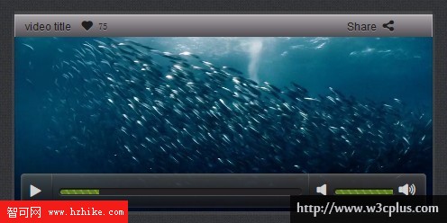
控制列 consists of 播放鈕、進度條與音量條,三者都是「底色槽 + 前景進度」的兩層結構,前景寬度由 JS 依 currentTime 與 volume 的比例設定。
#myVideo .control {
  position: absolute; left: 7px; bottom: 8px;
  width: 450px; height: 38px; border-radius: 4px;
  box-shadow: inset 0 1px 3px rgb(110,108,100);
  background: linear-gradient(top, rgba(100,97,90,0.6), rgba(23,22,19,0.6));
}
#myVideo .base-bar {
  height: 8px; margin: 16px auto; padding: 1px 2px;
  border-radius: 4px; background: rgb(36,34,37);
  cursor: pointer;
}
#myVideo .progress-bar {
  height: 100%; width: 0;
  border-radius: 3px 0 0 3px;
  background: linear-gradient(45deg,
    rgb(122,161,41) 25%, rgb(95,126,32) 25%,
    rgb(95,126,32) 75%, rgb(122,161,41) 75%)
    repeat-x left top / 8px 100%;
}
(function () {
  var video = $("#myVideo video");
  var progressBar = $(".progress-bar");
  var btnPlay = $("#myVideo .btn-play");

  EventUtil.addHandler(video, "timeupdate", function () {
    var percentage = this.currentTime / this.duration;
    progressBar.style.width = percentage * 100 + "%";
  });
  EventUtil.addHandler(progressBar.parentNode, "click", function (e) {
    var left = e.clientX - getPosition(this).left;
    var percentage = Math.min(Math.max(left / this.offsetWidth, 0), 1);
    video.currentTime = video.duration * percentage;
  });
  EventUtil.addHandler(btnPlay, "click", function () {
    video.paused ? video.play() : video.pause();
  });
  EventUtil.addHandler(video, "play",  function () { btnPlay.innerHTML = "w"; });
  EventUtil.addHandler(video, "pause", function () { btnPlay.innerHTML = "t"; });
})();
點擊進度條的換算要注意兩個細節:先扣掉容器內距的偏移,再把結果夾在 0 到 1 之間,否則點到邊緣會得到超出範圍的值。
寫到這裡的一些心得
這套元件能成立,關鍵有三點:一是把重複的視覺細節收攏成 class 屬性選擇器,改配色不必動結構;二是盡量用漸變、陰影、偽元素取代圖片,整頁幾乎沒有切圖;三是 JS 只負責狀態與數值,外觀全交給 CSS,兩者界線清楚,維護成本自然低。
需要留意的是,範例中大量使用了 *-linear-gradient 這類帶前綴的宣告,以及 0 0 0 Npx 這種只有擴散半徑的陰影寫法。在今日的瀏覽器環境下,多數前綴都可以省略,但正式專案仍建議搭配自動前綴工具處理。
特別聲明:原始設計稿並非本站作品,而是國外作者提供。文中程式碼僅供前端學習研究之用,若逕行套用於商業專案產生侵權責任,需自行承擔。
- 上一篇文章: 純 CSS 做斜角:border 交界原理與四向實作
- 下一篇文章: Cikonss:不靠圖片也不靠字型,純 CSS 畫出四十多個圖示