CSS Sprites 的做法是把多張小圖合併成一張大圖,再用 background-position 精準定位,只顯示需要的區塊。它的好處很明確:減少 HTTP 請求次數、加快頁面顯示,同時徹底解決圖片切換時的閃動問題。
哪些場景最適合
- 清單式導航的滑鼠翻轉效果
- 大量小圖標集中使用的情況(例如各類編輯器工具列)
- 任何需要頻繁切換背景、又不希望發出多次請求的元件
原理說穿了很簡單:固定容器尺寸,再用 background-repeat 與 background-position 把整張大圖「挪」到正確的位置上。
以滑鼠翻轉為例
準備好兩張素材:一張是各按鈕的靜態圖,一張是對應的翻轉圖。
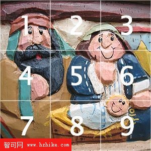

HTML 結構
<ul>
<li><a id="item1" href="#" title="Item 1"> </a></li>
<li><a id="item2" href="#" title="Item 2"> </a></li>
<li><a id="item3" href="#" title="Item 3"> </a></li>
<li><a id="item4" href="#" title="Item 4"> </a></li>
<li><a id="item5" href="#" title="Item 5"> </a></li>
<li><a id="item6" href="#" title="Item 6"> </a></li>
<li><a id="item7" href="#" title="Item 7"> </a></li>
<li><a id="item8" href="#" title="Item 8"> </a></li>
<li><a id="item9" href="#" title="Item 9"> </a></li>
</ul>
CSS 樣式
ul { width:300px; height:300px; margin:0px auto; padding:0px; overflow:hidden; background:transparent url(02.jpg) no-repeat;}
li { list-style-type:none; width:100px; height:100px; float:left;}
li a { display:block; width:100px; height:100px; text-decoration:none; background:transparent url(01.jpg) no-repeat 500px 500px; }
a#item1:hover { background-position: 0 0; }
a#item2:hover { background-position: -100px 0; }
a#item3:hover { background-position: -200px 0; }
a#item4:hover { background-position: 0 -100px; }
a#item5:hover { background-position: -100px -100px; }
a#item6:hover { background-position: -200px -100px; }
a#item7:hover { background-position: 0 -200px; }
a#item8:hover { background-position: -100px -200px; }
a#item9:hover { background-position: -200px -200px; }
把背景初始位置設成 500px 500px,是為了讓圖片在滑過之前完全離開可視區域,避免關鍵字圖閃一下。滑過時再用負值把對應格子拉進來。
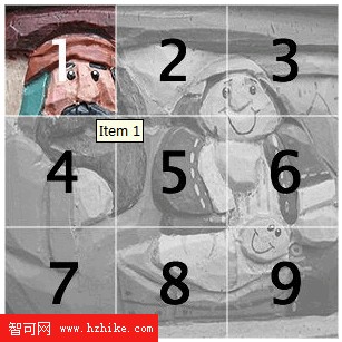
取捨
除了翻轉效果,這套思路也能拿來模擬圖片熱區、製作地圖提示等等。
要注意兩點:一是背景定位必須算得非常精準,圖上差一兩像素就會露出隔壁的圖;二是它雖然省下了多次請求,卻換成了一次較大的單一請求。是多是少,得看實際站點狀況自行權衡。
- 上一篇文章: CSS 進階技法:滑動門技術入門
- 下一篇文章: CSS 進階技法:五種圓角矩形實作方案