background 是 CSS 的核心屬性之一,值得你完整理解。本文從 CSS2 的五個背景屬性講起,一路談到即將到來的 CSS3 新增能力與既有屬性的調整。
CSS2 中的背景屬性
CSS2 共有五個與背景相關的屬性:
- background-color:填滿背景的顏色
- background-image:作為背景的圖片
- background-position:決定背景圖片的位置
- background-repeat:決定背景圖片是否重複鋪排
- background-attachment:決定背景圖片是否隨頁面滾動
這五項都可以寫進 background 這個簡寫屬性。要注意的是,background 負責的是元素內容區的背景,包含 padding 與 border,但不含 margin。Firefox、Safari、Opera 與 IE8 都是這樣處理的;然而在 IE7 與 IE6 中,背景並不包含 border,差異如下圖:
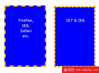
在 IE7 與 IE6 中,背景沒有涵蓋 border。
background-color
用來描述填滿背景的顏色,寫法有很多種,以下全部等效:
background-color: blue;
background-color: rgb(0, 0, 255);
background-color: #0000ff;
也可以設為 transparent,讓底層元素透出來。
background-image
讓你可以用自己的圖片當背景,它和 background-color 關係密切:一旦圖片不足以鋪滿整個元素,空出的部分就會露出 background-color 的顏色。使用極簡單,但務必注意圖片與 CSS 檔的相對路徑關係:
background-image: url(image.jpg);
background-image: url(images/image.jpg);
background-repeat
預設情況下,圖片會水平和垂直重複直到鋪滿整個元素。若只想單一方向重複:
background-repeat: repeat;    /* 預設值,全方向鋪展 */
background-repeat: no-repeat; /* 不重複,只出現一張 */
background-repeat: repeat-x;  /* 水平鋪展 */
background-repeat: repeat-y;  /* 垂直鋪展 */
background-repeat: inherit;   /* 沿用父元素的設定 */
background-position
掌握這個屬性的關鍵是:它是以圖片的左上角作為定位基準。以下範例都搭配 background-repeat: no-repeat:
/* 範例一:預設值 */
background-position: 0 0;      /* 元素的左上角 */
/* 範例二:往右移 */
background-position: 75px 0;
/* 範例三:往左移 */
background-position: -75px 0;
/* 範例四:往下移 */
background-position: 0 100px;
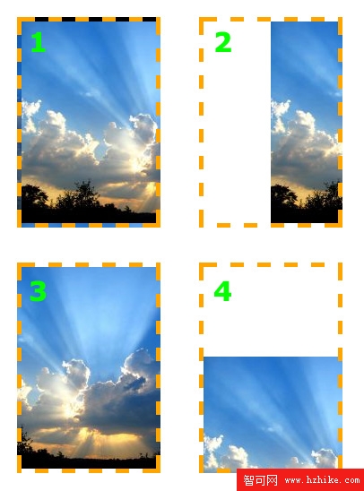
背景圖片的位置可以任意設定。
除了像素,background-position 也能用關鍵字與百分比。水平方向的關鍵字有 left、center、right;垂直方向有 top、center、bottom。寫法例如:
background-position: top right;
background-position: 100% 50%;
background-position: 100% 50%;
效果如下: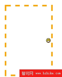
笑臉圖片被設到元素右側的垂直中央。
background-attachment
這個屬性定義使用者滾動頁面時背景圖片的行為,有三個可能值:scroll、fixed 與 inherit(沿用父元素設定)。
理解它的第一步,是先想清楚滾動時頁面實際發生了什麼。設為 fixed 時,畫面往下捲動的過程中內容在動,背景卻不動,視覺上就像內容從背景前面滑過;設為 scroll 時,背景會跟著一起滾動。
scroll 的例子:
background-image: url(test-image.jpg);
background-position: 0 0;
background-repeat: no-repeat;
background-attachment: scroll;
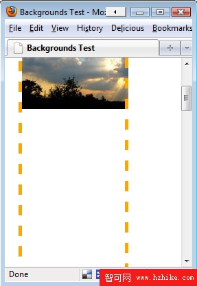
向下滾動時,背景圖片隨之向上移動直至消失。
fixed 的例子:
background-image: url(test-image.jpg);
background-position: 0 100%;
background-repeat: no-repeat;
background-attachment: fixed;
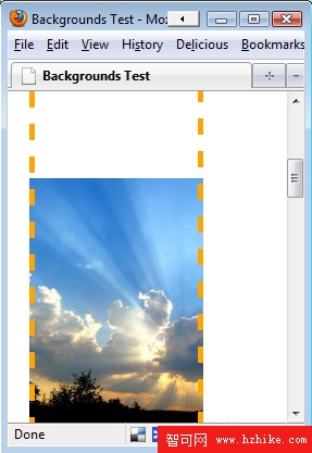
向下滾動頁面,背景圖片依然可見。
值得留意的是,背景圖片只能在自己的元素範圍內移動:
background-image: url(test-image.jpg);
background-position: 0 100%;
background-repeat: no-repeat;
background-attachment: fixed;
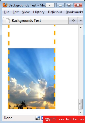
部分圖片消失了,因為它超出了元素邊界。
用簡寫屬性一次寫完
這些設定都可以合併到一個屬性裡,格式如下:
background: <color> <image> <position> <attachment> <repeat>
例如以下這組設定:
background-color: transparent;
background-image: url(image.jpg);
background-position: 50% 0;
background-attachment: scroll;
background-repeat: repeat-y;
可以寫成:
background: transparent url(image.jpg) 50% 0 scroll repeat-y;
而且你不需要每項都寫,沒寫的會採用預設值。因此上面這行還能再精簡為:
background: url(image.jpg) 50% 0 repeat-y;
背景的「非常規」應用
除了美化,背景屬性其實還有不少實用的旁支玩法。
Faux Columns(假欄位):用 float 做多欄時,要讓兩欄等長並不容易,元素高度不一,背景就會露出破綻。Faux Columns 是個經典解法,最早發表於 A List Apart:在父元素上放一張整體的背景圖,圖中縱欄的位置剛好對上實際分欄的位置。
文字替換(Text Replacement):網路上的字體選擇有限,我們常把文字做成圖片,但純圖片對搜尋引擎不友善。常見做法是「用背景顯示圖片、把真實文字移出畫面」,兼顧 SEO、螢幕閱讀器與視覺效果。例如:
<h3 class="blogroll">Blogroll</h3>
若文字圖片是 200px 寬、75px 高:
h3.blogroll {
  width: 200px;
  height: 75px;                             /* 剛好顯示整張圖片 */
  background: url(blogroll-text.jpg) 0 0 no-repeat;
  text-indent: -9999px;                     /* 把文字往左推出去隱藏 */
}
更好看的項目符號:無序列表的預設樣式未必好看,可以用背景圖片替換:
ul { list-style: none; }        /* 移除預設樣式 */
ul li {
  padding-left: 40px;            /* 內縮,為圖示留出空間 */
  background: url(bulletpoint.jpg) 0 0 no-repeat;
}
CSS3 中的背景新特性
CSS3 對背景屬性做了不少調整,最顯眼的就是多背景圖片支援,此外還有四個新屬性與若干既有屬性的改動。
多背景圖片
CSS3 允許一個元素使用多於一張的背景圖片,寫法與 CSS2 相同,用逗號分隔即可。第一個宣告的圖片會顯示在最上層:
background-image: url(top-image.jpg), url(middle-image.jpg), url(bottom-image.jpg);
新屬性一:background-clip
這個屬性正好回應了開頭提到的「border 算不算在背景內」的問題,用來控制背景的繪製範圍:
- background-clip: border-box;——背景在 border 內顯示,與目前多數瀏覽器的行為一致。
- background-clip: padding-box;——背景只畫到 padding 為止,不含 border,等同 IE6 的舊行為。
- background-clip: content-box;——背景只顯示在內容區,不含 padding 與 border。
- background-clip: no-clip;——預設值,效果同 border-box。
新屬性二:background-origin
需與 background-position 搭配使用,用來改變「位置的計算起點」:
- background-origin: border-box;——從 border 邊緣開始計算。
- background-origin: padding-box;——從 padding 邊緣開始計算。
- background-origin: content-box;——從內容區開始計算。
新屬性三:background-size
用來重新定義背景圖片的尺寸:
- background-size: contain;——縮放圖片使其完整塞進元素。
- background-size: cover;——放大圖片使其鋪滿元素(可能裁切)。
- background-size: 100px 100px;——指定絕對尺寸。
- background-size: 50% 100%;——以百分比指定尺寸。
新屬性四:background-break
在 CSS3 中,一個元素可能被拆成多個部分(例如 inline 元素 span 橫跨多行)。這個屬性控制背景圖片如何在多個部分之間呈現:
- background-break: continuous;——預設值。
- background-break: bounding-box;——把各部分之間的空隙也納入計算。
- background-break: each-box;——每個部分各自獨立處理。
既有屬性的調整
background-color:CSS3 支援前景色與底色並列,例如 background-color: green / blue; 代表預設綠色,若無法顯示則退回藍色。
background-repeat:針對圖片超出邊界而被裁掉的問題,新增兩個值:
- space——以調整間距的方式鋪排整數張圖片。
- round——自動縮放圖片大小,使其剛好填滿元素。
background-attachment:新增 local 值,與可滾動元素(例如設了 overflow: scroll 的元素)相關。原本 scroll 模式下背景不隨內容滾動,改用 local 後,圖片會跟著內容一起滾。
原文標題:〈前端設計師必知的 background 屬性(有 CSS3 內容)〉,連結:https://www.cnblogs.com/biko-zc/archive/2009/09/09/1563545.html
- 上一篇文章: 蘋果高管出任 HTML 標準化組織副主席
- 下一篇文章: IE6 不支援的四個 CSS 屬性及其替代思路