三角形是介面裡最不起眼卻最常用的小零件:下拉選單的箭頭、麵包屑的分隔標記、列表的層級提示、標籤頁下方的指向尖角,幾乎都靠它。它體積雖小,卻直接影響使用者對「我現在在哪、下一步去哪」的判斷。
真正讓人糾結的往往不是怎麼畫,而是「該用哪種方式畫」。圖片簡單卻增加請求,純 CSS 優雅卻要處理相容性。以下把實戰中常見的幾條路整理出來,並說清楚各自的取捨。
方案一:交給圖片
1. 一個方向一張圖
最直覺的做法是照設計稿切圖,需要多高、什麼顏色,就輸出對應的檔案。

HTML 與 CSS 都極其簡單,一條 background 就足夠。它的優勢在於還原度:漸層、紋理、特殊肌理、半透明陰影,圖片都能完整呈現;也可以透過指定底色,讓三角形邊緣與容器背景無縫接軌。
缺點同樣明顯——四個方向就是四張圖、四個 HTTP 請求,樣式表裡也得維護四段宣告。方向一多,CSS 立刻膨脹。
2. 一張菱形圖,四個方向共用
想壓掉請求數,可以把上下左右四個三角形拼進同一張圖(精靈圖),再用 background-position 挑出需要的那一角。一張圖服務四種狀態,請求量直接減到四分之一。
<div style="width:100px;height:100px;position:relative;margin:34px;background:#6699FF">
  <em style="background:url(/School/UploadFiles_7810/201106/20110626183043223.gif) no-repeat 0 0;width:67px;height:34px;display:block;position:absolute;top:-34px;left:15px"></em>
  <em style="background:url(/School/UploadFiles_7810/201106/20110626183043223.gif) no-repeat -35px 0;width:34px;height:67px;display:block;position:absolute;right:-34px;top:15px;"></em>
  <em style="background:url(/School/UploadFiles_7810/201106/20110626183043223.gif) no-repeat 0 -35px;width:67px;height:34px;display:block;position:absolute;bottom:-34px;left:15px;"></em>
  <em style="background:url(/School/UploadFiles_7810/201106/20110626183043223.gif) no-repeat 0 0;width:34px;height:67px;display:block;position:absolute;left:-34px;top:15px;"></em>
</div>
關鍵在於每個 em 都是一個絕對定位的「取景框」:尺寸固定為三角形的外接矩形,再用負座標把菱形圖推到正確位置。
3. 改用「負形」,讓 hover 換色成為可能
精靈圖的罩門是顏色被寫死在圖檔裡。如果需要滑鼠移入時由深變淺,就得換個思路:把三角形做成負形——用背景色蓋掉多餘的部分,可見的顏色改由 CSS 的 background-color 提供。
HTML:
<div style="width:100px;height:100px;position:relative;margin:34px;background:#6699FF">
  <a class="n_a_1"></a>
  <a class="n_a_2"></a>
  <a class="n_a_3"></a>
  <a class="n_a_4"></a>
</div>
CSS:
.n_a_1,.n_a_2,.n_a_3,.n_a_4{
  background-image:url(/School/UploadFiles_7810/201106/20110626183045206.gif);
  background-repeat:no-repeat;position:absolute;display:block;
}
a.n_a_1{background-color:#0033CC;background-position:0 0;width:67px;height:34px;top:-34px;left:15px}
a.n_a_1:hover{background-color:#db0085}
a.n_a_2{background-color:#0066CC;background-position:-33px 0;width:34px;height:67px;right:-34px;top:15px;}
a.n_a_2:hover{background-color:#db0085}
a.n_a_3{background-color:#00CCCC;background-position:0 -33px;width:67px;height:34px;bottom:-34px;left:15px;}
a.n_a_3:hover{background-color:#db0085}
a.n_a_4{background-color:#00FFCC;background-position:0 0;width:34px;height:67px;left:-34px;top:15px;}
a.n_a_4:hover{background-color:#db0085}如此一來,:hover 只要替換背景色就能變色,四個方向、任意配色都改得動。
但負形法有前提:構成負形的那塊顏色必須與頁面底色一致。一旦把這個元件放進有底色的區塊,負形就會露餡。此外,圖片尺寸寫死意味著只能做固定大小的等腰三角形,想改比例就得重新出圖——除非用上 background-size,而這個屬性當時只在 Opera、Firefox、Safari、Chrome 與 IE9 陸續支援。
方案二:不用圖片,讓瀏覽器自己畫
1. border 法:最經典的純 CSS 三角形
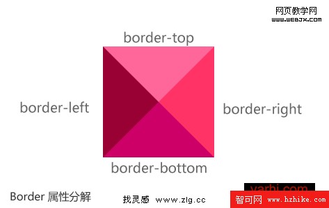
border 由寬度、樣式、顏色三要素組成。當元素本身的 width 與 height 都設為 0,四條 border 便會退化為四個直角三角形並拼成一個矩形——只保留一條可見,三角形就浮現了。
<!DOCTYPE Html>
<Html>
<head>
  <meta http-equiv="Content-Type" content="text/Html; charset=utf-8" />
  <style type="text/CSS">
    #boder_arrow{
      border-width:20px;
      border-color:#ff6699 #ff3366 #cc0066 #990033;
      border-style:solid;
      width:0;height:0;line-height:0;
    }
  </style>
</head>
<body>
  <div id="boder_arrow"></div>
</body>
</Html>
改變四邊的顏色組合,就能決定三角形朝向;讓四邊的 border-width 不相等,還能拉出不等腰的三角形:
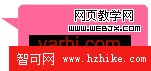
<div style="border-color: transparent #FF6699 transparent transparent;
  border-style: solid;border-width: 0 30px 20px 0;
  height: 0;line-height: 0;width: 0;"></div>
把不需要的三邊設為 transparent,是這招的靈魂。它零請求、零資源、可任意縮放,至今仍是最主流的寫法。
2. transform 旋轉法
需要「方形翻轉 45 度」的造型時(對話框尖角、卡片側邊的小箭頭),可以交給 CSS3 的 transform: rotate(45deg)。
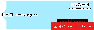
把設計稿拆解一下,其實就是四個小正方形各自旋轉後,有一半探出容器:
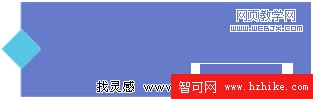
.box{position:relative;text-align:center;margin:50px;width:150px;height:150px;background:#ff6600}
.a,.b,.c,.d{
  z-index:10;position:absolute;width:50px;height:50px;background:#ff9999;
  -webkit-transform:rotate(45deg);
  -moz-transform:rotate(45deg);
  transform:rotate(45deg);
}
.a{top:21px;left:-25px}
.b{top:-25px;right:21px}
.c{bottom:21px;right:-25px}
.d{bottom:-25px;left:21px}
接著只要把旋轉後正方形的背景色設成與容器相同,兩者便融為一體,視覺上只剩一個尖角:
.box_same{position:relative;text-align:center;margin:50px;width:150px;height:150px;background:#ff9999}
.a_same,.b_same,.c_same,.d_same{
  z-index:10;position:absolute;width:50px;height:50px;background:#ff9999;
  -webkit-transform:rotate(45deg);
  -moz-transform:rotate(45deg);
  transform:rotate(45deg);
}
.a_same{top:21px;left:-25px}
.b_same{top:-25px;right:21px}
.c_same{bottom:21px;right:-25px}
.d_same{bottom:-25px;left:21px}
這招要求瀏覽器支援 transform,記得補上 -webkit- 與 -moz- 前綴。
3. 用 ◆ 字符硬湊
不想依賴 CSS3,還有更樸素也更耐用的做法:直接放一個 ◆ 字符,把文字顏色設成與容器一致,再用定位塞到邊緣。原理與旋轉法相同,但完全不需要 transform,相容性最好。
.wrap_char{position:relative;text-align:center;margin:50px;width:150px;height:150px;background:#ccc}
.a_char,.b_char,.c_char,.d_char{
  z-index:10;position:absolute;text-align:center;line-height:50px;
  color:#ccc;font-size:50px;
}
.a_char{bottom:-25px;left:-4px}
.b_char{top:-4px;left:-25px}
.c_char{top:-25px;right:-4px}
.d_char{bottom:-5px;right:-25px}
完整頁面:
<!DOCTYPE Html>
<Html>
<head>
  <meta charset="UTF-8" />
  <title>符號三角</title>
  <style>
    .wrap_char{width:150px;height:150px;text-align:center;margin:100px;background:#ccc;position:relative;}
    .a_char,.b_char,.c_char,.d_char{
      font-size:50px;text-align:center;color:#ccc;
      position:absolute;z-index:10;line-height:50px;
    }
    .a_char{left:-4px;bottom:-25px;}
    .b_char{left:-25px;top:-4px;}
    .c_char{top:-25px;right:-4px;}
    .d_char{right:-25px;bottom:-5px;}
  </style>
</head>
<body>
  <div class="wrap_char">
    <span class="a_char">◆</span>
    <span class="b_char">◆</span>
    <span class="c_char">◆</span>
    <span class="d_char">◆</span>
  </div>
</body>
</Html>
要注意的是,同一個字符在不同作業系統下的實際字型範圍略有差異,對齊往往需要微調幾個像素。
案例實戰
案例一:線框(空心)三角形

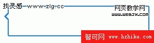
空心箭頭常被丟回去請設計師切圖,其實只要把兩個 border 三角形上下疊放,外層填底色、內層填背景色,就能蓋出線條:
.pos_rel{position:relative;margin:20px;height:10px;}
.pos_rel .icon1{
  display:block;border-width:9px 9px 9px 0;
  border-color:transparent #1c7ecf transparent transparent;
  border-style:solid;position:absolute;left:0;top:0;width:0;height:0;
}
.pos_rel .icon2{
  display:block;border-width:9px 9px 9px 0;
  border-color:transparent #fff transparent transparent;
  border-style:solid;position:absolute;left:4px;top:-9px;width:0;height:0;
}
<div class="pos_rel">
<span class="icon1"><span class="icon2"></span></span>
</div>用它做視窗的返回提示,成品就細緻多了:
案例二:標示當前導航狀態

用 border 做一個朝下的深色小三角,掛在每個項目內部的 span 上,並讓它只在選中或 hover 時出現:
#nav_state{height:20px;}
#nav_state a{
  width:80px;display:block;text-align:center;padding:2px;line-height:18px;
  float:left;background-color:#ccc;margin-right:5px;color:#333;
  position:relative;text-decoration:none;font-size:12px;
}
#nav_state a span{display:none;}
#nav_state a.current,#nav_state a:hover{background-color:#000;color:#fff;}
#nav_state a.current span,#nav_state a:hover span{
  display:block;width:0;height:0;border-width:8px;border-style:solid;
  border-color:#000 transparent transparent;
  position:absolute;top:20px;left:32px;overflow:hidden;
}
<div id="nav_state">
<a href="#" class="current">標簽一<span></span></a>
<a href="#">標簽二<span></span></a>
<a href="#">標簽三<span></span></a>
<a href="#">標簽四<span></span></a>
</div>這裡刻意讓 span 預設隱藏,避免四個箭頭同時冒出來。
案例三:寬度自適應、箭頭朝上

#menu_liquid{height:30px;margin:20px;list-style:none;font-size:12px;}
#menu_liquid li{height:30px;line-height:30px;float:left;white-space:nowrap;}
#menu_liquid li a{
  display:block;float:left;height:30px;position:relative;padding:0 12px;
  background:#777;color:#fff;text-decoration:none;border-right:1px solid #ccc;
}
#menu_liquid li a span{display:none;}
#menu_liquid li a.current,#menu_liquid li a:hover{background:#000;color:#0099FF;}
#menu_liquid li a.current span,#menu_liquid li a:hover span{
  display:block;width:0;height:0;border-style:solid;
  border-color:transparent transparent #f0f0f0 transparent;
  border-width:0 8px 8px;
  position:absolute;bottom:0;left:50%;margin-left:-4px;overflow:hidden;z-index:0;
}
#menu_liquid li a em{display:block;text-align:center;font-style:normal;cursor:pointer;}
把箭頭改成 border-bottom 實色、其餘三邊透明,再用 left:50% 搭配負的 margin-left 讓它永遠落在標籤正中,這樣不論文字多長都不會跑位。
特別提醒:箭頭是絕對定位、脫離文件流的。尺寸開太大很容易壓到上方文字,記得預留足夠的 padding。
以上只是一些常見思路,很難斷言哪一種絕對最好。三角形只有幾十個像素,卻牽涉請求數、可維護性、換色需求與相容性——實際專案裡,通常還是得具體問題具體分析。歡迎提出不同的看法。
- 上一篇文章: 用 CSS3 的 :checked 偽類做出可折疊樹狀選單
- 下一篇文章: Bind9 實作:把二級子域名的解析權下放到三級域名