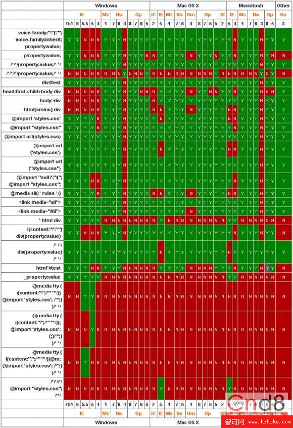
CSS 對瀏覽器的相容性有很高的實用價值。最典型的狀況是 IE 與 Firefox 對同一份樣式的解析存在明顯差異,以下把常見衝突與解法整理出來。
常見相容問題
- DOCTYPE 會直接影響 CSS 的處理方式,尤其是盒模型的計算。
- Firefox 中,div 設
margin-left、margin-right為auto即可置中;IE 不行。 - Firefox 中若 body 設了
text-align,div 還需要margin: auto才能置中。 - Firefox 設
padding後 div 的 height 與 width 會變大,IE 不會,因此需要用!important另外多設一組尺寸。 - Firefox 支援
!important,IE 會忽略,因此可用它為 Firefox 專門指定樣式。 - div 垂直置中可用
vertical-align: middle搭配把line-height設成與容器等高,缺點是內容不能換行。 cursor: pointer在 IE 與 Firefox 都能顯示手指游標,hand則只有 IE 認得。- Firefox 中若替連結加邊框與背景色,需設
display: block,同時設float: left才能避免換行。
盒模型與 margin 的經典 hack
Mozilla Firefox 與 IE 的盒模型解釋不一致,導致 2px 差距,解法是:
div{ margin: 30px !important; margin: 28px; }
這兩個 margin 的順序一定不能寫反。!important 這個屬性 IE 無法識別、其他瀏覽器可以識別,所以在 IE 眼中這段其實等價於 div{margin:30px; margin:28px},重複定義取最後一個,於是 IE 得到 28px、其他瀏覽器得到 30px。反過來說,只寫 margin: XXpx !important; 是沒有效果的。
IE5 與 IE6 對盒模型的解釋也不一致:
div{ width: 300px; margin: 0 10px 0 10px; }
IE5 會把寬度算成 300 − 10 − 10 = 280px,IE6 與其他瀏覽器則是 300 + 10 + 10 = 320px。此時可改寫為:
div{ width: 300px !important; width /**/: 340px; margin: 0 10px 0 10px }
其中 /**/ 這個空註解是個歷史產物:IE5 與 Firefox 都支持,IE6 則不支援,正好用來把值分送給不同陣營。
另外,ul 在 Mozilla 中預設有 padding,IE 中只有 margin 有值,先寫:
ul{ margin: 0; padding: 0; }
就能解決大部分問題。
注意事項
1. float 的 div 一定要閉合
例如 floatA、floatB 都已設 float: left,後面接一個不希望繼續平移、而想換行的 NOTfloatC:
<div id="floatA"></div>
<div id="floatB"></div>
<div id="NOTfloatC"></div>
這段在 IE 中毫無問題,問題出在 Firefox——NOTfloatC 並非 float 元素,必須先把浮動區塊閉合。做法是在 floatB 與 NOTfloatC 之間插入:
<div class="clear"></div>
這個 div 的位置一定要放在最恰當的地方,而且必須與兩個 float 元素同層,中間不能存在嵌套關係,否則會產生異常。樣式定義為:
.clear{ clear: both; }
此外,為了讓高度能自動適應,要在 wrapper 裡加上 overflow: hidden。當容器包含 float 子元素時,高度自動適應在 IE 下無效,這時要觸發 IE 的 hasLayout,用 zoom: 1 就能做到:
.colwrapper{
   overflow: hidden;
   zoom: 1;
   margin: 5px auto;
}
2. margin 加倍的問題
設為 float 的 div,在 IE6 下 margin 會加倍,這是一個著名 bug。解法是在該 div 上補 display: inline:
<div id="imfloat"></div>
#imfloat{
   float: left;
   margin: 5px;      /* IE 下理解為 10px */
   display: inline;  /* IE 下又理解回 5px */
}
3. 容器包含關係
很多時候,尤其是容器內有平行布局(例如兩三個 float 的 div)時,寬度很容易出問題。在 IE 中,外層寬度會被內層更寬的 div 撐破,因此切圖時要用 Photoshop 或 Fireworks 量到像素級精度,別靠目測。
4. 高度要不要寫死
如果是動態添加內容,高度最好不要定義,讓瀏覽器自動伸縮;若是靜態內容,高度最好事先定好,避免版面塌陷。
5. 最後的手段:!important
實在無法解決的細節問題,可以用這招。Firefox 會優先解析 !important,IE 則忽略:
.tabd1{
   background: url(/res/images/up/tab1.gif) no-repeat 0px 0px !important; /* for Firefox */
   background: url(/res/images/up/tab1.gif) no-repeat 1px 0px;         /* for IE */
}
要特別注意,帶 !important 的那句一定要寫在另一句之上,順序顛倒就完全失效了。
以上 hack 都是特定歷史階段的產物。今天的專案請優先依賴標準行為、feature detection 與漸進增強,把 hack 當作最後手段,並用註解標明它為何存在。
- 上一篇文章: 用 htc 行為為 input 加上動態外觀與狀態效果
- 下一篇文章: 純 CSS 打造立體感壓克力按鈕選單