純 CSS 三角箭頭實作:從原理到兼容 IE6 的完整做法
編輯:布局實例
為什麼不用圖片
做下拉選單時,箭頭通常需要兩張圖:一般狀態一張、hover 反向一張。為這麼小的細節載入兩張圖,著實浪費資源。純 CSS 就能解決,關鍵只用一個屬性:border-width。
原理拆解
先給一個元素加上四邊不同粗細的邊框,看起來像個普通的方框。接著把四條邊換成不同顏色,你會發現四個角出現了斜切。最後把內容清空(width: 0; height: 0; font-size: 0),四個三角形就乾淨地出現了。
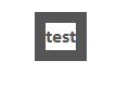
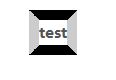

想要哪個方向的三角形,就把該方向的 border-color 設成你要的顏色,其餘三邊設為透明即可。

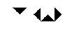
核心樣式只有幾行:
float: left;
border-style: solid;
border-width: 10px;
border-color: #000 #ccc #ccc #ccc;
height: 0;
width: 0;
font-size: 0;
實戰:向下箭頭(相容 IE6)
.demo { position: relative; }

.bottom-arrow {
  position: absolute;
  top: 10px;
  left: 0;
  border-style: solid;
  border-width: 100px;
  /* 上邊框設為想要的顏色 */
  border-color: #000000 transparent transparent transparent;
  height: 0;
  width: 0;
  font-size: 0;
  /* 以下兩行僅為相容 IE6 的透明邊框 */
  _border-color: #000000 tomato tomato tomato;
  _filter: chroma(color=tomato);
}
如果你不需要透明邊框,直接把 border-color 設成目標顏色即可,不必理會 IE6 的滤镜 hack。
Chroma 滤镜可以把指定顏色轉為透明,語法相當簡單:
filter: chroma(color=tomato);帶箭頭的容器框
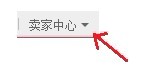
如果要做的是「對話框 + 指向箭頭」的組合,做法是外層相對定位、內層放箭頭,再用一層內容層蓋住箭頭與邊框交接處的接縫。
div.container {
  position: absolute;
  top: 30px;
  left: 40px;
  display: block;
  height: 100px;
  width: 200px;
  background-color: transparent;
  *border: 1px solid #666;
}

/* 外層三角形,負責描邊顏色 */
s {
  position: absolute;
  top: -20px;
  *top: -22px;
  left: 20px;
  display: block;
  height: 0;
  width: 0;
  font-size: 0;
  line-height: 0;
  border-color: transparent transparent #666 transparent;
  border-style: dashed dashed solid dashed;
  border-width: 10px;
}

/* 內層三角形,顏色同背景,蓋出描邊效果 */
i {
  position: absolute;
  top: -9px;
  *top: -9px;
  left: -10px;
  display: block;
  height: 0;
  width: 0;
  font-size: 0;
  line-height: 0;
  border-color: transparent transparent #fff transparent;
  border-style: dashed dashed solid dashed;
  border-width: 10px;
}
內容層用絕對定位鋪滿容器,加上圓角與陰影,並針對 IE 5.5–8 补上 filter /-ms-filter 的陰影寫法。這類寫法的好處是:框內文字可以動態更新,高度也能自適應增長。
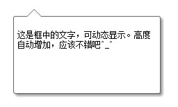
另外要提醒,設定邊框時如果四邊粗細相同,對角線會剛好交於角上;只有粗細不同時斜切才會明顯,這也是為什麼範例裡刻意用了不一樣的 border-width。
- 上一篇文章: CSS Regions 解析:讓內容在多個容器間自由流動
- 下一篇文章: CSS 選擇器大全與效能排序指南