Flexbox 不是單一屬性,而是一整套佈局模組,同時包含容器(父元素)與項目(子元素)兩側的屬性。
它的核心思想是:讓元素能夠改變尺寸以適應可用空間。空間變多時 flex 項目伸展填滿,空間不足時自動收縮。一句話——讓佈局隨著視窗大小自動伸縮。
建立 Flex 容器
給元素的 display 設為 flex 即可(IE10 需要 -ms-flexbox):
.container{
  display: -webkit-flex;
  display: -moz-flex;
  display: flex;
  display: -ms-flexbox;
}
一旦啟用,容器在正常文件流中的所有子元素都會變成 flex 項目。
水平或垂直排列
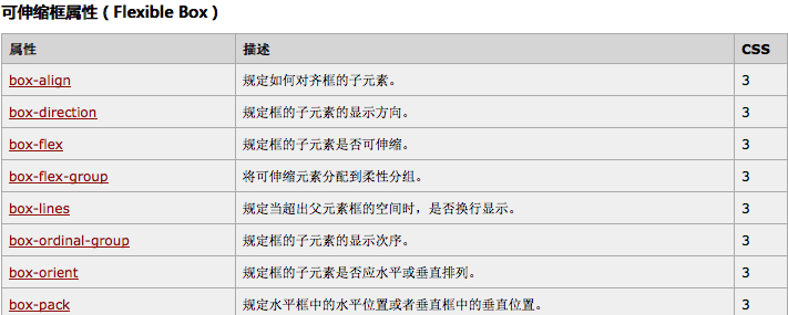
早期語法用 box-orient 定義主軸方向,horizontal 為水平、vertical 為垂直:
.container{
  display: box;
  box-orient: horizontal;
}
box-orient: horizontal | vertical | inline-axis | block-axis | inherit;
標準語法中,這件事由容器的 flex-direction 負責(row / column 及各自的 reverse)。
經典案例:完美居中
用 Flexbox 讓元素在頁面正中央,同時示範各版本語法的差異:
<!DOCTYPE html>
<html lang="en">
<head>
<meta charset="utf-8"/>
<title>Centering an Element on the Page</title>
<style type="text/css">
html {
  height: 100%;
}
body {
  display: -webkit-box;   /* 舊語法:Safari、iOS、Android browser、舊版 WebKit */
  display: -moz-box;      /* 舊語法:Firefox(有 bug) */
  display: -ms-flexbox;   /* 混合語法:IE 10 */
  display: -webkit-flex;  /* 新語法:Chrome 21+ */
  display: flex;          /* 新語法:Opera 12.1、Firefox 22+ */

  /* 垂直居中 */
  -webkit-box-align: center;   /* 舊語法 */
  -moz-box-align: center;
  -ms-flex-align: center;      /* 混合語法 */
  -webkit-align-items: center; /* 新語法 */
  align-items: center;

  /* 水平居中 */
  -webkit-box-pack: center;      /* 舊語法 */
  -moz-box-pack: center;
  -ms-flex-pack: center;         /* 混合語法 */
  -webkit-justify-content: center; /* 新語法 */
  justify-content: center;

  margin: 0;
  height: 100%;
  width: 100%; /* Firefox 需要 */
}
h1 {
  display: -webkit-box;
  display: -moz-box;
  display: -ms-flexbox;
  display: -webkit-flex;
  display: flex;
  -webkit-box-align: center;
  -moz-box-align: center;
  -ms-flex-align: center;
  -webkit-align-items: center;
  align-items: center;
  height: 10rem;
}
</style>
</head>
<body>
<h1>OMG, I'm centered</h1>
</body>
</html>
反向排列
body {
  display: -webkit-box;
  display: -moz-box;
  box-orient: vertical;
  box-direction: reverse;
  color: white;
}
#box1{ background: red;  height: 100px; width: 80px; }
#box2{ background: black; height: 100px; width: 80px; }
#box3{ background: blue; height: 100px; width: 80px; }
標準寫法對應的是容器的 flex-direction: column-reverse。
主軸對齊:justify-content
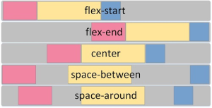
在解析完任何彈性長度與自動邊距之後,決定項目沿主軸的對齊方式:
justify-content: flex-start    /* 預設值,向起始位置靠齊 */
justify-content: flex-end      /* 向結束位置靠齊 */
justify-content: center        /* 向中間靠齊 */
justify-content: space-between /* 平均分布,首項貼起點、末項貼終點 */
justify-content: space-around  /* 平均分布,兩端各留一半空間 */
側軸對齊:align-items
與 justify-content 呼應,負責交叉軸方向:
flex-start:項目外邊距緊貼該行在側軸起始的邊
flex-end:項目外邊距緊貼該行在側軸終點的邊
center:項目在側軸上居中
baseline:依基線對齊
stretch(預設值):拉伸填滿整個容器,仍受 min/max-width/height 限制
換行:flex-wrap
nowrap        /* 預設值,不換行 */
wrap          /* 容納不下時換到新增的一行 */
wrap-reverse  /* 反向換行 */
設為 wrap 時,若一行放不下所有項目,多出的會換到新的 flex line,新行的方向由側軸決定。
多行對齊:align-content
它改變的是 flex-wrap 的行為——對齊的是「行」而不是「項目」:
flex-start:各行向容器起點堆疊
flex-end:各行向容器終點堆疊
center:各行向中間堆疊
space-between:各行平均分布
space-around:平均分布且兩端各留一半空間
stretch(預設值):各行伸展佔滿剩餘空間
單一項目覆寫:align-self
會覆蓋容器設定的 align-items,取值相同:stretch(預設)、flex-start、flex-end、center、baseline。
舊版屬性對照
box-direction 決定子元素排列方向:normal | reverse | inherit。
box-pack 決定當容器大於子元素時的放置位置:
start:全部靠左,右側留空
end:全部靠右,左側留空
justify:平均分布(預設值)
center:平均分配剩餘空間(可壓縮子元素並整體居中)
box-align 決定交叉軸對齊:
start:從頂部開始排列
end:從底部開始排列
center:橫向居中
baseline:沿同一基線排列
stretch:與容器等高(預設值)
box-flex 決定子元素是否可伸縮:
<div style="display:-webkit-box;border:1px solid #ccc; width:500px;height:50px;">
  <div style="-webkit-box-flex:1;background-color:#0f0"></div>
  <div style="-webkit-box-flex:2;background-color:#f00"></div>
  <div style="width:100px;background-color:#0f0"></div>
</div>
另外,與傳統盒模型一樣,overflow 用來決定溢出顯示方式;要避免溢出,可把 box-lines 設為 multiple 使其換行。
flex 的三種簡寫值
flex: initial——有剩餘空間時不會伸長,但必要時會收縮。
flex: auto——會依主軸自動伸縮以佔滿所有剩餘空間。這個值早期僅 Opera 12.11 支援,Chrome 23 上無效,當時可以用 flex: 1 達到相同效果。
flex: none——任何情況下都不伸縮。
現代語法對照表
標準版的屬性對應如下,寫新專案時直接用右欄即可:
box-orient: horizontal      → flex-direction: row
box-orient: vertical        → flex-direction: column
box-direction: reverse      → flex-direction: row-reverse / column-reverse
box-pack                    → justify-content
box-align                   → align-items
box-flex: N                 → flex: N
—                           → flex-wrap
—                           → align-content
—                           → align-self
—                           → order(取代舊版的排序 hack)
掌握「容器管排列與對齊、項目管伸縮與個別對齊」這個分工,Flexbox 就不難了。
- 上一篇文章: 純 CSS3 打造帶入場動畫的導覽列
- 下一篇文章: 禁止選取頁面文字:user-select 實用指南