製作表單時經常遇到這樣的需求:姓名、手機號碼、出生地、身份證號碼這些標籤字數不同,卻要讓右側的輸入框左邊緣完全對齊。這就要用到 text-align 與 text-justify 的組合。
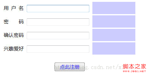
基本思路
text-align 直接設為 justify 比較簡單,text-justify 的取值則相對複雜,需要根據瀏覽器選擇。
IE 的可用取值
auto:由瀏覽器自行決定對齊規則。
inter-word:通過增加詞間空格對齊,速度最快,但對最後一行無效。
newspaper:通過增減字母間空格對齊,是拉丁字母最精確的兩端對齊格式。
distribute:處理空格的方式類似 newspaper,適用於東亞文檔,尤其是泰文。
distribute-all-lines:與 distribute 相同,但同時作用於段落的最後一行,適用於表意文字文檔。
inter-ideograph:為表意文字提供完全兩端對齊,增減的是漢字與詞間的間距。
需要說明的是,text-justify 最早是 IE 的私有實現,Firefox 與 Chrome 支持得很晚,因此存在嚴格的兼容問題。而且在 Firefox、Chrome 下,通常需要手動在漢字之間插入空白或軟換行標簽才會生效。
示例代碼
<form>
  <div>
    <span>用 戶 名</span>
    <input id='username' type="text" name="" />
    <strong></strong>
  </div>
  <div>
    <span>密 碼</span>
    <input type="password" name="" />
    <strong></strong>
  </div>
  <div>
    <span>確 認 密 碼</span>
    <input type="password" name="" />
    <strong></strong>
  </div>
  <div>
    <span>興 趣 愛 好</span>
    <input type="text" name="" />
    <strong></strong>
  </div>
  <div class='reg'>
    <input type="button" value='點此注冊' name="" />
  </div>
</form>
注意:每兩個字符之間是有一個空格的,這正是為了讓 justify 有可伸縮的對象。
樣式代碼
/* 頂部為 CSS 重置 */
html{color:#000; background:#FFF; font-family:Microsoft YaHei, sans-serif, Arial, '宋體';}
body,div,dl,dt,dd,ul,ol,li,h1,h2,h3,h4,h5,h6,pre,code,form,fieldset,legend,
input,button,textarea,p,blockquote,th,td,strong{
  padding:0; margin:0;
  font-family:Microsoft YaHei, sans-serif, Arial;
}
table{border-collapse:collapse; border-spacing:0;}
fieldset,img{border:0;}
a{text-decoration:none; outline:none;}
a:hover{text-decoration:none;}
li{list-style:none;}
caption,th{text-align:left;}
h1,h2,h3,h4,h5,h6{font-size:100%; font-weight:normal;}
input,button,textarea,select,optgroup,option{
  font-family:inherit; font-size:inherit; font-style:inherit; font-weight:inherit;
}
.clear {clear:both; height:0px; overflow:hidden;}

/* 從此處起為表單樣式 */
form{width:430px; margin:20px auto 0;}
div{
  width:430px;
  height:40px;
  line-height:40px;
  clear:both;
  word-spacing:-1em;          /* 調整字距,防止兩端對齊後間距過大 */
  text-align:justify;
  text-justify:distribute-all-lines;  /* IE6-8 */
  text-align-last:justify;            /* IE9 */
  -moz-text-align-last:justify;       /* Firefox */
  -webkit-text-align-last:justify;    /* Chrome 20+ */
}
@media screen and (-webkit-min-device-pixel-ratio:0){
  /* 兼容 Chrome:用偽元素撐出可伸縮空間 */
  div span:after{
    content:".";
    display:inline-block;
    width:100%;
    overflow:hidden;
    height:0;
  }
}
span{float:left; width:65px; height:40px; line-height:40px; margin-right:10px;}
strong{float:left; width:140px; height:40px; line-height:40px; margin-left:10px; background:#ccf;}
input[type=text], input[type=password]{
  float:left; width:200px; height:20px; margin:10px 0;
}
input[type=button]{color:#00f; width:100px; height:30px;}
.reg{text-align:center; margin:20px auto 0;}
代碼要點
word-spacing 給負值,是為了抵消兩端對齊拉開的過大間距,避免標籤看起來散架。
那段 @media 查詢是給 Chrome 用的補丁:justify 需要行內有可伸縮的空白才生效,而 Chrome 對中文的处理不及 IE 徹底,於是用 span 的 :after 偽元素生成一個寬度 100% 的不可見字符,強行撐出可伸展空間。
更省事的現代做法
上述方案依賴大量 hack,且需要手動在字符間敲空格,維護成本高。今天更推薦用 Grid 直接對齊兩列:
.form_row{
  display:grid;
  grid-template-columns: 5em 1fr;  /* 標籤列固定寬,內容列自適應 */
  align-items:center;
  gap:10px;
}
<div class="form_row">
  <span>用戶名</span>
  <input type="text" />
</div>
標籤列寬度統一,所有輸入框自然左對齊,不必敲空格、不必寫 hack,字數再多也不影響對齊。
- 上一篇文章: 聊聊 CSS 外边距合併:一句話就能想通的事
- 下一篇文章: 純 CSS3 動畫導航菜單:不用一行 JavaScript