瀏覽器預設的按鈕外觀向來被嫌醜,但只要願意花點心思寫樣式,就能做出相當有質感的控制項。以下整理四款可直接取用的按鈕樣式。
一、帶圖示的按鈕
·樣式預覽

·程式碼
/* CSS Document */
/* BUTTONS */
.buttons a, .buttons button{
    display:block;
    float:left;
    margin:0 7px 0 0;
    background-color:#f5f5f5;
    border:1px solid #dedede;
    border-top:1px solid #eee;
    border-left:1px solid #eee;
    font-family:"Lucida Grande", Tahoma, Arial, Verdana, sans-serif;
    font-size:12px;
    line-height:130%;
    text-decoration:none;
    font-weight:bold;
    color:#565656;
    cursor:pointer;
    padding:5px 10px 6px 7px; /* Links */
}
.buttons button{
    width:auto;
    overflow:visible;
    padding:4px 10px 3px 7px; /* IE6 */
}
.buttons button[type]{
    padding:5px 10px 5px 7px; /* Firefox */
    line-height:17px; /* Safari */
}
*:first-child+html button[type]{
    padding:4px 10px 3px 7px; /* IE7 */
}
.buttons button img, .buttons a img{
    margin:0 3px -3px 0 !important;
    padding:0;
    border:none;
    width:16px;
    height:16px;
}

/* STANDARD */
button:hover, .buttons a:hover{
    background-color:#dff4ff;
    border:1px solid #c2e1ef;
    color:#336699;
}
.buttons a:active{
    background-color:#6299c5;
    border:1px solid #6299c5;
    color:#fff;
}

/* POSITIVE */
button.positive, .buttons a.positive{
    color:#529214;
}
.buttons a.positive:hover, button.positive:hover{
    background-color:#E6EFC2;
    border:1px solid #C6D880;
    color:#529214;
}
.buttons a.positive:active{
    background-color:#529214;
    border:1px solid #529214;
    color:#fff;
}

/* NEGATIVE */
.buttons a.negative, button.negative{
    color:#d12f19;
}
.buttons a.negative:hover, button.negative:hover{
    background:#fbe3e4;
    border:1px solid #fbc2c4;
    color:#d12f19;
}
.buttons a.negative:active{
    background-color:#d12f19;
    border:1px solid #d12f19;
    color:#fff;
}

/* REGULAR */
button.regular, .buttons a.regular{
    color:#336699;
}
.buttons a.regular:hover, button.regular:hover{
    background-color:#dff4ff;
    border:1px solid #c2e1ef;
    color:#336699;
}
.buttons a.regular:active{
    background-color:#6299c5;
    border:1px solid #6299c5;
    color:#fff;
}
這款的巧思是用 positive/negative/regular 三組 class 區分語意:綠色系表示確認、紅色系表示刪除、藍色系為一般操作。四邊邊框刻意做出「上淺下深」的落差,看起來就有微微凸起的手感。
二、圓角按鈕(Sliding Doors 手法)
·樣式預覽

·程式碼
<!DOCTYPE HTML PUBLIC "-//W3C//DTD HTML 4.01 Transitional//EN" "https://www.w3.org/TR/html4/loose.dtd">
<html>
<head>
<title>Untitled Document</title>
<meta http-equiv="Content-Type" content="text/html; charset=gb2312">
<style type="text/css">
<!--
.clear { /* 包住浮動按鈕的通用容器 */
    overflow: hidden;
    width: 100%;
}

a.button {
    background: transparent url('bg_button_a.gif') no-repeat scroll top right;
    color: #444;
    display: block;
    float: left;
    font: normal 12px arial, sans-serif;
    height: 24px;
    margin-right: 6px;
    padding-right: 18px; /* sliding doors padding */
    text-decoration: none;
}

a.button span {
    background: transparent url('bg_button_span.gif') no-repeat;
    display: block;
    line-height: 14px;
    padding: 5px 0 5px 18px;
}

a.button:active {
    background-position: bottom right;
    color: #000;
    outline: none; /* 移除 Firefox 虛線外框 */
}

a.button:active span {
    background-position: bottom left;
    padding: 6px 0 4px 18px; /* 文字下壓 1px */
}

-->
</style>
</head>
<body>
 <a class="button" href="https://www.xue51.com/" onclick="this.blur();"><span>學無憂css</span></a>
 <a class="button" href="https://www.xue51.com/" onclick="this.blur();"><span>學無憂-www.xue51.com</span></a>
</body>
</html>
這就是經典的 sliding doors(滑門)技巧:外層 a 掛右半張背景圖,內層 span 掛左半張,兩張圖重疊拼成一個完整的圓角按鈕。因為寬度可變,按鈕能適應任何文字長度,在 border-radius 普及之前是唯一解。按下時把背景位置移到下方,就得到另一個狀態的圖。
三、帶導角且有背景圖的按鈕
·樣式預覽
·程式碼
<!DOCTYPE HTML PUBLIC "-//W3C//DTD HTML 4.01 Transitional//EN" "https://www.w3.org/TR/html4/loose.dtd">
<html>
<head>
<title>Untitled Document</title>
<meta http-equiv="Content-Type" content="text/html; charset=gb2312">
<script type="text/javascript" src="btn.js"></script>
<style type="text/css" media="screen">

body { padding: 20px; font-size: 0.85em; font-family: georgia, serif; }
.btn { display: block; position: relative; background: #aaa; padding: 5px; float: left; color: #fff; text-decoration: none; cursor: pointer; }
.btn * { font-style: normal; background-image: url(btn2.png); background-repeat: no-repeat; display: block; position: relative; }
.btn i { background-position: top left; position: absolute; margin-bottom: -5px; top: 0; left: 0; width: 5px; height: 5px; }
.btn span { background-position: bottom left; left: -5px; padding: 0 0 5px 10px; margin-bottom: -5px; }
.btn span i { background-position: bottom right; margin-bottom: 0; position: absolute; left: 100%; width: 10px; height: 100%; top: 0; }
.btn span span { background-position: top right; position: absolute; right: -10px; margin-left: 10px; top: -5px; height: 0; }

* html .btn span,
* html .btn i { float: left; width: auto; background-image: none; cursor: pointer; }

.btn.blue { background: #2ae; }
.btn.green { background: #9d4; }
.btn.pink { background: #e1a; }
.btn:hover { background-color: #a00; }
.btn:active { background-color: #444; }
.btn[class] { background-image: url(shade.png); background-position: bottom; }

* html .btn { border: 3px double #aaa; }
* html .btn.blue { border-color: #2ae; }
* html .btn.green { border-color: #9d4; }
* html .btn.pink { border-color: #e1a; }
* html .btn:hover { border-color: #a00; }

p { clear: both; padding-bottom: 2em; }
form { margin-top: 2em; }
form p .btn { margin-right: 1em; }
textarea { margin: 1em 0;}

</style>
</head>
<body>
 <p><a href="#" class="btn blue">This is a blue button</a></p>
 <p><a href="#" class="btn green">This should be a green button</a></p>
 <p><big><a href="#" class="btn blue big">Big Text</a></big></p>
 <form method="post" action="#">
 <fieldset>
 <legend>Form Example</legend>
 <div><input type="text" /></div>
 <div><textarea cols="40" rows="10"></textarea></div>
 <p><input type="Button" id="reset_btn" value="Reset" class="btn" /> <input type="Submit" id="submit_btn" value="Submit this form" class="btn pink" /></p>
 </fieldset>
 </form>

</body>
</html>
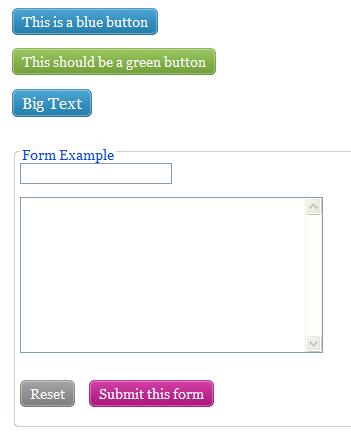
這款把四個角各自用一個純裝飾的 i/span 元素掛上 sprite 的四個角落,中間填色,於是做出四角導圓的效果。好處是同一張 sprite 可以換色(blue/green/pink 只是改背景色),按下時再疊一層 shade.png 做出深淺變化。
四、較炫的導角按鈕(CSS Sprite 換圖)
·樣式預覽
·程式碼
<!DOCTYPE html PUBLIC "-//W3C//DTD XHTML 1.0 Transitional//EN" "https://www.w3.org/TR/xhtml1/DTD/xhtml1-transitional.dtd">
<html xmlns="https://www.w3.org/1999/xhtml">
<head>
<meta http-equiv="Content-Type" content="text/html; charset=iso-8859-1" />
<title>Image Rollover with CSS</title>
<style type="text/css" media="screen">

a.button { background:url(rss-feed-img.png) repeat 0px 0px; width: 123px; height: 44px; display: block; }

a.button span { display: none; }

a.button:hover { background: url(rss-feed-img.png) repeat 0px -44px; }

</style>
</head>

<body>
<a href="#" class="button">
 <span>RSS Feeds</span>
</a>
</body>
</html>
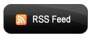
最後這款走的是 sprite 換圖路線:一張圖裡上下排了兩個狀態,正常顯示上半部,滑鼠移入時把背景往下挪 44px(也就是按鈕高度),就換成第二個狀態。只載一張圖、不必等 hover 圖檔載入,因此不會有閃空的問題,這是 sprite 最直接的效益。內含的 span 用 display:none 藏起來,是留給圖片載入失敗時的替代文字。
選用的建議
這四款分別代表三個時代的做法:滑門拼圖、多元素湊圓角、sprite 換圖。若你今天才要開新專案,直接用 border-radius 加上 transition,程式碼可以短到十分之一,效果還更好。這些老技巧的價值在於理解「在沒有這些屬性的年代,前端是怎麼把問題解掉的」。
- 上一篇文章: 移除 Firefox 按鈕與連結上的虛線外框
- 下一篇文章: IE8 無法解析 background:問題出在屬性值的書寫順序