做一個太陽系八大行星的運轉動畫,不包括行星的衛星,所有行星圍繞太陽公轉,行星采用純色,暫時沒有自轉。
效果靜態圖:
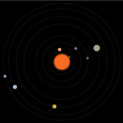
動畫中包括:太陽及各行星,運行軌道,行星公轉動畫。
先畫好草圖,設計好大小和位置,根據公轉周期計算好動畫執行的時間。
html的結構:
一個class為solarsys的div,作為太陽系容器元素,該div的position為relative。
行星軌道和行星都用div,position為absolute。
容器用relative和內部元素采用absolute的定位方式,比較簡單的能實現效果,缺點就是大小是固定的。
    <div class="solarsys">
        <!--太陽-->
        <div class='sun'></div>

        <!--水星軌道-->
        <div class='mercuryOrbit'></div>

        <!--水星-->
        <div class='mercury'></div>

        <!--金星軌道-->
        <div class='venusOrbit'></div>

        <!--金星-->
        <div class='venus'></div>

        <!--地球軌道-->
        <div class='earthOrbit'></div>

        <!--地球-->
        <div class='earth'></div>

        <!--火星軌道-->
        <div class='marsOrbit'></div>

        <!--火星-->
        <div class='mars'></div>

        <!--木星軌道-->
        <div class='jupiterOrbit'></div>

        <!--木星-->
        <div class='jupiter'></div>

        <!--土星軌道-->
        <div class='saturnOrbit'></div>

        <!--土星-->
        <div class='saturn'></div>

        <!--天王星軌道-->
        <div class='uranusOrbit'></div>

        <!--天王星-->
        <div class='uranus'></div>

        <!--海王星軌道-->
        <div class='neptuneOrbit'></div>

        <!--海王星-->
        <div class='neptune'></div>
    </div>
太陽系容器div的css:
定寬,定高,relative定位,頁面內劇中對齊。
        .solarsys{
            width: 800px;
            height: 800px;;
            position: relative;
            margin: 0 auto;
            background-color: #000000;
            padding: 0;
            transform: scale(1);
        }
太陽div的css:
按照設計的大小和位置,設定寬高,left,top。
設定顏色。
通過把boder-radius生成50%,把一個正方形變成圓形。
通過box-shadow的4層顏色設置實現太陽光暈。
        .sun {
            left:357px;
            top:357px;
            height: 90px;
            width: 90px;
            background-color: rgb(248,107,35);
            border-radius: 50%;
            box-shadow: 5px 5px 10px rgb(248,107,35), -5px -5px 10px rgb(248,107,35), 5px -5px 10px rgb(248,107,35), -5px 5px 10px rgb(248,107,35);
            position: absolute;
            margin: 0;
        }
行星軌道div的css:
假設是水星軌道。
按照設計的大小和位置,設定寬高,left,top。
背景色透明。
通過把boder-radius生成50%,把一個正方形變成圓形。
boder的類型設成虛線。
boder的顏色設成灰色。
寬度設1。
        .mercuryOrbit {
            left:342.5px;
            top:342.5px;
            height: 115px;
            width: 115px;
            background-color: transparent;
            border-radius: 50%;
            border-style: dashed;
            border-color: gray;
            position: absolute;
            border-width: 1px;
            margin: 0px;
            padding: 0px;
        }
行星div的css:
假設是水星。
按照設計的大小和位置,設定寬高,left,top。
設置顏色。
通過把boder-radius生成50%,把一個正方形變成圓形。
將transfrom-origin設定成當前div的左上角相對於整個太陽系容器的中心點的橫向和縱向的偏移量。加上旋轉動畫後就是圍繞著中心點旋轉效果。
做一個animation,引用rotate關鍵幀動畫,線性永久執行,這裡的執行時長是根據行星的公轉周期計算出來。
        .mercury {
            left:337.5px;
            top:395px;
            height: 10px;
            width: 10px;
            background-color: rgb(166,138,56);
            border-radius: 50%;
            position: absolute;
            transform-origin: 62.5px 5px;
            animation: rotate 1.5s infinite linear;
        }
rotate關鍵幀動畫:
逆時針旋轉。
        @keyframes rotate {
            100% {
                transform: rotate(-360deg);
            }
        }
基本結構完成。
僅在chrome中測試過。
全部代碼:
<html>
<head>
    <style>
        .solarsys{
            width: 800px;
            height: 800px;;
            position: relative;
            margin: 0 auto;
            background-color: #000000;
            padding: 0;
            transform: scale(1);
        }

        /*太陽*/
        .sun {
            left:357px;
            top:357px;
            height: 90px;
            width: 90px;
            background-color: rgb(248,107,35);
            border-radius: 50%;
            box-shadow: 5px 5px 10px rgb(248,107,35), -5px -5px 10px rgb(248,107,35), 5px -5px 10px rgb(248,107,35), -5px 5px 10px rgb(248,107,35);
            position: absolute;
            margin: 0;
        }

        /*水星*/
        .mercury {
            left:337.5px;
            top:395px;
            height: 10px;
            width: 10px;
            background-color: rgb(166,138,56);
            border-radius: 50%;
            position: absolute;
            transform-origin: 62.5px 5px;
            animation: rotate 1.5s infinite linear;
        }

        /*水星軌道*/
        .mercuryOrbit {
            left:342.5px;
            top:342.5px;
            height: 115px;
            width: 115px;
            background-color: transparent;
            border-radius: 50%;
            border-style: dashed;
            border-color: gray;
            position: absolute;
            border-width: 1px;
            margin: 0px;
            padding: 0px;
        }

        /*金星*/
        .venus {
            left:309px;
            top:389px;
            height: 22px;
            width: 22px;
            background-color: rgb(246,157,97);
            border-radius: 50%;
            position: absolute;
            transform-origin: 91px 11px;
            animation: rotate 3.84s infinite linear;
        }

        /*金星軌道*/
        .venusOrbit {
            left:320px;
            top:320px;
            height: 160px;
            width: 160px;
            background-color: transparent;
            border-radius: 50%;
            border-style: dashed;
            border-color: gray;
            position: absolute;
            border-width: 1px;
            /*margin: 100px;*/
            /*transform-origin: -75px -75px;*/
            /*animation: rotate 4s infinite linear;*/
            margin: 0px;
            padding: 0px;
        }

        /*地球*/
        .earth {
            left:266.5px;
            top:391px;
            height: 18px;
            width: 18px;
            background-color: rgb(115,114,174);
            border-radius: 50%;
            position: absolute;
            transform-origin: 134px 9px;
            animation: rotate 6.25s infinite linear;
        }

        /*地球軌道*/
        .earthOrbit {
            left:275px;
            top:275px;
            height: 250px;
            width: 250px;
            background-color: transparent;
            border-radius: 50%;
            border-style: dashed;
            border-color: gray;
            position: absolute;
            border-width: 1px;
            /*margin: 100px;*/
            /*transform-origin: -75px -75px;*/
            /*animation: rotate 4s infinite linear;*/
            margin: 0px;
            padding: 0px;
        }

        /*火星*/
        .mars {
            left:222.5px;
            top:392.5px;
            height: 15px;
            width: 15px;
            background-color: rgb(140,119,63);
            border-radius: 50%;
            position: absolute;
            transform-origin: 177.5px 7.5px;
            animation: rotate 11.75s infinite linear;
        }

         /*火星軌道*/
        .marsOrbit {
            left:230px;
            top:230px;
            height: 340px;
            width: 340px;
            background-color: transparent;
            border-radius: 50%;
            border-style: dashed;
            border-color: gray;
            position: absolute;
            border-width: 1px;
            /*margin: 100px;*/
            /*transform-origin: -75px -75px;*/
            /*animation: rotate 4s infinite linear;*/
            margin: 0px;
            padding: 0px;
        }

        /*木星*/
        .jupiter {
            left:134px;
            top:379px;
            height: 42px;
            width: 42px;
            background-color: rgb(156,164,143);
            border-radius: 50%;
            position: absolute;
            transform-origin: 266px 21px;
            animation: rotate 74.04s infinite linear;
        }

        /*木星軌道*/
        .jupiterOrbit {
            left:155px;
            top:155px;
            height: 490px;
            width: 490px;
            background-color: transparent;
            border-radius: 50%;
            border-style: dashed;
            border-color: gray;
            position: absolute;
            border-width: 1px;
            /*margin: 100px;*/
            /*transform-origin: -75px -75px;*/
            /*animation: rotate 4s infinite linear;*/
            margin: 0px;
            padding: 0px;
        }

        /*土星*/
        .saturn {
            left:92px;
            top:387px;
            height: 26px;
            width: 26px;
            background-color: rgb(215,171,68);
            border-radius: 50%;
            position: absolute;
            transform-origin: 308px 13px;
            animation: rotate 183.92s infinite linear;
        }

        /*土星軌道*/
        .saturnOrbit {
            left:105px;
            top:105px;
            height: 590px;
            width: 590px;
            background-color: transparent;
            border-radius: 50%;
            border-style: dashed;
            border-color: gray;
            position: absolute;
            border-width: 1px;
            /*margin: 100px;*/
            /*transform-origin: -75px -75px;*/
            /*animation: rotate 4s infinite linear;*/
            margin: 0px;
            padding: 0px;
        }

        /*天王星*/
        .uranus {
            left:41.5px;
            top:386.5px;
            height: 27px;
            width: 27px;
            background-color: rgb(164,192,206);
            border-radius: 50%;
            position: absolute;
            transform-origin: 358.5px 13.5px;
            animation: rotate 524.46s infinite linear;
        }

        /*天王星軌道*/
        .uranusOrbit {
            left:55px;
            top:55px;
            height: 690px;
            width: 690px;
            background-color: transparent;
            border-radius: 50%;
            border-style: dashed;
            border-color: gray;
            position: absolute;
            border-width: 1px;
            /*margin: 100px;*/
            /*transform-origin: -75px -75px;*/
            /*animation: rotate 4s infinite linear;*/
            margin: 0px;
            padding: 0px;
        }

        /*海王星*/
        .neptune {
            left:10px;
            top:390px;
            height: 20px;
            width: 20px;
            background-color: rgb(133,136,180);
            border-radius: 50%;
            position: absolute;
            transform-origin: 390px 10px;
            animation: rotate 1028.76s infinite linear;
        }

        /*海王星軌道*/
        .neptuneOrbit {
            left:20px;
            top:20px;
            height: 760px;
            width: 760px;
            background-color: transparent;
            border-radius: 50%;
            border-style: dashed;
            border-color: gray;
            position: absolute;
            border-width: 1px;
            /*margin: 100px;*/
            /*transform-origin: -75px -75px;*/
            /*animation: rotate 4s infinite linear;*/
            margin: 0px;
            padding: 0px;
        }

        @keyframes rotate {
            100% {
                transform: rotate(-360deg);
            }
        }

    </style>

</head>
<body>
    <div class="solarsys">
        <!--太陽-->
        <div class='sun'></div>

        <!--水星軌道-->
        <div class='mercuryOrbit'></div>

        <!--水星-->
        <div class='mercury'></div>

        <!--金星軌道-->
        <div class='venusOrbit'></div>

        <!--金星-->
        <div class='venus'></div>

        <!--地球軌道-->
        <div class='earthOrbit'></div>

        <!--地球-->
        <div class='earth'></div>

        <!--火星軌道-->
        <div class='marsOrbit'></div>

        <!--火星-->
        <div class='mars'></div>

        <!--木星軌道-->
        <div class='jupiterOrbit'></div>

        <!--木星-->
        <div class='jupiter'></div>

        <!--土星軌道-->
        <div class='saturnOrbit'></div>

        <!--土星-->
        <div class='saturn'></div>

        <!--天王星軌道-->
        <div class='uranusOrbit'></div>

        <!--天王星-->
        <div class='uranus'></div>

        <!--海王星軌道-->
        <div class='neptuneOrbit'></div>

        <!--海王星-->
        <div class='neptune'></div>
    </div>
</body>
</html>