手機頁面設計一般的大小是640,但是,手機屏幕大小確實不確定的,這樣,怎麼才能做出適應所有手機的手機頁面呢?
一般的解決方案有兩種,rem布局和百分比布局。這兩種方案我有都試過,所以現在更推薦用rem布局來制作手機頁面;
rem布局的兼容性:
Mozilla Firefox 3.6+、Apple Safari 5+、Google Chrome、IE9+和Opera11+、ie6-IE8 還是別用rem
不過現在的手機一般浏覽器,一般可以直接不用去管IE內核的浏覽器了。
REM的計算公式
例:Html 設置font-size:16px 1rem = 16px
那麼640px = 640/16 =40rem
個人建議設置為100px 方便計算
首先,給頁面的Html定義一個100px的
Html{ font-size:100px;}/*設定基礎rem*/
然後,最核心的代碼就是這一段JS運算了,根據頁面的大小來控制基礎rem的值;
new function (){
var _self = this;
_self.width = 640;//設置默認最大寬度
_self.fontSize = 100;//默認字體大小
_self.widthProportion = function(){var p = (document.body&&document.body.clIEntWidthdocument.getElementsByTagName("Html")[0].offsetWidth)/_self.width;return p>1?1:p<0.5?0.5:p;};
_self.changePage = function(){
document.getElementsByTagName("Html")[0].setAttribute("style","font-size:"+_self.widthProportion()*_self.fontSize+"px !important");
}
_self.changePage();
window.addEventListener("resize",function(){_self.changePage();},false);
};
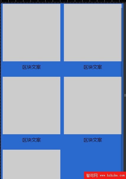
demo
<!DOCTYPE html>
<Html>
<head>
<meta name="vIEwport" content="width=device-width, initial-scale=1.0, user-scalable=0, minimum-scale=1.0, maximum-scale=1.0">
<meta charset="utf-8">
<title>rem基礎布局</title>
<script type="text/Javascript">
new function (){
   var _self = this;
   _self.width = 640;//設置默認最大寬度
   _self.fontSize = 100;//默認字體大小
   _self.widthProportion = function(){var p = (document.body&&document.body.clIEntWidthdocument.getElementsByTagName("html")[0].offsetWidth)/_self.width;return p>1?1:p<0.5?0.5:p;};
   _self.changePage = function(){
       document.getElementsByTagName("html")[0].setAttribute("style","font-size:"+_self.widthProportion()*_self.fontSize+"px !important");
   }
   _self.changePage();
   window.addEventListener("resize",function(){_self.changePage();},false);
};
</script>
<style type="text/CSS">
/*=== base style===*/
*{margin: 0px; padding: 0px;}
ul{list-style: none;}
.wrap{min-width: 320px; max-width: 640px; width: 100%; margin: 0px auto;; background: #2a6ace; font-family:"微軟雅黑", "helvetica neue",tahoma,"hiragino sans gb",stheiti,"wenquanyi micro hei",\5FAE\8F6F\96C5\9ED1,\5B8B\4F53,sans-serif; font-size: 12px;}/*適用於手機端:字體大小用em,1em=16px;為默認字體大小;最大寬度640*/

.pro{width:6.2rem; margin: 0px auto; padding-top: 20px; overflow: hidden;}
.clearfix:after {content:"";height:0;display:block;clear:both;}
.clearfix {zoom:1;}
.pro ul{width:6.4rem;}
.pro li{width: 3rem; height: 3.6rem; float: left; margin: 0 0.2rem 0.2rem 0;}
.pro li .box{width: 3rem; height: 3rem; background: #ccc;}
.pro li p{font-size: 0.24rem; line-height: 0.6rem; text-align: center;}
</style>
</head>
<body>
<div class="wrap">
   <div class="pro">
      <ul class="clearfix">
         <li> <div class="box"></div> <p>區塊文案</p> </li>
         <li> <div class="box"></div> <p>區塊文案</p> </li>
         <li> <div class="box"></div> <p>區塊文案</p> </li>
         <li> <div class="box"></div> <p>區塊文案</p> </li>
         <li> <div class="box"></div> <p>區塊文案</p> </li>
      </ul>
   </div>
</div>
</body>
</Html>