animation CSS3動畫總結
編輯:HTML5詳解
最近一個小游戲項目用到了CSS3的動畫屬性,例如transition、transform、animation。經過三個星期,終於做完了,利用周末好好梳理總結一下。
- keyframes
這個屬性用來定義一系列關鍵幀。也就是在動畫運行的全過程中的一個個中間點。
Internet Explorer 10、Firefox 以及 Opera 支持 @keyframes 規則和 animation 屬性。
Chrome 和 Safari 需要前綴 -webkit-。
- animation的屬性
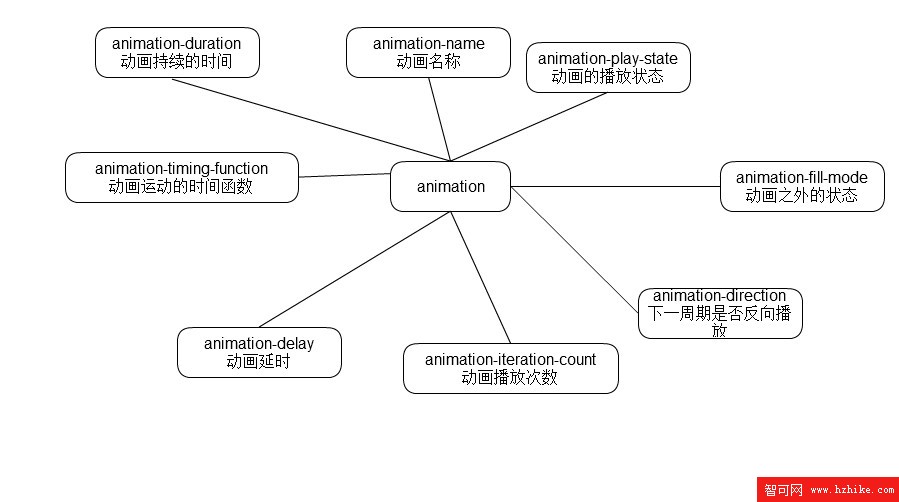
- animation 縮寫
animation: name duration timing-function delay iteration-count direction;
- 一些重點難點的理解
animation-delay
這個屬性是規定動畫開始前等待幾秒才開始。本來是很好理解的,但是當時就有個疑問:假如我的動畫是連續執行好多次的情況下的話,是第一次執行前才會延遲還是每次執行前都會延遲呢?答案是:只有第一次會。
<!DOCTYPE HTML>
<html>
<head>
<meta charset="utf-8">
<title>delay</title>
<meta name="vIEwport" content="width=device-width, initial-scale=1" />

<style type="text/CSS">
    @-webkit-keyframes delay{

        99%{
            -webkit-transform:translate(100px,0);
        }

    }
    .delay{

        width:100px;height:100px;
        background-color: #000;
        -webkit-animation:delay 1s linear 2s infinite;
        animation:delay 1s linear 2s infinite;
    }
</style>
</head>
<body>
    <div class="delay"></div>
</body>
</Html>
animation-fill-mode
該屬性有四個值
none:默認值。不設置對象動畫之外的狀態
forwards:設置對象狀態為動畫結束時的狀態
backwards:設置對象狀態為動畫開始時的狀態
both:設置對象狀態為動畫結束或開始的狀態
一開始比較糾結著三個到底有什麼區別。網上也找了,發現網上說的有點錯誤。起碼我試了一下forwards和both的效果是一模一樣的。都是動畫運行完了停在哪裡就是哪裡。至於backwards,就是總停在一開始的狀態。
<!DOCTYPE HTML>
<html>
<head>
<meta charset="utf-8">
<title>delay</title>
<meta name="vIEwport" content="width=device-width, initial-scale=1" />

<style type="text/CSS">
    @-webkit-keyframes delay{

        100%{
            -webkit-transform:translate(100px,0);
        }

    }
    .delay{

        width:100px;height:100px;
        background-color: #000;
        -webkit-animation:delay 1s linear 2 forwards alternate;
    }
</style>
</head>
<body>
    <div class="delay"></div>
</body>
</Html>
<!DOCTYPE HTML>
<html>
<head>
<meta charset="utf-8">
<title>delay</title>
<meta name="vIEwport" content="width=device-width, initial-scale=1" />
<style type="text/CSS">
@-webkit-keyframes delay{
100%{
-webkit-transform:translate(100px,0);
}
}
.delay{
width:100px;height:100px;
background-color: #000;
-webkit-animation:delay 1s linear 2 both alternate;
}
</style>
</head>
<body>
<div class="delay"></div>
</body>
</Html>
-
兩段代碼主要說明在forwards和both的情況下動畫在設置了反向運行偶次數時,效果仍然一樣。因為之前看到網上說的是forwards在偶次數反向是會停在關鍵幀的100%處,而不是0%處。
- iteration-count
運行次數。
這個本來沒什麼好說的,一目了然,但是無意中發現,有以下的特殊情況:
不能為負數
可以為0 為0的時候,按1來算
可以為小數 小數的時候,不會取整。而是多少就運行多少,比如 .5 就運行到50%的位置。
- 事件
在動畫的世界裡,總有這樣的需求,就是某個動畫結束了之後才進行下一個動畫,這個時候就要知道上一個動畫是什麼時候結束的了。雖然可以用setTimeout來計時達到差不多的效果,但是總感覺不夠精確。
還好,CSS3的動畫有JS事件。
開始:animationstart
迭代:animationiteration
結束:animationend
<!DOCTYPE HTML>
<Html>
<head>
<meta charset="utf-8">
<title>delay</title>
<meta name="vIEwport" content="width=device-width, initial-scale=1" />

<style type="text/CSS">
    @-webkit-keyframes delay{

        100%{
            -webkit-transform:translate(100px,0);
        }

    }
    .delay{

        width:100px;height:100px;
        background-color: #000;
        -webkit-animation:delay 1s linear 2 both alternate;
    }
</style>
</head>
<body>
    <div class="delay"></div>
    <script type="text/Javascript">
    window.onload = function(){
        var delay = document.getElementsByClassName("delay")[0],
        time1,
        time2;
        delay.addEventListener("webkitAnimationStart",function(){
            time1 = new Date().getTime();
            time2 = time1;
            console.log(time2-time1+"ms")

        })
        delay.addEventListener("webkitAnimationIteration",function(){
            time2 = new Date().getTime();
            console.log(time2-time1+"ms")
        })
        delay.addEventListener("webkitAnimationEnd",function(){
            time2 = new Date().getTime();
            console.log(time2-time1+"ms")
        })
    }
    </script>
</body>
</Html>
從代碼可以看出,iteration是在動畫重復執行的時候觸發的。
小編推薦
熱門推薦