用純 CSS 美化 checkbox 與 radio 的實用範例
編輯:HTML和Xhtml
原生表單控制項的外觀往往因瀏覽器而異,樣式單調又難以統一。想讓複選框(checkbox)與單選框(radio)看起來更精緻?其實不必動用 JavaScript,只要善用 CSS 的偽類選擇器就能辦到。本文透過兩個簡單範例,帶你動手打造客製化的勾選與選擇樣式。
核心思路
關鍵在於先把真正的 input 隱藏起來,再透過相鄰的 label 元素「代班」顯示外觀。利用 :checked 偽類搭配 ::after 偽元素,就能在選中時動態呈現勾選標記或填色效果,同時完整保留原生的點擊行為。
checkbox 範例
先將原生 checkbox 隱藏,接著為緊鄰的 label 畫出方框,並在勾選時用 ::after 填入一個勾號字符(\2714):
input[type="checkbox"] {
    display: none;
}

input[type="checkbox"] + label {
    display: inline-block;
    position: relative;
    border: solid 2px #99a1a7;
    width: 35px;
    height: 35px;
    line-height: 35px;
    border-radius: 4px;
}

input[type="checkbox"]:checked + label:after {
    content: '\2714';
    font-size: 25px;
    color: #99a1a7;
    width: 35px;
    height: 35px;
    line-height: 35px;
    position: absolute;
    text-align: center;
    background-color: #e9ecee;
}
HTML 結構則是「input 搭配一個空的 label」,透過 for 屬性把兩者綁定:
<div align="center" style="float: left; height: 39px; width: 39px;">
    <input id="ck101" type="checkbox" />
    <label for="ck101"></label>
</div>
<div style="float: left; height: 39px; line-height: 39px; font-size: 25px; margin-left: 10px;">
    測試101
</div>
radio 範例
radio 的做法類似,差別在於外框用較大的 border-radius 做成圓形,選中時再疊上一個深色的小圓點:
input[type="radio"] {
    display: none;
}

input[type="radio"] + label {
    display: inline-block;
    position: relative;
    border: solid 2px #99a1a7;
    width: 25px;
    height: 25px;
    line-height: 25px;
    padding: 5px;
    border-radius: 19.5px;
}

input[type="radio"]:checked + label:after {
    content: ' ';
    width: 25px;
    height: 25px;
    line-height: 25px;
    position: absolute;
    text-align: center;
    background-color: #99a1a7;
    border-radius: 12.5px;
}

input[type="radio"]:checked + label {
    background-color: #e9ecee;
}
HTML 部分同樣是 input 加空 label,記得同一組單選要共用相同的 name:
<input id="rd101" name="rd" type="radio" />
<label for="rd101"></label>
成果預覽
套用上述樣式後,就能得到乾淨俐落的方形勾選框與圓形單選鈕:
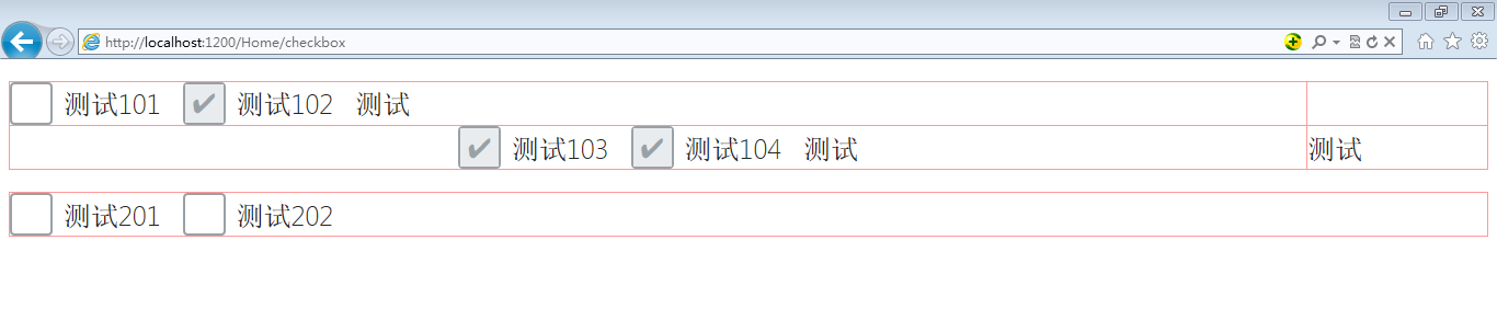
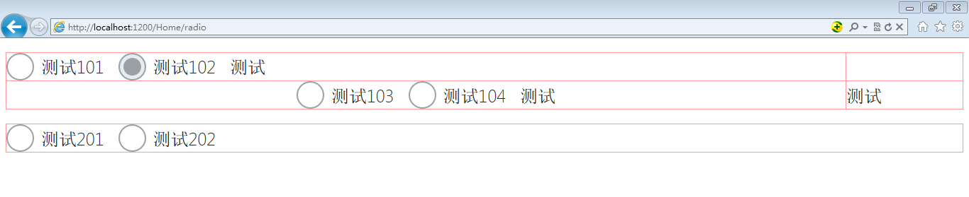
這套做法完全依靠 CSS 完成,無需額外套件,既能統一跨瀏覽器的視覺呈現,也能自由調整尺寸與配色,很適合直接套進現有專案。
- 上一篇文章: 用 HTML 與 CSS3 打造太陽系行星公轉動畫
- 下一篇文章: HTML 學習重點筆記:新手必看的核心觀念整理