用 HTML 與 CSS 純手繪打造暖男「大白」
編輯:HTML和Xhtml
最終成果就是下面這個樣子,是不是有點萌?接下來我們只用 HTML 和 CSS,完全不靠圖片,把《大英雄天團》裡的暖男大白畫出來。
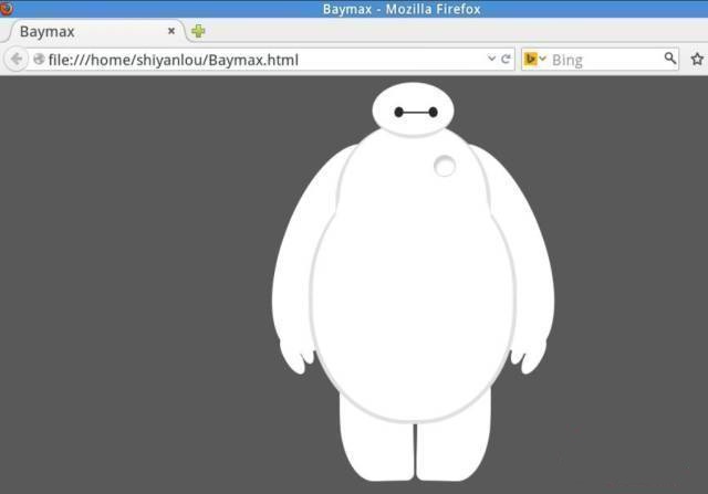
小提醒:讀者最好對 HTML 與 CSS 有基礎認識。當然,如果你是純新手也別擔心——小白遇見「大白」,也算是一樁美事。
一、動手前的準備
先切換到 /home/shiyanlou/ 目錄,新建一個空白文件:

命名為 Baymax.html(名字可以自訂,但副檔名一定要是 .html):
接著用 gedit 打開,準備開始寫程式碼:

二、撰寫 HTML 結構
大白白的思路其實很單純:先用一層層的 div 把頭、軀干、腹部、雙臂、雙腿切分出來,再用 CSS 為每一塊上色、倒圓角、旋轉定位。
<!doctype html>
<html>
  <head><meta charset="utf-8"><title>Baymax</title></head>
<body>
  <div id="baymax">
    <!-- 頭部:兩隻眼睛 + 一張嘴 -->
    <div id="head">
      <div id="eye"></div>
      <div id="eye2"></div>
      <div id="mouth"></div>
    </div>
    <!-- 軀干:含心臟 -->
    <div id="torso">
      <div id="heart"></div>
    </div>
    <!-- 腹部:cover 為與軀干的銜接處 -->
    <div id="belly">
      <div id="cover"></div>
    </div>
    <!-- 左臂:一大一小兩根手指 -->
    <div id="left-arm">
      <div id="l-bigfinger"></div>
      <div id="l-smallfinger"></div>
    </div>
    <!-- 右臂:同樣一大一小兩根手指 -->
    <div id="right-arm">
      <div id="r-bigfinger"></div>
      <div id="r-smallfinger"></div>
    </div>
    <!-- 左腿 -->
    <div id="left-leg"></div>
    <!-- 右腿 -->
    <div id="right-leg"></div>
  </div>
</body>
</html>
三、加上 CSS 樣式
骨架搭好之後,接下來才是真正「畫」出大白的階段。由於大白一身白,為了讓輪廓看得清楚,我們把頁面底色調成深灰。
先處理頭部
body {
  background: #595959;
}

#baymax{
  /* 水平居中 */
  margin: 0 auto;
  height: 600px;
  /* 隱藏溢出部分 */
  overflow: hidden;
}

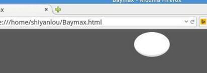
#head{
  height: 64px;
  width: 100px;
  /* 用百分比定義圓角,做出橢圓 */
  border-radius: 50%;
  background: #fff;
  margin: 0 auto;
  margin-bottom: -20px;
  /* 下邊框做出頭與身體的接縫陰影 */
  border-bottom: 5px solid #e0e0e0;
  /* 提高堆疊順序,讓頭壓在身體之上 */
  z-index: 100;
  position: relative;
}
效果預覽:
接著補上眼睛和嘴
#eye,
#eye2{
  width: 11px;
  height: 13px;
  background: #282828;
  border-radius: 50%;
  position: relative;
  top: 30px;
  left: 27px;
  /* 稍微旋轉,讓眼神更呆萌 */
  transform: rotate(8deg);
}

#eye2{
  /* 左右對稱 */
  transform: rotate(-8deg);
  left: 69px;  top: 17px;
}

#mouth{
  width: 38px;
  height: 1.5px;
  background: #282828;
  position: relative;
  left: 34px;
  top: 10px;
}
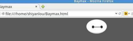
一個 mini 版大白雛形初現:
軀干與腹部
#torso,
#belly{
  margin: 0 auto;
  height: 200px;
  width: 180px;
  background: #fff;
  border-radius: 47%;
  /* 只需要左右與下邊框 */
  border: 5px solid #e0e0e0;
  border-top: none;
  z-index: 1;
}

#belly{
  height: 300px;
  width: 245px;
  margin-top: -140px;
  z-index: 5;
}

#cover{
  width: 190px;
  background: #fff;
  height: 150px;
  margin: 0 auto;
  position: relative;
  top: -20px;
  border-radius: 50%;
}
賦予它一顆心臟
#heart{
  width: 25px;
  height: 25px;
  border-radius: 50%;
  position: relative;
  /* 內陰影做出立體感 */
  box-shadow: 2px 5px 2px #ccc inset;
  right: -115px;
  top: 40px;
  z-index: 111;
  border: 1px solid #ccc;
}
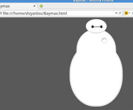
目前的大白是這樣:
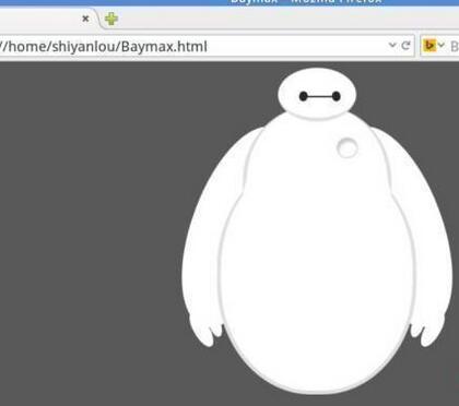
再來一雙溫暖的手臂
#left-arm,
#right-arm{
  height: 270px;
  width: 120px;
  border-radius: 50%;
  background: #fff;
  margin: 0 auto;
  position: relative;
  top: -350px;
  left: -100px;
  transform: rotate(20deg);
  z-index: -1;
}

#right-arm{
  transform: rotate(-20deg);
  left: 100px;
  top: -620px;
}
手指也不能少
#l-bigfinger,
#r-bigfinger{
  height: 50px;
  width: 20px;
  border-radius: 50%;
  background: #fff;
  position: relative;
  top: 250px;
  left: 50px;
  transform: rotate(-50deg);
}

#r-bigfinger{
  left: 50px;
  transform: rotate(50deg);
}

#l-smallfinger,
#r-smallfinger{
  height: 35px;
  width: 15px;
  border-radius: 50%;
  background: #fff;
  position: relative;
  top: 195px;
  left: 66px;
  transform: rotate(-40deg);
}

#r-smallfinger{
  transform: rotate(40deg);
  top: 195px;
  left: 37px;
}
到這裡已經有點意思了:
最後是兩條腿
#left-leg,
#right-leg{
  height: 170px;
  width: 90px;
  border-radius: 40% 30% 10px 45%;
  background: #fff;
  position: relative;
  top: -640px;
  left: -45px;
  transform: rotate(-1deg);
  z-index: -2;
  margin: 0 auto;
}

#right-leg{
  border-radius: 30% 40% 45% 10px;
  margin: 0 auto;
  top: -810px;
  left: 50px;
  transform: rotate(1deg);
}
特技完成!
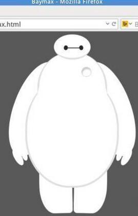
屬於你的暖男大白來到身邊了,是不是特別有安全感?回頭看整個過程你會發現,這個作品其實只用了三招:border-radius 畫圓、transform: rotate 調姿態、position 搭配 z-index 排層次。把這三招練熟,你能用純 CSS 畫出來的東西遠不止一個大白。
- 上一篇文章: XHTML 常用標籤完整整理:從基本概念到實戰語法
- 下一篇文章: 用 HTML + CSS 做出純文字按鈕與帶圖示按鈕