相關閱讀:
BootStrap入門教程(一)之可視化布局
HTML5文檔類型(Doctype)
Bootstrap使用了一些HTML5元素和CSS屬性,所以需要使用HTML5文檔類型。
<!DOCTYPE html>
<html>
....
</html>
移動設備優先
<meta name=”viewport” content=”width=device-width, initial-scale=1.0”>
寬度設置為device-width可以確保它能正確呈現在不同設備上。
initial-scale=1.0確保網頁加載時,以1:1的比例呈現。
可以為viewport meta標簽添加user-scalable=no來禁止其縮放功能。
<meta name="viewport" content="width=device-width,
initial-scale=1.0,
maximum-scale=1.0,
user-scalable=no">
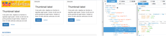
響應式圖像
<img src="..." class="img-responsive" alt="響應式圖像">
  bootstrap.css裡設置了img-responsive的屬性:
.img-responsive {
display: inline-block;
height: auto;
max-width: 100%;
}
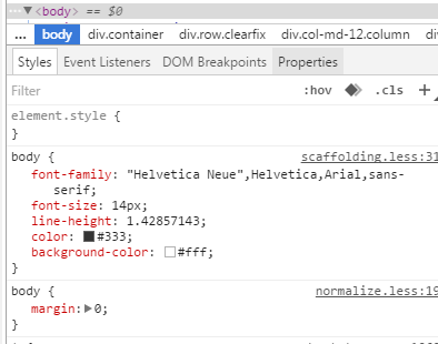
基本的全局顯示
body {
font-family: "Helvetica Neue", Helvetica, Arial, sans-serif;
font-size: 14px;
line-height: 1.428571429;
color: #333333;
background-color: #ffffff;
}
body {margin:0}
鏈接樣式
a:hover,
a:focus {
color: #2a6496;
text-decoration: underline;
}
a:focus {
outline: thin dotted #333;
outline: 5px auto -webkit-focus-ring-color;
outline-offset: -2px;
}
默認設置有好有壞,難免嘛。
不想要下劃線的話可以在a鏈接上加一個名為btn的class,該class的默認設置如下:
a:hover,
a:focus {
color: #2a6496;
text-decoration: underline;}
a:focus {
outline: thin dotted #333;
outline: 5px auto -webkit-focus-ring-color;
outline-offset: -2px;}
避免跨浏覽器的不一致
Normalize.css提供了更好的跨浏覽器一致性。
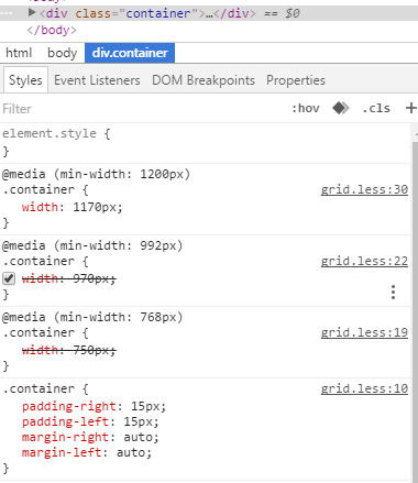
容器(Container)
<div class=”container”>
..
</div>
.container的樣式:
.container {
padding-right: 15px;
padding-left: 15px;
margin-right: auto;
margin-left: auto;
}
左右外邊距交由浏覽器決定。
由於內邊距是固定寬度,默認情況下容器是不可嵌套的。
.container:before,.container:after {
display: table;
content: " ";
}
設置display為table,會創建一個匿名的table-cell和一個新的塊格式化上下文。:before偽元素防止上邊距崩塌,:after偽元素清除浮動。content:” ”修復一些Opera bug。
.container:after {
clear: both;
}
另外還有申請相應的媒體查詢:
@media (min-width: 768px) {
.container {
width: 750px;
  }
}
Bootstrap浏覽器/設備支持
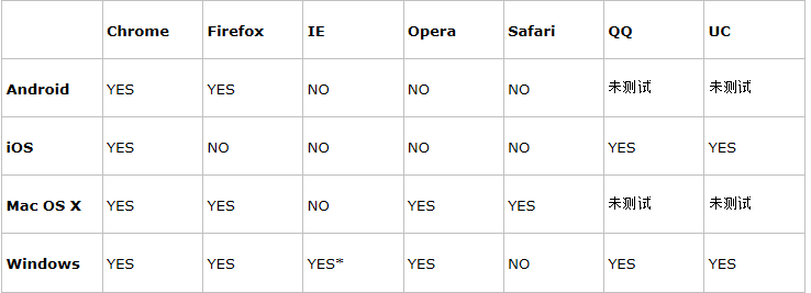
* Bootstrap 支持 Internet Explorer 8 及更高版本的 IE 浏覽器。
參考:http://www.runoob.com/bootstrap/bootstrap-css-overview.html
以上所述是小編給大家介紹的BootStrap入門教程(二)之固定的內置樣式,希望對大家有所幫助,如果大家有任何疑問請給我留言,小編會及時回復大家的。在此也非常感謝大家對網站的支持!