JS 檢測行動端橫豎屏
編輯:關於JavaScript
行動裝置旋轉螢幕時,若能即時切換橫豎屏樣式,使用者體驗會更好。最直接的方式是監聽 orientationchange 事件。
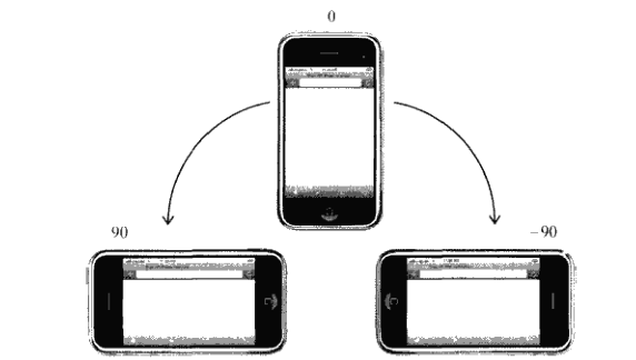
orientation 屬性
window.orientation 常見值為 0、90、-90。0 代表豎屏,90 與 -90 代表左右橫屏。
window.addEventListener("orientationchange", function () {
  var orientation = window.orientation;
  if (orientation === 90 || orientation === -90) {
    document.body.parentNode.setAttribute("class", "landscape");
  } else {
    document.body.parentNode.setAttribute("class", "portrait");
  }
}, false);
CSS 搭配
切換 class 後,就能用 CSS 分別控制橫豎屏樣式。
.portrait body div {
  background: red;
}

.landscape body div {
  background: blue;
}
相容性處理
部分裝置不支援 orientationchange,此時可用 resize 事件,比較 innerWidth 與 innerHeight 來判斷方向。
function updateOrientation() {
  var orientation = window.innerWidth > window.innerHeight ? "landscape" : "portrait";
  document.body.parentNode.setAttribute("class", orientation);
}

window.addEventListener("resize", updateOrientation, false);
實務上可先偵測是否支援 orientationchange,不支援時再退回 resize,兼顧相容性與準確度。
- 上一篇文章: JavaScript + Java 將 HTML 頁面轉存為 PDF
- 下一篇文章: Bootstrap Tab 頁籤切換實作