JS + CSS 打造帶淡入提示效果的豎向導航菜單
編輯:關於JavaScript
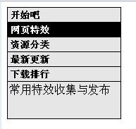
這是一款用 JS + CSS 做的另類豎向導航菜單,滑鼠懸停時會在下方淡入一段說明文字。整體結構不複雜,美工部分比較樸素,感興趣的朋友可以在視覺上繼續打磨。
運行效果截圖如下:
在線演示地址:
https://demo.jb51.net/js/2015/js-css-alert-txt-nav-menu-demo/
完整代碼
<html>
<head>
<title>帶提示的豎向導航菜單</title>
<style type="text/css">
#coolmenu { border: 1px solid black; width: 160px; background-color: #E6E6E6; }
#coolmenu a {
    font: bold 13px Verdana; padding: 2px; padding-left: 4px;
    display: block; width: 100%; color: black;
    text-decoration: none; border-bottom: 1px solid black;
}
html>body #coolmenu a { width: auto; }
#coolmenu a:hover { background-color: black; color: white; }
#tabledescription {
    width: 100%; height: 3em; padding: 2px;
    filter: alpha(opacity=0);
    -moz-opacity: 0;
}
</style>
<script type="text/javascript">
var baseopacity = 0;

function showtext(thetext){
    if (!document.getElementById) return
    textcontainerobj = document.getElementById("tabledescription")
    browserdetect = textcontainerobj.filters ? "ie"
                  : typeof textcontainerobj.style.MozOpacity == "string" ? "mozilla" : ""
    instantset(baseopacity)
    document.getElementById("tabledescription").innerHTML = thetext
    highlighting = setInterval("gradualfade(textcontainerobj)", 50)
}

function hidetext(){
    cleartimer()
    instantset(baseopacity)
}

function instantset(degree){
    if (browserdetect == "mozilla") textcontainerobj.style.MozOpacity = degree / 100
    else if (browserdetect == "ie") textcontainerobj.filters.alpha.opacity = degree
    else if (document.getElementById && baseopacity == 0)
        document.getElementById("tabledescription").innerHTML = ""
}

function cleartimer(){
    if (window.highlighting) clearInterval(highlighting)
}

// 逐步提升透明度,實現淡入
function gradualfade(cur2){
    if (browserdetect == "mozilla" && cur2.style.MozOpacity < 1)
        cur2.style.MozOpacity = Math.min(parseFloat(cur2.style.MozOpacity) + 0.2, 0.99)
    else if (browserdetect == "ie" && cur2.filters.alpha.opacity < 100)
        cur2.filters.alpha.opacity += 20
    else if (window.highlighting) clearInterval(highlighting)
}
</script>
</head>
<body>
<div id="coolmenu">
<a href="#" onMouseover="showtext('精品腳本代碼下載!')" onMouseout="hidetext()">開始吧</a>
<a href="#" onMouseover="showtext('常用特效收集與發布')" onMouseout="hidetext()">網頁特效</a>
<a href="#" onMouseover="showtext('網站地圖索引')" onMouseout="hidetext()">資源分類</a>
<a href="#" onMouseover="showtext('最新更新的資源')" onMouseout="hidetext()">最新更新</a>
<a href="#" onMouseover="showtext('網站最熱的下載')" onMouseout="hidetext()">下載排行</a>
<div id="tabledescription"></div>
</div>
</body>
</html>
淡入是怎麼做出來的
核心在 gradualfade:用 setInterval 每 50 毫秒把透明度往上加一點,直到接近完全不透明時清除定時器,於是文字就「漸顯」出來了。滑鼠移出時調用 hidetext,先清掉定時器再把透明度歸零,避免動畫疊加。
代碼裡針對 IE 的 filters.alpha.opacity 與早期 Firefox 的 MozOpacity 分別做了判斷,這是那個「多瀏覽器大戰」年代的必要功課。今天只需一行 element.style.opacity 加 CSS transition: opacity .3s 就能完成同樣的效果,甚至連 JS 都可以省下來。
希望本文所述對大家的 JavaScript 程序設計有所幫助。
- 上一篇文章: JavaScript 實現當前菜單高亮顯示的導航條
- 下一篇文章: 用 Cookie 記錄當前位置:刷新後狀態不丟的導航菜單