用 JavaScript 實作 3D 環形圖片旋轉展示
編輯:關於JavaScript
本文分享一段以 JavaScript 完成的 3D 環形圖片旋轉展示效果。為了讓示範載入更快,範例把圖片暫時替換成數字方塊,並預留了圖片位置——熟悉 HTML 的人只要把 <div class="item"> 裡換成 <img> 即可。旋轉採手動控制,每按一次轉一格,操作起來相當直觀。
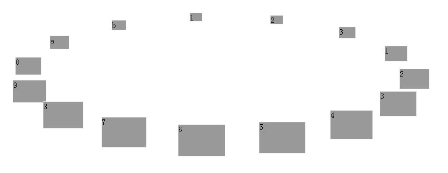
線上示範:https://demo.jb51.net/js/2015/js-3d-pic-scroll-show-style-codes/
用三角函數排出圓環
3D 的錯覺其實全靠 sin 與 cos。每個項目在圓環上的角度是 r * i,其中 r 是「整圈 2π 除以項目數」:
var showerWidth = 800, showerHeight = 400;

window.onload = function(){
  showerObj = document.getElementById("show");
  listObj = showerObj.getElementsByTagName("div");
  len = listObj.length;
  r = Math.PI / 180 * 360 / len;        // 每格的弧度

  for (var i = 0; i < len; i++){
    var item = listObj[i];
    item.style.top  = showerHeight/2 + Math.sin(r*i) * showerWidth/2 - 20 + "px";
    item.style.left = showerWidth/2  + Math.cos(r*i) * showerWidth/2 - 30 + "px";
    item.rotate = (r*i + 2*Math.PI) % (2*Math.PI);
    item.onclick = function(){
      cR = Math.PI/2 - this.rotate;     // 點誰就把誰轉到正前方
      timer || (timer = setInterval(rotate, 10));
    };
  }
  ...
}
減去 20 與 30 是因為方塊高 40、寬 60,要把左上角座標換成中心座標對齊。
用透視與縮放強化立體感
真正讓它「像 3D」的是迴轉時的縮放與層級:位於圓環後方的項目比較小、z-index 較低,前方的比較大、蓋在上面。
var rotate = function(){
  ccR = (ccR + 2*Math.PI) % (2*Math.PI);
  if (cR - ccR < 0) cR = cR + 2*Math.PI;
  if (cR - ccR < Math.PI) ccR = ccR + (cR - ccR)/19;    // 順時針逼近
  else                    ccR = ccR - (2*Math.PI + ccR - cR)/19;

  if (Math.abs((cR+2*Math.PI)%(2*Math.PI) - (ccR+2*Math.PI)%(2*Math.PI)) < Math.PI/720){
    ccR = cR; clearInterval(timer); timer = 0;           // 精度夠了才停
  }

  for (var i = 0; i < len; i++){
    var item = listObj[i], w, h;
    var sinR = Math.sin(r*i + ccR), cosR = Math.cos(r*i + ccR);
    w = 60 + 0.6 * 60 * sinR;                 // 前方放大、後方縮小
    h = 40 + 0.6 * 40 * sinR;
    item.style.cssText += ";width:"+w+"px;height:"+h+"px;" +
      "top:"+parseInt(showerHeight/2 + sinR*showerWidth/2/3 - w/2)+"px;" +
      "left:"+parseInt(showerWidth/2 + cosR*showerWidth/2 - h/2)+"px;" +
      "z-index:"+parseInt(showerHeight/2 + sinR*showerWidth/2/3 - w/2)+";";
  }
}
幾個值得留意的細節:sinR 同時決定了大小、高度與 z-index,三者連動才有透視感;cR - ccR 與 2π 的差值判斷負責決定要往哪個方向旋轉(走哪邊比較近);而除以 19 的逼近方式讓轉速自然減衰,最後再用 Math.PI/720 這個高精度門檻收尾並清除計時器,避免無限loop。
左右按鈕
document.getElementById("l").onclick = function(){
  cR = (cR + r + 2*Math.PI) % (2*Math.PI);
  timer || (timer = setInterval(rotate, 10));
}
document.getElementById("r").onclick = function(){
  cR = (cR - r + 2*Math.PI) % (2*Math.PI);
  timer || (timer = setInterval(rotate, 10));
}
rotate();
timer || (timer = setInterval(...)) 這個寫法很聰明:確保同一時間只有一個計時器在跑,連點不會疊加加速。
延伸方向
想再進一階,可以把 style.cssText += 的累加寫法改成個別屬性賦值(累加會讓 inline style 越來越長),並改用 CSS3 的 transform: rotateY() 搭配 perspective,程式碼量能少掉一大半,效果還更順。
- 上一篇文章: 同一頁放兩組滑動門與 Tab 選項卡的解法
- 下一篇文章: JS + CSS 實作帶小三角指引的滑動門