產品類網站的分類往往有兩三層,用一般下拉選單會顯得單調。本文這份菜單像抽屜一樣一層層拉開:滑過主類別時右側滑出次類別,次類別若還有子項,再往右展開第三層,滑鼠移出整個區域後全部收回。以 JavaScript 負責狀態切換、CSS 負責背景拼接,是練習多層選單相當完整的範例。
執行結果如下:
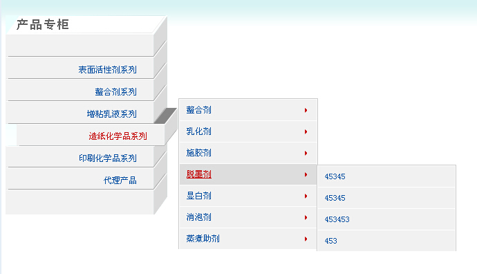
線上展示:https://demo.jb51.net/js/2015/js-ct-style-product-web-nav-menu-codes/
三層各由一組函式負責
程式分成幾個部分,每層都有成對的「進入」與「離開」函式:
selectturns 處理第一層。它同時設定八個主項目的 class(this/this2 表示展開狀態、bg02 表示一般狀態),並控制 p1~p6 六個次層面板的 display。selectturnsout 則是對外的統一復原,把主項目全部設回 bg02、所有面板設回 none。
selectturns2 與 selectturns3 負責第二層:前者處理 b1~b5 這組子項與 s1~s5 面板,後者在保持主項目展開的前提下切換 s 系列面板,也就是「不收起抽屜,只換抽屜裡的內容」。
selectturns4 與 selectturns5 則是第三層,分別對應 z1~z7 與 w1~w7。三層之間靠 setturnsout 統一收合,避免滑鼠移出後殘留展開狀態。
CSS 如何拼出抽屜
主項目用 cpzg.gif 以 repeat-y 鋪出垂直底紋,再用 background-position 的位移切出一般態(0 -32px)、展開態(0 -61px)與收合態(0 -91px)。展開時寬度從 234px 撐到 250px,營造「拉出來」的錯覺。次層 .p_son 用 position: absolute 定位在 left: 250px,第三層 .s_son 則是 left: 450px,一層往右推 200px,層級關係就出來了。
每個面板的 top 值都寫死在樣式表裡,例如 #p1 是 36px、#p2 是 68px,間距 32px 剛好等於一個項目的高度。這種做法對齊精準但擴充不易,新增分類時必須手動補 top 值。
核心樣式
<style type="text/css">
body{margin:0;padding:0;background:url(images/search_bg.gif) repeat-x;font-size:12px;}
ul,li{margin:0;padding:0;list-style:none;}
.link_box{width:240px;background:url(images/search_bg.gif) repeat-x;padding-bottom:20px;height:295px;}
.link_box .prdct{width:234px;margin-top:15px;float:right;position:relative;}
.link_box .prdct p{position:absolute;background:url(images/cpzg.gif) repeat-y;
  height:32px;line-height:30px;width:234px;}
.link_box .prdct p a{display:block;height:32px;width:190px;padding-right:44px;
  text-align:right;color:#004FA3;text-decoration:none;cursor:pointer;}
.link_box .prdct p.bg02{background-position:0 -32px;}
.link_box .prdct p.this{background-position:0 -61px;width:250px;}
.link_box .prdct p.this2{background-position:0 -91px;width:250px;}
#t2{top:32px;} #t3{top:64px;} #t4{top:96px;} #t5{top:128px;}
#t6{top:160px;} #t7{top:192px;} #t8{top:224px;}
.prdct .p_son{width:200px;background:#F1F1F1;border:1px solid #cbcbcb;
  border-bottom:none;position:absolute;left:250px;display:none;}
.p_son li,.s_son li{height:30px;line-height:30px;border-bottom:1px solid #cbcbcb;text-align:left;}
.p_son li a,.s_son li a{color:#004FA3;text-decoration:none;display:block;width:188px;
  height:30px;padding-left:10px;overflow:hidden;white-space:nowrap;text-overflow:ellipsis;}
.p_son li a.jt{background:url(images/001_14.gif) no-repeat 180px 50%;}
.p_son li.on{background:url(images/001_14.gif) no-repeat 180px 50% #ddd;}
#p1,#s1{top:36px;} #p2,#s2{top:68px;} #p3,#s3{top:100px;} #p4,#s4{top:132px;}
.prdct .s_son{left:450px;}   /* 第三層再往右推 200px */
</style>
核心腳本(以第一、二層為例)
<script type="text/javascript">
// 第一層:展開對應主項目並顯示次層面板
function selectturns(i){
  for (var n = 2; n <= 8; n++) {
    document.getElementById("t" + n).className = "bg02";
  }
  document.getElementById("t" + (i + 1)).className = "this";
  document.getElementById("t" + (i + 2)).className = "this2";
  for (var n = 1; n <= 6; n++) {
    document.getElementById("p" + n).style.display = (n == i) ? "block" : "none";
  }
}
// 第二層:在不收起抽屜的前提下切換 s 系列面板
function selectturns2(i){
  for (var n = 1; n <= 5; n++) {
    document.getElementById("b" + n).className = (n == i) ? "on" : "";
    document.getElementById("s" + n).style.display = (n == i) ? "block" : "none";
  }
}
// 滑鼠移出:全部復原
function selectturnsout(){
  for (var n = 2; n <= 8; n++) { document.getElementById("t" + n).className = "bg02"; }
  for (var n = 1; n <= 6; n++) { document.getElementById("p" + n).style.display = "none"; }
  for (var n = 1; n <= 5; n++) { document.getElementById("s" + n).style.display = "none"; }
  for (var n = 1; n <= 7; n++) { document.getElementById("w" + n).style.display = "none"; }
}
</script>
<div class="link_box">
 <div class="prdct">
  <p class="bg02" id="t3" onmouseover="selectturns(1)" onmouseout="selectturnsout()">
   <a href="#">表面活性劑系列</a></p>
  <p class="bg02" id="t4" onmouseover="selectturns(2)" onmouseout="selectturnsout()">
   <a href="#">螯合劑系列</a></p>
  <div class="p_son" id="p1" onmouseover="selectturns(1)" onmouseout="selectturnsout()">
   <ul>
    <li id="b1" onmouseover="selectturns2(1)"><a href="#" class="jt">功能性表面活性劑</a></li>
    <li id="b2" onmouseover="selectturns2(2)"><a href="#" class="jt">陽離子表面活性劑</a></li>
   </ul>
  </div>
  <div class="p_son s_son" id="s1" onmouseover="selectturns2(1)">
   <ul><li><a href="#">子項範例</a></li></ul>
  </div>
 </div>
</div>
這份範例值得學與可以更好的地方
值得學的是分層職責的切分:每一層各自一組函式,滑鼠移出統一由 selectturnsout 復原,思維清楚。可以改進的是原版的 switch 寫法極度冗長,每個 case 都要逐一設定十幾個元素,實際上完全可以改寫成上面那樣的迴圈;另外所有位置都寫死在 CSS 裡,資料一多就很難維護,改用巢狀 ul 並以 li:hover 控制顯示會彈性得多。若要支援觸控裝置,也建議把 onmouseover 換成 onclick 並加上「點擊空白處收合」的處理。
- 上一篇文章: 不規則造型的 TAB 選項卡:把方正邊角換成圓角的實作
- 下一篇文章: 用純JS+CSS打造帶碰撞緩衝動效的豎向導航選單