JS中使用media實現響應式布局
編輯:JavaScript技巧
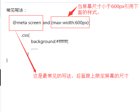
常見寫法:
下面總結常見的響應式布局的分類:
@media screen and (max-width:320px){
 #talkFooter .editArea{…… }
}
@media screen and (min-width:321px) and (max-width:375px){
  #talkFooter .editArea{…… }
}
@media screen and (min-width:376px) and (max-width:414px){
 #talkFooter .editArea{…… }
}
@media screen and (min-width:415px) and (max-width:639px){
 #talkFooter .editArea{……}
}
@media screen and (min-width:640px) and (max-width:719px){
 #talkFooter .editArea{……}
}
@media screen and (min-width:720px) and (max-width:749px){
 #talkFooter .editArea{……}
}
@media screen and (min-width:750px) and (max-width:799px){
 #talkFooter .editArea{……}
}
@media screen(min-width:800px){}
總結
以上所述是小編給大家介紹的JS中使用media實現響應式布局,希望對大家有所幫助,如果大家有任何疑問請給我留言,小編會及時回復大家的。在此也非常感謝大家對網站的支持!
小編推薦
熱門推薦