拋磚引玉之寬度自適應布局
什麼是寬度自適應布局呢?
就是當浏覽器窗口大小改變時,浏覽器裡的元素寬度也隨之改變,從而達到自適應布局。
常見的寬度自適應布局有:
1、 兩列:左邊寬度不變,右邊寬度自適應
2、 三列:左右兩邊寬度不變,中間部分自適應
3、 三列:左右兩邊寬度自適應,中間部分不變
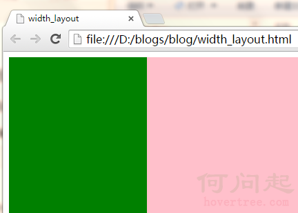
一、利用div+css實現以上“自適應布局”(1)兩列:左邊寬度固定,右邊寬度自適應
利用div+float+margin,已在隨筆‘float剖析’中講解,具體代碼和效果圖見下:


<!DOCTYPE html>
    <head>
        <title>width_layout</title>
        <meta http-equiv="Content-Type" content="text/html; charset=gb2312"/>
        <style type="text/css">
            .content {
                min-width:300px;
            }
            .div1 {
                width:200px;
                height:300px;
                background:green;
                float:left;
            }
            .div2 {
                height:300px;
                background:pink;
                margin-left:200px;
            }
        </style>
    </head>
    <body>

        <div class="content">
            <div class="div1"></div>
            <div class="div2"></div>
        </div>

    </body>
</html>
View Code
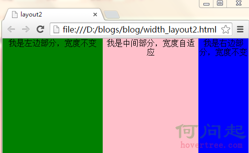
(2)三列:左右兩列寬度固定,中間部分自適應
思路:將左右兩列分別設置為左浮動和右浮動,中間的列寬度不管,將它的margin-left和margin-right設置為與左右兩列的固定寬度一致。
具體代碼和效果圖見下:
<!DOCTYPE html>
    <head>
        <title>layout2</title>
        <meta http-equiv="Content-Type" content="text/html; charset=gb2312"/>
        <style>
            * {
                margin:0;
                padding:0;
            }
            .main {
                height:300px;
                width:100%;
                min-width:400px;
            }
            .main_left {
                height:300px;
                width:200px;
                float:left;
                background-color:green;
                text-align:center;
            }
            .main_center {
                height:300px;
                margin-left:200px;
                margin-right:100px;
                text-align:center;
                background-color:pink;
            }
            .main_right {
                height:300px;
                width:100px;
                float:right;
                text-align:center;
                background-color:blue;
            }
        </style>
    </head>
    <body>
        <div class="main">
            <div class="main_left">我是左邊部分,寬度不變</div>
            <div class="main_right">我是右邊部分,寬度不變</div>
            <div class="main_center">
                我是中間部分,寬度自適應
            </div>
        </div>
    </body>
</html>
View Code
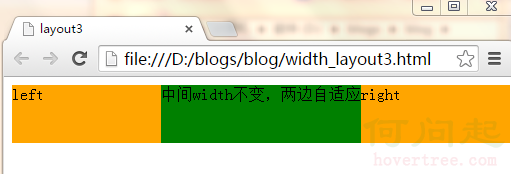
(3)三列:左右兩列寬度自適應,中間列寬度固定不變
思路:倘若左右兩列寬度一樣,左右兩列將其寬度各設置為父元素的50%,然後再將左右兩列的margin-left設置為中間列固定寬度的一半,然後將這三列都左浮動,就ok了。
具體代碼及效果見下:
<!DOCTYPE html>
    <head>
        <title>layout3</title>
        <meta http-equiv="Content-Type" content="text/html; charset=gb2312"/>
        <style>
            body {
                min-width:500px;
            }
            #left,
            #right {
                float: left;
                margin: 0 0 0 -101px;
                width: 50%;
                height:58px;
                *width: 49.9%;
            }

            #main {
                width: 200px;
                height:58px;
                float: left;
                background: green;
            }
            .inner {
                height: 100%;
            }

            #left .inner,
            #right .inner {
                margin: 0 0 0 101px;
                background: orange;
            }
        </style>
    </head>
    <body>
        <div id="left">
            <div class="inner">left</div>
        </div>
        <div id="main">
            <div class="inner">中間width不變,兩邊自適應</div>
        </div>
        <div id="right">
            <div class="inner">right</div>
        </div>
    </body>
</html>
View Code
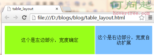
由於table自帶一些特性,所以實現以上三種布局,比較容易。
在這裡用到的table特性就是文字自動垂直居中,當不設置td的寬度width時,浏覽器自動渲染。
(1)兩列:左邊寬度固定,中間部分自適應
<!DOCTYPE html>
    <head>
        <meta http-equiv="Content-Type" content="text/html; charset=gb2312"/>
        <title>table_layout</title>
        <style>
            .m_table {
                width:100%;
                height:100px;
                text-align:center;
            }
            .left_td {
                width:300px;
                background-color:#98FF1A;
            }
            .right_td {

                background-color:#7CC0FF;
            }
        </style>
    </head>
    <body>
        <table class="m_table">
            <tr>
                <td class="left_td">這個是左邊部分,寬度確定</td>
                <td class="right_td">這個是右邊部分,寬度自動擴展</td>
            </tr>
        </table>
    </body>
</html>
View Code
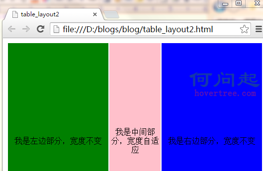
(2)三列:左右兩列寬度固定,中間部分自適應
<!DOCTYPE html>
    <head>
        <meta http-equiv="Content-Type" content="text/html; charset=gb2312"/>
        <title>table_layout2</title>
        <style>
        .m_table {
            width:100%;
            height:400px;
            text-align:center;
        }
        .left_td {
            width:200px;
            height:300px;
            min-width:200px;
            background-color:green;
        }
        .center_td {
            height:300px;
            background-color:pink;
        }
        .right_td {
            width:200px;
            height:300px;
            min-width:200px;
            background-color:blue;
        }
    </style>
    </head>
    <body>
        <table class="m_table">
            <tr>
                <td class="left_td">我是左邊部分,寬度不變</td>
                <td class="center_td">我是中間部分,寬度自適應</td>
                <td class="right_td">我是右邊部分,寬度不變</td>
            </tr>
        </table>
    </body>
</html>
View Code
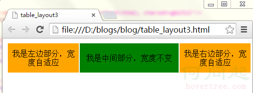
(3)左右兩列寬度自適應,中間列寬度固定不變
<!DOCTYPE html>
    <head>
        <meta http-equiv="Content-Type" content="text/html; charset=gb2312"/>
        <title>table_layout3</title>
        <style>
        .m_table {
            width:100%;
            min-width:500px;
            height:58px;
            text-align:center;
        }
        .left_td {
            height:58px;
            background-color:orange;
        }
        .center_td {
            height:58px;
            width:200px;
            background-color:green;
        }
        .right_td {
            height:58px;
            background-color:orange;
        }
        </style>
    </head>
    <body>
        <table class="m_table">
            <tr>
                <td class="left_td">我是左邊部分,寬度自適應</td>
                <td class="center_td">我是中間部分,寬度不變</td>
                <td class="right_td">我是右邊部分,寬度自適應</td>
            </tr>
        </table>
    </body>
</html>
View Code
對於這兩個概念的區別以及優劣勢,網站建設的設計師和SEO者已經是再熟悉不過了,眾所周知DIV+CSS的優勢,也都清楚table布局已經趨於淘汰,現在極少數人會使用table去建網站了。對於二者的區別,網上早有大量的文章,在下就列舉幾點談談。
1、 table結構的網站是按照表格一格一格的打開的速度很慢;DIV+CSS結構的網站打開速度快。
2、 div+css的網站適合百度蜘蛛爬行。可以這麼說,百度蜘蛛喜歡div+css結構的站,不喜歡table結構的站,因為後者爬起來太費勁。
3、 table結構的站,架構過於單調,一眼看去就顯得方方框框的感覺,如果想實現圓潤或者流線的效果,必須繪制大量的邊框圖片。而div+css的站,樣式及其豐富,可以利用結構做出豐富的效果。
4、 table結構的站,頁面樣式都在頁面代碼裡面,不但代碼冗余,可讀性和再次開發性差,而且修改起來麻煩;Div+css的結構,結構與樣式分離,可讀性和二次修改都極其方便。
- 上一頁:BFC之寬度自適應布局篇
- 下一頁:css3中的動畫功能