借助 CSS3 的 border-radius、transform、漸變等特性,我們可以純手工繪製出多種幾何圖形。下面從圓形開始,逐一動手實現。
1. 圓形
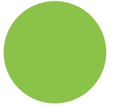
思路:給任意正方形元素設一個足夠大的 border-radius,就能變成圓形。
<div class="size example1"></div>
.size{ width:200px; height: 200px; background: #8BC34A; } .example1{ border-radius:100px; }
2. 自適應橢圓
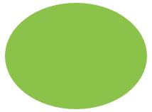
思路:border-radius 除了接受長度值,還接受百分比。百分比會基於元素尺寸解析,意味著相同的百分比在不同尺寸下會算出不同的水平與垂直半徑。
<div class="example3"></div>
.example3{ width:200px; height: 150px; border-radius:50%; background: #8BC34A; }
3. 自適應半橢圓(沿橫軸劈開)
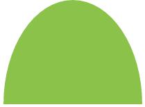
思路:border-radius 其實是簡寫屬性,對應四個展開式:border-top-left-radius、border-top-right-radius、border-bottom-right-radius、border-bottom-left-radius。我們甚至能為四個角提供不同的水平與垂直半徑,方法是在斜槓前後各指定 1~4 個值。例如 border-radius:10px / 5px 20px 等同於 10px 10px 10px 10px / 5px 20px 5px 20px。
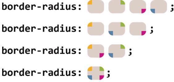
<div class="example4"></div>
.example4{ width:200px; height: 150px; border-radius: 50% / 100% 100% 0 0; background: #8BC34A; }
4. 自適應半橢圓(沿縱軸劈開)
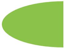
<div class="example5"></div>
.example5{ width:200px; height: 150px; border-radius: 100% 0 0 100% / 50%; background: #8BC34A; }
5. 四分之一橢圓
思路:一個角的水平與垂直半徑都設為 100%,其餘三角都不設圓角。
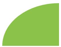
<div class="example6"></div>
.example6{ width:160px; height: 100px; border-radius: 100% 0 0 0; background: #8BC34A; }
6. 用橢圓繪製 Opera 瀏覽器 Logo

思路:Logo 只有兩層——最底部的橢圓與最上層的橢圓。量得外層水平寬 258px、垂直高 275px,四角均為水平半徑 258px、垂直半徑 275px 的橢圓;內層橢圓四角均為水平半徑 112px、垂直半徑 231px。
<div class="opera"> <div class="opera-top"></div> </div>
.opera{ width:258px; height: 275px; background: #F22629; border-radius:258px 258px 258px 258px /275px 275px 275px 275px; position: relative; } .opera-top{ width: 112px; height: 231px; background: #FFFFFF; border-radius: 112px 112px 112px 112px/231px 231px 231px 231px; position: absolute; left: 50%; right: 50%; top: 50%; bottom: 50%; margin-left: -56px; margin-top: -115px; }
7. 平行四邊形
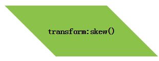
思路(偽元素方案):把所有樣式(背景、邊框等)套到偽元素上,再對偽元素變形。由於內容不在偽元素裡,內容就不受變形影響。
<div class="button">transform:skew()</div>
.button { width:200px; height: 100px; position: relative; left: 100px; line-height: 100px; text-align: center; font-weight: bolder; }
.button::before {
    content: ''; /* 用偽元素生成一個矩形 */
 position: absolute;
 top: 0; right: 0; bottom: 0; left: 0;
 z-index: -1;
 transform: skew(45deg);
 background: #8BC34A;
}
技巧總結:這招不僅對 skew() 有用,也適用於任何變形樣式——當我們想變形元素本身卻不想動到內容時就能派上用場。
8. 菱形
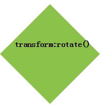
思路:把上一招針對 rotate() 稍作調整,用到正方形上就能得到菱形。
<div class="example1">transform:rotate()</div>
.example1 { width:140px; height: 140px; position: relative; left: 100px; line-height: 100px; text-align: center; font-weight: bolder; } .example1::before { content: ''; position: absolute; top: 0; right: 0; bottom: 0; left: 0; z-index: -1; transform: rotate(45deg); background: #8BC34A; }
技巧總結:關鍵在於利用偽元素與定位產生一個方塊,對偽元素設樣式並置於宿主元素下層。這思路還能運用到其他場景。
9. 菱形圖片
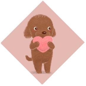
思路:基於變形方案,我們希望圖片寬度等於容器對角線而非邊長。由勾股定理,正方形對角線等於邊長乘以根號 2(約 1.414)。因此把 max-width 設為約 142% 較合理(向上取整,避免捨入導致圖片偏小)。
<div class="picture"> <img src="./imgs/7.jpg"> </div>
.picture { width: 200px; transform: rotate(45deg); overflow: hidden; margin: 50px; } .picture img { max-width: 100%; transform: rotate(-45deg) scale(1.42); z-index: -1; position: relative; }
技巧總結:保留 width 為 100%,可在瀏覽器不支援變形時仍得到合理布局;用 scale() 縮放是以中心點為原點,用 width 放大則以左上角為原點,需靠負外邊距校正位置。
10. 切角效果
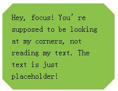
思路:基於 linear-gradient(),把四個角都做出切角,需要四層漸變圖案。
<div class="example2">Hey, focus! You're supposed to be looking at my corners, not reading my text. The text is just placeholder!</div>
.example2{ background: #8BC34A; background: linear-gradient(135deg, transparent 15px, #8BC34A 0) top left, linear-gradient(-135deg, transparent 15px, #8BC34A 0) top right, linear-gradient(-45deg, transparent 15px, #8BC34A 0) bottom right, linear-gradient(45deg, transparent 15px, #8BC34A 0) bottom left; background-size: 50% 50%; background-repeat: no-repeat; padding: 1em 1.2em; max-width: 12em; line-height: 1.5em; }
11. 弧形切角
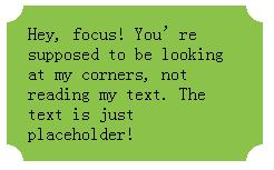
思路:上述漸變技巧的變種,用徑向漸變取代線性漸變,即可做出「內凹圓角」效果。
<div class="example3">Hey, focus! You're supposed to be looking at my corners, not reading my text. The text is just placeholder!</div>
.example3{ background: #8BC34A; background: radial-gradient(circle at top left, transparent 15px, #8BC34A 0) top left, radial-gradient(circle at top right, transparent 15px, #8BC34A 0) top right, radial-gradient(circle at bottom right, transparent 15px, #8BC34A 0) bottom right, radial-gradient(circle at bottom left, transparent 15px, #8BC34A 0) bottom left; background-size: 50% 50%; background-repeat: no-repeat; padding: 1em 1.2em; max-width: 12em; }
12. 簡單的餅圖
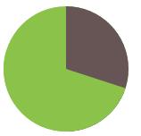
思路:基於 transform。用一個 rotate() 讓偽元素轉起來,要顯示 20% 就把旋轉值設為 72deg(0.2×360),寫成 .2turn 更直觀。
<div class="pie"></div>
.pie{ width:140px; height: 140px; background: #8BC34A; border-radius: 50%; background-image: linear-gradient(to right,transparent 50%,#655 0); } .pie::before{ content: ''; display: block; margin-left: 50%; height: 100%; border-radius: 0 100% 100% 0 / 50%; background-color: inherit; transform-origin: left; transform: rotate(.1turn);/*10%*/ transform: rotate(.2turn);/*20%*/ transform: rotate(.3turn);/*30%*/ }
提示:turn 是圈,1turn=360deg;另有弧度 rad,2πrad=1turn=360deg,如 transform:rotate(2turn) 表示旋轉兩圈。
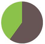
此法在顯示 0~50% 時運作良好,但顯示 60% 時會出問題。解法是用反向版本:設一個深色偽元素,讓它在 0~0.5turn 範圍旋轉。要得到 60% 的餅圖:
<div class="pie2"></div>
.pie2{ width:140px; height: 140px; background: #8BC34A; border-radius: 50%; background-image: linear-gradient(to right,transparent 50%,#655 0); } .pie2::before{ content: ''; display: block; margin-left: 50%; height: 100%; border-radius: 0 100% 100% 0 / 50%; background: #655;/*當範圍大於50%時,需把偽元素背景改為 #655*/ transform-origin: left; transform: rotate(.1turn); }
再用 CSS 動畫實現從 0 到 100% 的進度指示器:
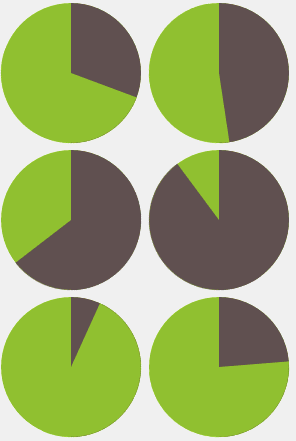
<div class="pie3"></div>
.pie3 { width:140px; height: 140px; border-radius: 50%; background: yellowgreen; background-image: linear-gradient(to right, transparent 50%, currentColor 0); color: #655; } .pie3::before { content: ''; display: block; margin-left: 50%; height: 100%; border-radius: 0 100% 100% 0 / 50%; background-color: inherit; transform-origin: left; animation: spin 3s linear infinite, bg 6s step-end infinite; } @keyframes spin { to { transform: rotate(.5turn); } } @keyframes bg { 50% { background: currentColor; } }
- 上一篇文章: CSS 的三種引入方式與基本語法
- 下一篇文章: CSS 實現 ul li 橫向排列的兩種方法