盒子置中可分為水平與垂直兩部分。水平置中只要 margin: 0 auto 就能解決,垂直置中則相對複雜。以下從零開始,逐步示範三種做法。
準備一個待置中的元素
<!DOCTYPE html>
<html lang="en">
<head>
<meta charset="UTF-8">
<title>index</title>
<style>
.content {
  width: 300px;
  height: 300px;
  background: orange;
}
</style>
</head>
<body>
<div class="content"></div>
</body>
</html>
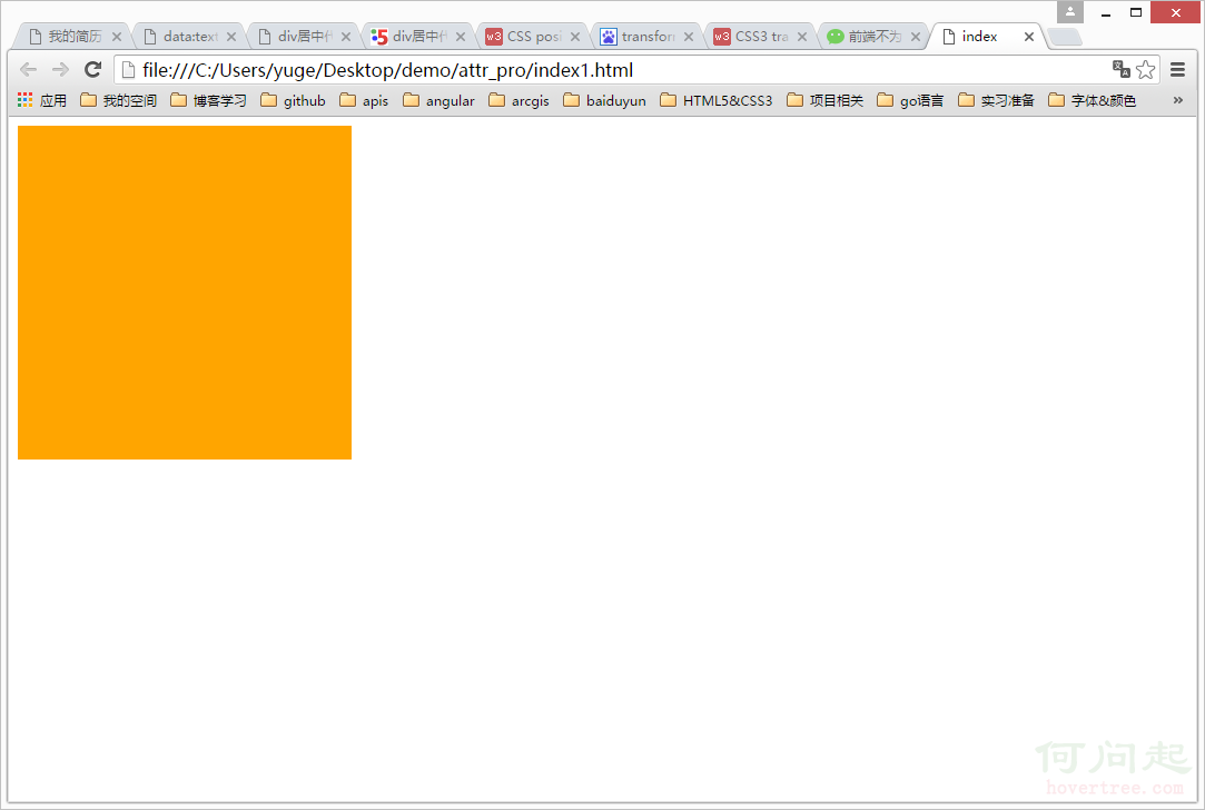
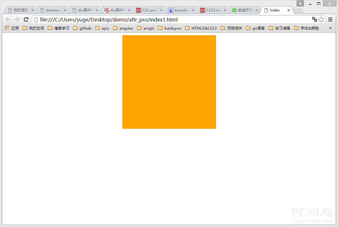
第一步:先完成水平置中
.content {
  width: 300px;
  height: 300px;
  background: orange;
  margin: 0 auto;
}
第二步:準備垂直置中的前提條件
在動手之前,必須先讓 html 與 body 具備實際高度,同時清除預設樣式。因為 body 預設高度為 0,若不先撐開,任何以百分比為基準的垂直計算都會失效;若不清除 margin,畫面還會出現 scrollbar。
html, body {
  width: 100%;
  height: 100%;
  margin: 0;
  padding: 0;
}

.content {
  width: 300px;
  height: 300px;
  background: orange;
  margin: 0 auto; /* 水平居中 */
}
第三步:讓元素脫離文檔流
top 屬性可以讓元素產生垂直位移,但在普通文檔流中元素位置由排列規則決定,直接寫 top 不會有效果。因此需要先用 position 讓它脫離文檔流:
.content {
  width: 300px;
  height: 300px;
  background: orange;
  margin: 0 auto;
  position: relative; /* 脫離文檔流以便使用 top */
}
此時畫面不變,這是正常的——只是拿到了位移的能力,還沒開始位移。
第四步:下移 50%
.content {
  width: 300px;
  height: 300px;
  background: orange;
  margin: 0 auto;
  position: relative;
  top: 50%;
}
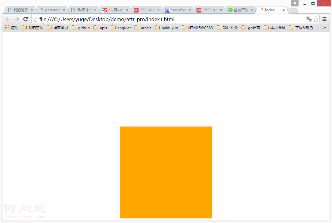
如圖所示,元素明顯偏下。原因是 top: 50% 對齊的是「元素的頂邊」到中線,而不是元素中心。
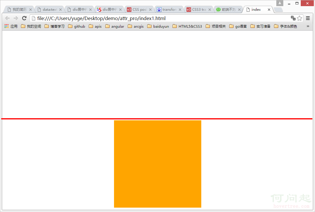
畫一條水平中線來看就很清楚:只要把元素往上推「自身高度的一半」,中心就會落在中線上。
第五步:用負 margin 回推
.content {
  width: 300px;
  height: 300px;
  background: orange;
  margin: 0 auto;
  position: relative;
  top: 50%;
  margin-top: -150px;
}
元素高 300px,一半就是 150px。之所以是負值,是因為我們需要向上位移。
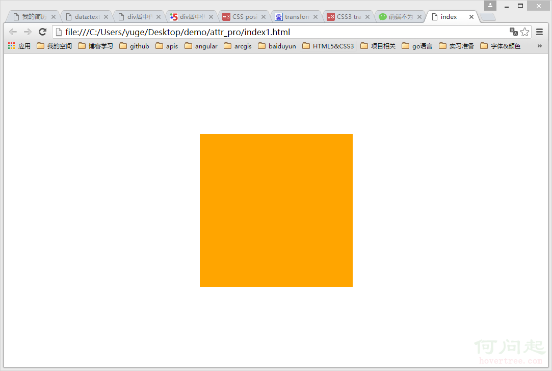
成功置中。這個方法的缺點是需要手動計算高度的一半,尺寸一變就得重算。
替代做法:用 transform 取代負 margin
.content {
  width: 300px;
  height: 300px;
  background: orange;
  margin: 0 auto;
  position: relative;
  top: 50%;
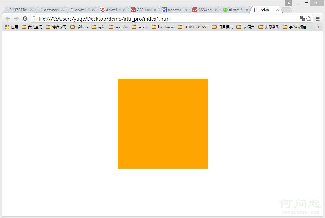
  transform: translateY(-50%);
}
translateY(-50%) 的意思是向上平移「自身高度」的 50%。由於百分比以元素自身尺寸為基準,無論元素多高都能正確置中,不必再動算數字。
最簡潔的做法:Flex 佈局
html, body {
  width: 100%;
  height: 100%;
  margin: 0;
  padding: 0;
}

body {
  display: flex;
  align-items: center;     /* 垂直居中 */
  justify-content: center; /* 水平居中 */
}

.content {
  width: 300px;
  height: 300px;
  background: orange;
}
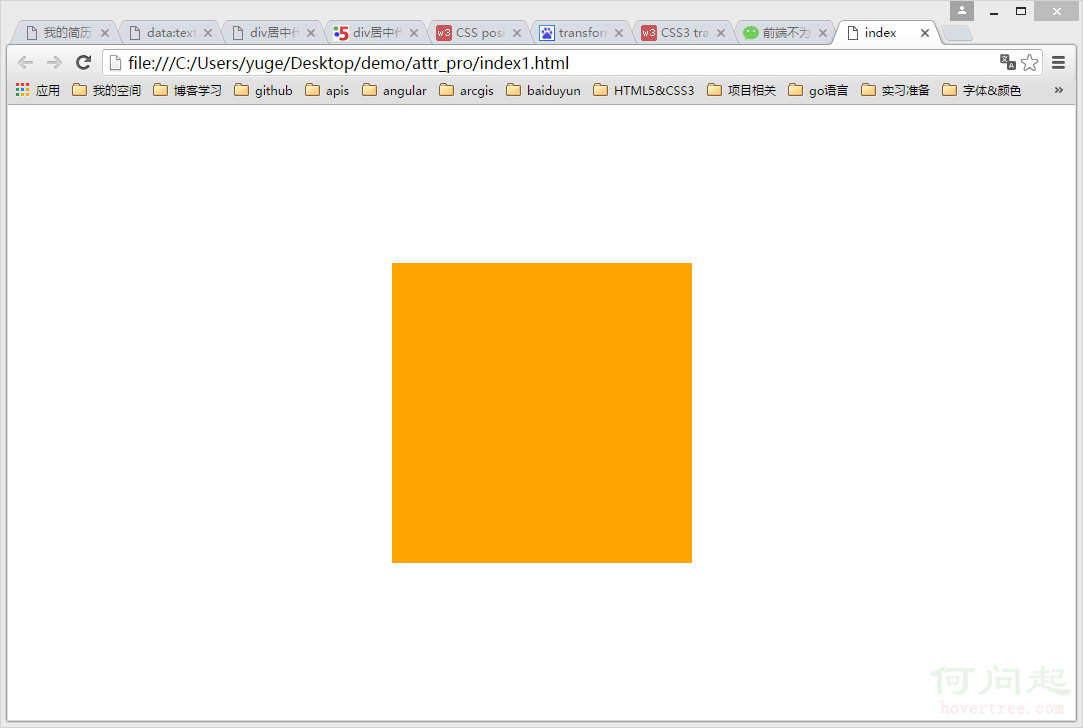
只要把父層設為 flex 容器,兩個方向各一行屬性就搞定,完全不需要 position、負 margin 或任何計算。
還有一種不推薦的做法
把父層設為 display: table、子層設為 display: table-cell,再搭配 vertical-align 也能置中。但它會改變元素的佈局行為,容易破壞既有樣式,維護成本反而更高——如果真的想用表格佈局,不如直接用 table 標籤還單純些。
選擇建議
新專案直接用 Flex;需要相容舊版 IE 時,用「top: 50% + transform: translateY(-50%)」;若連 transform 都不支援,才退回負 margin 手算。理解每種方法的限制,比記住單一寫法更有價值。
- 上一篇文章: 用 CSS3 伸縮盒讓圖片垂直置中
- 下一篇文章: CSS 選擇器的優先權