提示:如果你覺得本篇實現的彈窗效果不錯,歡迎持續關注。後續我會不斷追加新效果,並將其封裝成插件,讓調用變得更加省心。
CSS3的三大利器
CSS3為開發者帶來了過渡、動畫與變形這三種特殊效果的處理方式。當使用者與介面元素互動時,善用這些樣式能顯著提升體驗;而且它們由瀏覽器引擎直接處理,可以節省不少開銷。不過也要留意,這些效果本身相當耗費運算資源,在結構複雜的網頁上尤其明顯,哪怕只是最基礎的效果也一樣。本文的目的只是帶大家熟悉這三種特性,並不建議在正式專案裡大面積鋪開使用。
溫馨提醒:請審慎、克制地使用這些特殊效果。
另一方面,在CSS3標準化之前,主流瀏覽器都是靠添加廠商前綴來提供支援的。因此為了兼顧相容性,我們往往要為同一個屬性寫上一長串前綴。以過渡延遲屬性transition-delay為例,就不得不這樣寫:
-webkit-transition-delay: 300ms; -o-transition-delay: 300ms; -moz-transition-delay: 300ms; -ms-transition-delay: 300ms; transition-delay: 300ms;
代碼量陡增,可讀性也隨之下降。
最終效果預覽
先來看看最終呈現的效果:
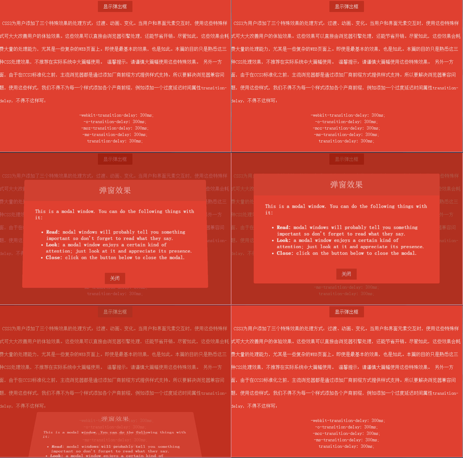
效果並不算複雜,主要包含以下幾點:
窗口透明度從最初的0漸變到1。
窗口位置由瀏覽器底部漸變到居中位置。
窗口伴隨一個90度的翻轉動畫。
彈窗出現時,遮罩層的透明度從0漸變到0.7。
關閉窗口時,所有動畫反向播放。
彈窗布局
首先要實現彈窗樣式。由於彈窗需要懸浮在瀏覽器可視區域之上,因此要將position設為fixed。窗口容器的樣式如下:
.dialog-root{ position: fixed; z-index: 2000; left: 50%; top: 50%; transform: translate(-50%, -50%); }
直接把left和top設為50%,只能讓元素的左上角原點落在瀏覽器中央;而我們希望以窗口的中心作為原點,這時就可以借助CSS變形的平移函數translate來實現。順帶梳理一下變形都有哪些函數:
translate(x, y)(長度值或百分比):在水平與垂直方向上平移元素。
translateX(value):水平方向平移。
translateY(value):垂直方向平移。
scale(x, y)、scaleX(value)、scaleY(value):在水平、垂直或兩個方向上縮放元素。
rotate()、rotateX()、rotateY()、rotateZ():其中rotate支援3D,可讓元素繞x、y、z軸旋轉。
skew()、skewX()、skewY():在水平、垂直或兩個方向上傾斜一定角度。
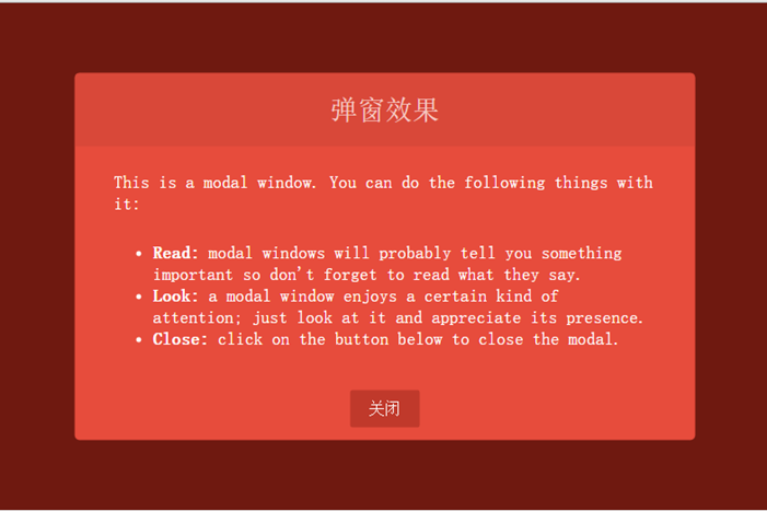
窗口布局的完整樣式如下:
<html lang="en"> <head> <meta charset="UTF-8"> <title>CSS特殊效果</title> <style tpe="text/css"> /* ---------------------公共樣式 -------------------*/ body{ background: #000; } p { display: block; -webkit-margin-before: 1em; -webkit-margin-after: 1em; -webkit-margin-start: 0px; -webkit-margin-end: 0px; } a, button{ outline: none; } button { border: none; padding: 0.6em 1.2em; background: #c0392b; color: #fff; font-size: 1em; cursor: pointer; display: block; margin: 3px auto; border-radius: 2px; } button:hover, button:active, button:focus{ border: none; } /* ---------------------彈窗樣式 -------------------*/ /* 遮擋層樣式 */ .dialog-face{ position: fixed; background: #A02418; height: 100%; width: 100%; z-index: 1000; top: 0; left: 0; opacity: 0.7; } /* 彈窗布局樣式 */ .dialog-root{ position: fixed; z-index: 2000; left: 50%; top: 50%; transform: translate(-50%, -50%); } /* 彈窗容器 */ .dialog-wrapper{ background: #E74C3C; width: 635px; height: 375px; overflow: hidden; -webkit-border-radius: 5px; -moz-border-radius: 5px; border-radius: 5px; } /* 彈窗標題 */ .dialog-header{ height: 75px; background: #d94839; text-align: center; } .dialog-header span{ font-size: 28px; line-height: 75px; color:#F6CBC6; } /* 彈窗內容 */ .dialog-content{ font-weight: 300; font-size: 1.15em; color: #fff; padding: 15px 40px 20px 40px; margin: 0; } .dialog-content p{ margin: 0; padding: 10px 0; } </style> </head> <body> <div id="dialog-face" class="dialog-face"> </div> <div id="dialog" class="dialog-root"> <div id="dialog-wrapper" class="dialog-wrapper"> <div class="dialog-header"> <span>彈窗效果</span> </div> <div class="dialog-content"> <p>This is a modal window. You can do the following things with it:</p> <ul> <li><strong>Read:</strong> modal windows will probably tell you something important so don't forget to read what they say.</li> <li><strong>Look:</strong> a modal window enjoys a certain kind of attention; just look at it and appreciate its presence.</li> <li><strong>Close:</strong> click on the button below to close the modal.</li> </ul> </div> <div class="dialog-footer"> <button>關閉</button> </div> </div> </div> </body> </html>
效果如下:
動畫實現
先看看CSS3為我們準備的動畫屬性:
animation-delay:設定動畫開始前的延遲時間。
animation-direction:設定動畫循環播放時是否反向,包含normal與alternate兩個值。
animation-duration:設定動畫播放的持續時間。
animation-interaction-count:設定動畫的播放次數,可為具體數值或無限循環關鍵字infinite。
animation-name:指定動畫名稱。
animation-play-state:允許動畫暫停與重新播放,包含running、paused。
animation-timing-function:指定如何計算中間動畫值。
CSS3動畫提供了關鍵幀設置,我們可以按百分比來編排動畫。彈窗首先要從窗口底部向上平移到居中位置,設定的關鍵幀如下:
@keyframes dialogSlipToUp { 0%{ top: 100%; opacity: 0.3; } 100%{ top: 50%; opacity: 1; } } @keyframes dialogSlipToBottom { 0%{ top: 50%; opacity: 1; -webkit-transform: translate(-50%, -50%); -moz-transform: translate(-50%, -50%); -ms-transform: translate(-50%, -50%); -o-transform: translate(-50%, -50%); transform: translate(-50%, -50%); } 100%{ top: 100%; opacity: 0.3; -webkit-transform: translate(-50%, 0); -moz-transform: translate(-50%, 0); -ms-transform: translate(-50%, 0); -o-transform: translate(-50%, 0); transform: translate(-50%, 0); } }
以上就是關鍵幀的定義代碼,dialogSlipToBottom與dialogSlipToUp是關鍵幀名稱,元素可透過animation-name屬性來引用。dialogSlipToUp是彈窗時的動畫,透明度從0.3漸變到1,元素也從瀏覽器底部漸移到居中位置。關閉窗口時則改用dialogSlipToBottom,效果與前者相反;這裡還搭配了變形的translate函數——由於窗口的基準點位於中心,移到窗口底部時會有一半高度沒有隱藏,因此用translate(-50%, 0)把基準點移到頂部,這樣整個窗口就能徹底隱藏了。
彈窗還有一個3D旋轉效果。要使用CSS3的3D動畫,必須先選一個容器作為透視容器,只有在這個容器內設置動畫才會生效。透過perspective屬性把dialog-root設為3D動畫容器,樣式如下:
.dialog-root{ position: fixed; z-index: 2000; left: 50%; -webkit-animation-duration: 500ms; -moz-animation-duration: 500ms; -o-animation-duration: 500ms; animation-duration: 500ms; -webkit-perspective: 1300px; -moz-perspective: 1300px; perspective: 1300px; }
這裡把透視容器的透視距離設為1300像素,動畫週期(animation-duration)為500毫秒。
彈窗的旋轉是從瀏覽器由內向外翻轉90度,透過transform-origin: 50% 100%讓窗口以底線作為旋轉軸。旋轉容器樣式如下:
.dialog-wrapper{ background: #E74C3C; width: 635px; height: 375px; overflow: hidden; -webkit-border-radius: 5px; -moz-border-radius: 5px; border-radius: 5px; -webkit-animation-duration: 500ms; -moz-animation-duration: 500ms; -o-animation-duration: 500ms; animation-duration: 500ms; -webkit-transform-origin: 50% 100%; -moz-transform-origin: 50% 100%; -ms-transform-origin: 50% 100%; -o-transform-origin:50% 100%; transform-origin: 50% 100%; } .dialog-wrapper.slipUp{ -webkit-transform: rotateX(0deg); -moz-transform: rotateX(0deg); -ms-transform: rotateX(0deg); -o-transform: rotateX(0deg); transform: rotateX(0deg); -webkit-animation-name: contentSlipToUp; -moz-animation-name: contentSlipToUp; -o-animation-name: contentSlipToUp; animation-name: contentSlipToUp; } .dialog-wrapper.slipBottom{ -webkit-transform: rotateX(90deg); -moz-transform: rotateX(90deg); -ms-transform: rotateX(90deg); -o-transform: rotateX(90deg); transform: rotateX(90deg); -webkit-animation-name: contentSlipToBottom; -moz-animation-name: contentSlipToBottom; -o-animation-name: contentSlipToBottom; animation-name: contentSlipToBottom; }
接著添加彈出或關閉窗口的函數toggleDialog,傳入一個布爾值,true表示彈窗,false表示關閉窗口。代碼如下:
function toggleDialog(show){ var animationClass = show ? "slipUp" : "slipBottom"; var animation = function(){ var ele = document.getElementById("dialog-face"); ele.className = "dialog-face " + animationClass; ele = document.getElementById("dialog"); ele.className = "dialog-root " + animationClass; ele = document.getElementById("dialog-wrapper"); ele.className = "dialog-wrapper " + animationClass; }; setTimeout(animation, 100); }
完整代碼
<!DOCTYPE html> <html lang="en"> <head> <meta charset="UTF-8"> <title>CSS特殊效果</title> <style tpe="text/css"> /* ---------------------公共樣式 -------------------*/ body{ background: #000; } .none{ display: none; } .layout-root{ position: fixed; background: #E74C3C; height: 100%; width: 100%; z-index: 1000; top: 0; left: 0; } .layout-content{ line-height: 44px; font-weight: 300; font-size: 1em; color: #fff; text-indent: 10px; } .layout-content .code{ line-height: 22px; text-align: center; } p { display: block; -webkit-margin-before: 1em; -webkit-margin-after: 1em; -webkit-margin-start: 0px; -webkit-margin-end: 0px; } a, button{ outline: none; } button { border: none; padding: 0.6em 1.2em; background: #c0392b; color: #fff; font-size: 1em; cursor: pointer; display: block; margin: 3px auto; border-radius: 2px; } button:hover, button:active, button:focus{ border: none; } /* ---------------------彈窗樣式 -------------------*/ .dialog-face{ position: fixed; background: #A02418; height: 100%; width: 100%; z-index: 1000; top: 0; left: 0; -webkit-animation-duration: 500ms; -moz-animation-duration:500ms; -o-animation-duration:500ms; animation-duration: 500ms; } .dialog-face.slipBottom[opacity="0"]{ display: none; } .dialog-face.slipUp{ opacity: 0.7; -webkit-animation-name: dialogFaceSlipToUp; -moz-animation-name: dialogFaceSlipToUp; -o-animation-name: dialogFaceSlipToUp; animation-name: dialogFaceSlipToUp; } .dialog-face.slipBottom{ opacity: 0; visibility: hidden; -webkit-animation-name: dialogFaceSlipToBottom; -moz-animation-name: dialogFaceSlipToBottom; -o-animation-name: dialogFaceSlipToBottom; animation-name: dialogFaceSlipToBottom; } .dialog-root{ position: fixed; z-index: 2000; left: 50%; -webkit-animation-duration: 500ms; -moz-animation-duration: 500ms; -o-animation-duration: 500ms; animation-duration: 500ms; -webkit-perspective: 1300px; -moz-perspective: 1300px; perspective: 1300px; } .dialog-root.slipUp{ top: 50%; opacity: 1; -webkit-animation-name: dialogSlipToUp; -moz-animation-name: dialogSlipToUp; -o-animation-name: dialogSlipToUp; animation-name: dialogSlipToUp; -webkit-transform: translate(-50%, -50%); -o-transform: translate(-50%, -50%); -moz-transform: translate(-50%, -50%); -ms-transform: translate(-50%, -50%); transform: translate(-50%, -50%); } .dialog-root.slipBottom{ top: 100%; opacity: 0.3; -webkit-animation-duration: 500ms; -moz-animation-duration: 500ms; -o-animation-duration: 500ms; animation-duration: 500ms; -webkit-animation-name: dialogSlipToBottom; -moz-animation-name: dialogSlipToBottom; -o-animation-name: dialogSlipToBottom; animation-name: dialogSlipToBottom; -webkit-transform: translate(-50%, 0); -o-transform: translate(-50%, 0); -moz-transform: translate(-50%, 0); -ms-transform: translate(-50%, 0); transform: translate(-50%, 0); } .dialog-wrapper{ background: #E74C3C; width: 635px; height: 375px; overflow: hidden; -webkit-border-radius: 5px; -moz-border-radius: 5px; border-radius: 5px; -webkit-animation-duration: 500ms; -moz-animation-duration: 500ms; -o-animation-duration: 500ms; animation-duration: 500ms; -webkit-transform-origin: 50% 100%; -moz-transform-origin: 50% 100%; -ms-transform-origin: 50% 100%; -o-transform-origin:50% 100%; transform-origin: 50% 100%; } .dialog-wrapper.slipUp{ -webkit-transform: rotateX(0deg); -moz-transform: rotateX(0deg); -ms-transform: rotateX(0deg); -o-transform: rotateX(0deg); transform: rotateX(0deg); -webkit-animation-name: contentSlipToUp; -moz-animation-name: contentSlipToUp; -o-animation-name: contentSlipToUp; animation-name: contentSlipToUp; } .dialog-wrapper.slipBottom{ -webkit-transform: rotateX(90deg); -moz-transform: rotateX(90deg); -ms-transform: rotateX(90deg); -o-transform: rotateX(90deg); transform: rotateX(90deg); -webkit-animation-name: contentSlipToBottom; -moz-animation-name: contentSlipToBottom; -o-animation-name: contentSlipToBottom; animation-name: contentSlipToBottom; } .dialog-header{ height: 75px; background: #d94839; text-align: center; } .dialog-header span{ font-size: 28px; line-height: 75px; color:#F6CBC6; } .dialog-content{ font-weight: 300; font-size: 1.15em; color: #fff; padding: 15px 40px 20px 40px; margin: 0; } .dialog-content p{ margin: 0; padding: 10px 0; } .dialog-footer{ } /* ---------------------動畫關鍵幀 -------------------*/ @keyframes dialogFaceSlipToUp { 0%{ opacity: 0; } 100%{ opacity: 0.7; } } @keyframes dialogFaceSlipToBottom { 0%{ opacity: 0.7; visibility:visible; } 100%{ visibility: hidden; opacity: 0; } } @keyframes dialogSlipToUp { 0%{ top: 100%; opacity: 0.3; } 100%{ top: 50%; opacity: 1; } } @keyframes dialogSlipToBottom { 0%{ top: 50%; opacity: 1; -webkit-transform: translate(-50%, -50%); -moz-transform: translate(-50%, -50%); -ms-transform: translate(-50%, -50%); -o-transform: translate(-50%, -50%); transform: translate(-50%, -50%); } 100%{ top: 100%; opacity: 0.3; -webkit-transform: translate(-50%, 0); -moz-transform: translate(-50%, 0); -ms-transform: translate(-50%, 0); -o-transform: translate(-50%, 0); transform: translate(-50%, 0); } } @keyframes contentSlipToUp { 0%{ -webkit-transform: rotateX(90deg); -moz-transform: rotateX(90deg); -ms-transform: rotateX(90deg); -o-transform: rotateX(90deg); transform: rotateX(90deg); } 100%{ -webkit-transform: rotateX(0deg); -moz-transform: rotateX(0deg); -ms-transform: rotateX(0deg); -o-transform: rotateX(0deg); transform: rotateX(0deg); } } @keyframes contentSlipToBottom { 0%{ -webkit-transform: rotateX(0deg); -moz-transform: rotateX(0deg); -ms-transform: rotateX(0deg); -o-transform: rotateX(0deg); transform: rotateX(0deg); } 60%{ -webkit-transform: rotateX(60deg); -moz-transform: rotateX(60deg); -ms-transform: rotateX(60deg); -o-transform: rotateX(60deg); transform: rotateX(60deg); } 100%{ -webkit-transform: rotateX(90deg); -moz-transform: rotateX(90deg); -ms-transform: rotateX(90deg); -o-transform: rotateX(90deg); transform: rotateX(90deg); } } </style> </head> <body> <div class="fixed layout-root"> <div class="layout-content"> <button onclick="toggleDialog(true)">顯示彈出框</button> </div> <div class="layout-content"> <p> CSS3為用戶添加了三個特殊效果的处理方式:过渡、动画、变化。當用戶和界面元素交互時,使用這些特殊樣式可大大改善用戶的體驗效果。這些效果可以直接由浏覽器引擎处理,還能節省開銷。盡管如此,這些效果會耗費大量的处理才能,尤其是一些复雜的WEB頁面上。即使是最基本的效果,也是如此。本篇的目的只是熟悉這三種CSS处理效果,不推薦在實際系統中大篇幅使用。 溫馨提示:請謹慎大篇幅使用這些特殊效果。 另外一方面,由于在CCS3标准化之前,主流浏覽器都是通过添加廠商前綴方式提供樣式支持。所以要解決浏覽器兼容問題,使用這些樣式,我們不得不為每一個樣式添加各個產商前綴,例如添加一個过度延遲時間屬性transition-delay,不得不這樣寫: </p> <p class="code"> -webkit-transition-delay: 300ms;<br> -o-transition-delay: 300ms;<br> -moz-transition-delay: 300ms;<br> -ms-transition-delay: 300ms;<br> transition-delay: 300ms; </p> </div> </div> <div id="dialog-face" class="none"> </div> <div id="dialog" class="none"> <div id="dialog-wrapper"> <div class="dialog-header"> <span>彈窗效果</span> </div> <div class="dialog-content"> <p>This is a modal window. You can do the following things with it:</p> <ul> <li><strong>Read:</strong> modal windows will probably tell you something important so don't forget to read what they say.</li> <li><strong>Look:</strong> a modal window enjoys a certain kind of attention; just look at it and appreciate its presence.</li> <li><strong>Close:</strong> click on the button below to close the modal.</li> </ul> </div> <div class="dialog-footer"> <button onclick="toggleDialog(false)">關閉</button> </div> </div> </div> <script type="text/javascript"> function toggleDialog(show){ var animationClass = show ? "slipUp" : "slipBottom"; var animation = function(){ var ele = document.getElementById("dialog-face"); ele.className = "dialog-face " + animationClass; ele = document.getElementById("dialog"); ele.className = "dialog-root " + animationClass; ele = document.getElementById("dialog-wrapper"); ele.className = "dialog-wrapper " + animationClass; }; setTimeout(animation, 100); } </script> </body> </html>
如果本文對你有幫助,歡迎點擊關注;若有不足之處,也歡迎拍磚指正。你們的回饋就是我持續創作的動力!下一篇敬請期待。
- 上一篇文章: CSS3 彈性盒模型 Flexbox 完全解析
- 下一篇文章: CSS布局核心知識——透徹理解BFC