CSS before、after 偽元素的巧妙用法
編輯:CSS特效代碼
CSS 偽元素包含 after、before、first-letter 等,只要善加利用,就能讓 HTML 結構更精簡。最常見的寫法如 p::after { content: ' '; },其中 content 可以是文字,也可以是圖片,例如:
p::before { content: '尾部'; }
p::after { content: url(img.jpg); }
我們最常拿它來清除浮動,或添加一些簡單的首尾內容。以下再補充幾種進階玩法(程式碼皆以 Chrome 為例)。
一、常見的消息提示框
要做出這種帶小三角形的對話框,不必動用圖片!

關鍵在於:當元素寬高都設為 0px,並將四條 border 設成不同顏色時,會呈現四個三角形的拼圖。
利用這個特性就能做出提示框:
<style>
div {
  width: 300px;
  background-color: rgba(0,0,0,0.7);
  color: #fff;
  font-family: 'Microsoft YaHei';
  text-align: center;
  padding: 5px;
  margin: 100px auto;
  position: relative;
}
div::before {
  content: ' ';
  width: 0px;
  height: 0px;
  position: absolute;
  left: -12px;
  top: 50%;
  -webkit-transform: translate(0px, -50%);
  border: 6px solid rgba(0,0,0,0.7);
  border-color: transparent rgba(0,0,0,0.7) transparent transparent;
}
</style>

<div>我是內容我是內容我是內容</div>
注意幾個細節:content 的值要留一個空格(' ')而非空字串;四條邊寬度必須相同,其餘三條邊設為 transparent 才能只露出一個三角形。至於 -webkit-transform 搭配 50% 定位與 translate(-50%, -50%),則是讓任意寬高元素置中的常用技巧。当然,也能用定位疊加做出有底色與邊框的小三角。
二、陰影效果
透過偽元素,同樣能做出不必使用圖片的漂亮陰影:
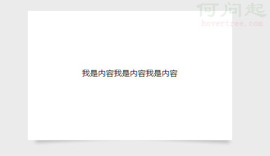
程式碼如下:
<style>
body { background-color: #ebebeb; }
div.outer {
  width: 400px; height: 250px; padding: 5px;
  margin: 100px auto; position: relative;
}
div.child {
  position: absolute; top: 0px; left: 0px; right: 0px; bottom: 0px;
  background-color: #fff; color: #000; line-height: 250px;
  font-family: 'Microsoft YaHei'; text-align: center; z-index: 2;
}
div.outer::before, div.outer::after {
  content: ''; z-index: 1; width: 50%; height: 3px;
  position: absolute; left: 10px; bottom: 7px;
  background-color: transparent;
  box-shadow: 5px 5px 10px rgba(0,0,0,0.5);
  -webkit-transform: rotate(-3deg);
}
div.outer::after {
  left: auto; right: 10px; -webkit-transform: rotate(3deg);
}
</style>
<div class='outer'>
  <div class='child'>我是內容我是內容我是內容</div>
</div>
透過設定 before、after 的不同位置與旋轉角度,就能做出目前網路上很流行的傾斜陰影效果,同時別忘了協調偽元素的顏色與 z-index。掌握這個思路後,還有照片疊加等各種延伸玩法,都能自己動手嘗試。
- 上一篇文章: 關於 position 定位屬性的實用整理
- 下一篇文章: CSS 等高布局的實作方法