在 CSS 世界中,要讓塊級元素水平居中,大家都知道用 margin: 0 auto;,讓它在父元素中水平居中。例如:


<!DOCTYPE html>
<head>
<title>center</title>
<meta http-equiv="Content-Type" content="text/html; charset=utf-8"/>
<style>
.parent { width:50%; height:100px; border:1px solid black; position:relative; }
.child { margin:0 auto; width:50px; height:50px; background:#22B14C; }
</style>
</head>
<body>
  <div class="parent">
    <div class="child"></div>
  </div>
</body>
</html>
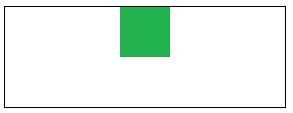
綠色方塊水平居中於父元素。那如果想讓它垂直居中或水平垂直居中呢?是否只要設 margin: auto 0; 或 margin: auto; 就好?我曾經也這麼以為,但垂直居中並非如此。在普通文件流中,設 margin: auto 時瀏覽器會解析為 margin: 0 auto;(上下為 0、左右自適應)。

那該如何讓塊級元素垂直居中?以下整理幾種方法。
方法一:absolute + margin
將元素設為絕對定位 absolute,使其脫離普通文件流(absolute 還會把 display 設為 block),再把定位座標(left、top、right、bottom)都設為 0,讓瀏覽器為絕對定位包一層新的盒子模型,最後搭配 margin,就能隨心所欲水平居中(margin:0 auto)、垂直居中(margin:auto 0)或水平垂直居中(margin:auto)。以下為水平垂直居中範例:
<!DOCTYPE html>
<head>
<title>center</title>
<meta http-equiv="Content-Type" content="text/html; charset=utf-8"/>
<style>
.parent { width:50%; height:100px; border:1px solid black; position:relative; }
.child { margin: auto; position: absolute; top:0; left:0; bottom:0; right:0; width:50px; height:50px; background:#22B14C; }
</style>
</head>
<body>
  <div class="parent">
    <div class="child"></div>
  </div>
</body>
</html>
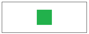
補充:position: fixed 也能脫離文件流,與 absolute 相同,差別在於 fixed 相對於瀏覽器視窗定位。
方法二:計算寬高
若不改變文件流,另一條路就是計算元素寬高。以垂直居中為例:先把子元素移到父元素頂點,往右下移動父元素寬高的 50%(如下圖二),再讓子元素以父元素中心為準,往左上移動自身寬高的 50%(如下圖三),即可垂直居中。
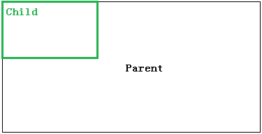
圖二: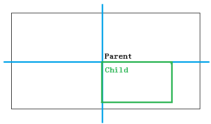
圖三: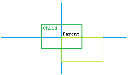
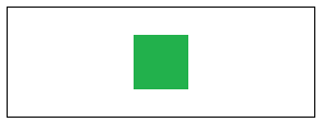
(1)margin + absolute
設 child 為 absolute,top、left 皆為 50%(呈現圖二),再把 margin-top、margin-left 設為 -50%(實現圖三):
<!DOCTYPE html>
<head>
<title>center</title>
<meta http-equiv="Content-Type" content="text/html; charset=utf-8"/>
<style>
.parent { width:50%; height:100px; border:1px solid black; position:relative; }
.child { position:absolute; width:50px; height:50px; top:50%; left:50%; margin-top:-25px; margin-left:-25px; background:#22B14C; }
</style>
</head>
<body>
  <div class="parent">
    <div class="child"></div>
  </div>
</body>
</html>
(2)translate + absolute
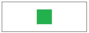
設 child 為 absolute,top、left 皆為 50%(呈現圖二),再用 translate 把元素往左上移動 50%,也能得到圖三:
<!DOCTYPE html>
<head>
<title>center</title>
<meta http-equiv="Content-Type" content="text/html; charset=utf-8"/>
<style>
.parent { width:50%; height:100px; border:1px solid black; position:relative; }
.child { position:absolute; width:50px; height:50px; top:50%; left:50%; -webkit-transform: translate(-50%,-50%); -ms-transform: translate(-50%,-50%); transform: translate(-50%,-50%); background:#22B14C; }
</style>
</head>
<body>
  <div class="parent">
    <div class="child"></div>
  </div>
</body>
</html>
方法三:table-cell
把父元素變為 table-cell,即可使用 table 的 vertical-align: middle 讓元素垂直居中,再將子元素設 margin: 0 auto; 實現水平居中。注意 table-cell 必須包含在 display: table 的元素中。
<!DOCTYPE html>
<head>
<title>center</title>
<meta http-equiv="Content-Type" content="text/html; charset=utf-8"/>
<style>
.root { width:50%; height:100px; border:1px solid black; display:table; }
.parent { display:table-cell; vertical-align:middle; }
.child { width:50px; height:50px; background:#22B14C; margin:0 auto; }
</style>
</head>
<body>
  <div class="root">
    <div class="parent">
      <div class="child"></div>
    </div>
  </div>
</body>
</html>
以上就是 CSS 水平垂直居中的常見做法(彈性布局 Flex 不在此篇討論範圍)。晚安,everyone~
- 上一篇文章: 好用的一些 CSS 樣式片段
- 下一篇文章: CSS 定位佈局全解析:position 四種取值與 z-index 實戰