HTML5 引入了一批語意化標籤,讓頁面的結構能直接被瀏覽器與搜尋引擎理解。本文用一個完整範例,把 header、nav、article、section、aside、figure、footer 全部串起來,並搭配 CSS3 完成樣式。
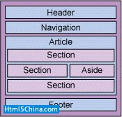
頁面規劃如下:
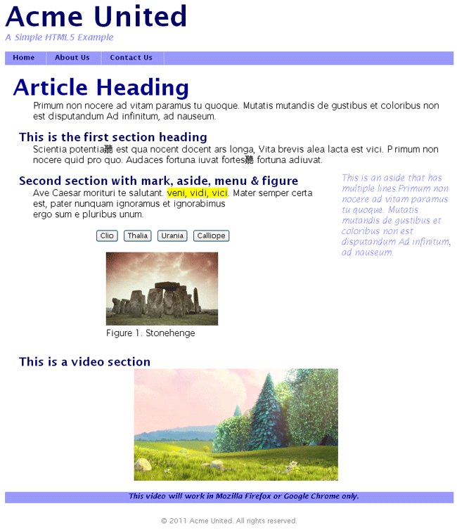
最終效果:
結構包含一個 Header 區、一個 Navigation 區、一個內含三段 Section 與一個 Aside 的 Article 區,以及最後的 Footer 區。
Header 區
放置頁面標題與副標題,用 <header> 標籤:
<header>
<h1>標題文字</h1>
<p>文本或是圖像可放在這裡</p>
<p>Logo 通常也放在這個地方</p>
</header>
Navigation 區
<nav> 定義了一個專門用於導航的區域。要注意:nav 應該用於主站點導航,而不是用來放置頁面其他區域中的連結群組。
<nav>
<ul>
<li><a href="#">Home</a></li>
<li><a href="#">About Us</a></li>
<li><a href="#">Our Products</a></li>
<li><a href="#">Contact Us</a></li>
</ul>
</nav>
Article 與 Section 區
Article 區存放頁面的實際內容,內部可以再切分成若干 Section:
<article>
<section>
Content
</section>
<section>
Content
</section>
</article>

<section>
<article>
Content
</article>
<article>
Content
</article>
</section>
兩者可以互相嵌套:article 代表可獨立分發的完整內容,section 代表主題性的分節。
圖像元素:figure 與 figcaption
<figure> 用來加入圖像、圖表與照片。它可以包含 <figcaption>,用來標註圖形標題,讓圖片與內文更緊密地關聯。section、article、header、footer 內部都可以使用 figure。
<figure>
<img src="/figure.jpg" width="304" height="228" alt="Picture">
<figcaption>Caption for the figure</figcaption>
</figure>
媒體元素
HTML5 讓多媒體能「被標記」而不只是「被嵌入」。
audio 標識聲音內容,可用屬性有 src、preload、controls、loop 與 autoplay:
<audio src="MyFirstMusic.ogg" controls autoplay loop>
Your browser does not support the audio tag.
</audio>
video 擁有 audio 的所有屬性,另加上 poster、width、height。poster 讓你在影片載入中或完全無法載入時,先顯示一張替代圖片:
<video src="MyFirstMovie.ogg" controls="controls">
Your browser does not support the video tag
</video>
source 可放在 video 或 audio 內,用來指定多個替代檔案。瀏覽器會依媒體類型或支援的編解碼器自行挑選;若全部失敗,則顯示後方的提示文字:
<audio>
<source src="/music/good_enough.wma" type="audio/x-ms-wma">
<source src="/music/good_enough.mp3" type="audio/mpeg">
<p>Your browser does not support the HTML 'audio' element.</p>
</audio>
embed 定義可帶入頁面的嵌入內容,例如 Flash SWF 外掛。除了 src 與 type,還有 height 與 width:
<embed src="MyFirstVideo.swf" type="application/x-shockwave-flash" />
Aside 區
<aside> 用來存放補充性內容——那些與主內容相關、但不屬於主內容連續敘述部分的資訊:
<p>My family and I visited Euro Disney last year.</p>
<aside>
<h4>Disney in France</h4>
<p>Besides Euro Disney, there is a Disneyland in California.</p>
</aside>
Footer 區
<footer>
<p>Copyright 2011 Acme United. All rights reserved.</p>
</footer>
組裝頁面:HTML 部分
<!doctype html>
<html lang="en">
  <head>
  <title>HTML5 Fundamentals Example</title>
  <link rel="stylesheet" href="main-stylesheet.css" />
  </head>
  <body>
  <header>
  <hgroup>
  <h1>Acme United</h1>
  <h2>A Simple HTML5 Example</h2>
  </hgroup>
  </header>
先用 CSS 建立字體、頁寬與 header 的標題樣式:
* {
font-family: Lucida Sans, Arial, Helvetica, sans-serif;
}

body {
width: 800px;
margin: 0em auto;
}

header h1 {
font-size: 50px;
margin: 0px;
color: #006;
}

header h2 {
font-size: 15px;
margin: 0px;
color: #99f;
font-style: italic;
}
導航列樣式
<nav>
<ul>
<li><a href="#">Home</a></li>
<li><a href="#">About Us</a></li>
<li><a href="#">Contact Us</a></li>
</ul>
</nav>
nav ul {
list-style: none;
padding: 0px;
display: block;
clear: right;
background-color: #99f;
padding-left: 4px;
height: 24px;
}

nav ul li {
display: inline;
padding: 0px 20px 5px 10px;
height: 24px;
border-right: 1px solid #ccc;
}

nav ul li a {
color: #006;
text-decoration: none;
font-size: 13px;
font-weight: bold;
}

nav ul li a:hover {
color: #fff;
}
關鍵是 display:inline 讓 li 橫向排列,再用 border-right 做出分隔線。
Article 與 Section 的樣式
Article 區由 <article> 定義,內部有自己的 header;其中的 section 也有各自的 header:
<article>
<header>
<h1>
<a href="#" title="Link to this post" rel="bookmark">Article Heading</a>
</h1>
</header>
<p> Primum non nocere ad vitam Paramus . . . </p>
<section>
<header>
<h1>This is the first section heading</h1>
</header>
<p>Scientia potentia est qua nocent docentp . . .</p>
</section>
注意這裡的 h1 與頁面層級的 h1 格式不同,樣式定義都掛在包含它們的 article 標籤上:
article > header h1 {
font-size: 40px;
float: left;
margin-left: 14px;
}

article > header h1 a {
color: #000090;
text-decoration: none;
}

article > section header h1 {
font-size: 20px;
margin-left: 25px;
}

article p {
clear: both;
margin-top: 0px;
margin-left: 50px;
}
第二個 Section:mark、aside、menu 與 figure
<section>
<header>
<h1>Second section with mark, aside, menu & figure</h1>
</header>
<p class="next-to-aside"> . . . <mark>veni, vidi, vici</mark>. Mater . . .</p>
<aside>
<p>This is an aside that has multiple lines. . . .</p>
</aside>
<menu label="File">
<button type="button" onClick="JavaScript:alert('Clio . . .')">Clio</button>
<button type="button" onClick="JavaScript:alert('Thalia . . .')">Thalia</button>
<button type="button" onClick="JavaScript:alert('Urania . . .')">Urania</button>
<button type="button" onClick="JavaScript:alert('Calliope . . .')">Calliope</button>
</menu>
<figure><img src="stonehenge.jpg" alt="Stonehenge" width="200" height="131"/>
<figcaption>Figure 1. Stonehenge</figcaption>
</figure>
</section>
這裡 aside 呈現的是與周圍連續內容無直接關係的補充資訊,figure 則放了一張 Stonehenge 圖片,menu 用四個繆斯女神的名字做按鈕,mark 則用來在段落中 highlight 特定詞句。
article p.next-to-aside {
width: 500px;
}

article > section figure {
margin-left: 180px;
margin-bottom: 30px;
}

article > section > menu {
margin-left: 120px;
}

aside p {
position: relative;
left: 0px;
top: -100px;
z-index: 1;
width: 200px;
float: right;
font-style: italic;
color: #99f;
}
把 p.next-to-aside 的寬度設得比頁面寬度小,aside 才能浮在右側而不遮住文字。
視頻區
<section>
<header>
<h1>This is a video section</h1>
</header>
<p>< video src="https://people.xiph.org/~maikmerten/demos/BigBuckBunny.ogv"
   controls autoplay loop>
<div class="no-html5-video"><p>This video will work in
Mozilla Firefox or Google Chrome only. </p>
</div>
</video></p>
</section>
</article>
影片載入後自動播放、不斷循環,並提供暫停與播放控制。實務上 ogg 影片常用 ogv 副檔名(v 代表 video),audio 標籤的運作方式完全相同。
article > section video {
height: 200px;
margin-left: 180px;
}

article > section div.no-html5-video{
height: 20px;
text-align: center;
color: #000090;
font-size: 13px;
font-style: italic;
font-weight: bold;
background-color: #99f;
}
頁尾
<footer>
<p>Copyright: 2011 Acme United. All rights reserved.</p>
</footer>
</body>
</html>
footer p {
text-align: center;
font-size: 12px;
color: #888;
margin-top: 24px;
}
這份範例值得學的三件事
語意化標籤取代無名 div。header、nav、article、section、aside、footer 讓文件結構自己說話,螢幕閱讀器與搜尋引擎都能正確理解各部分角色。
選擇器善用子元素組合。像 article > section header h1 這樣的寫法,讓同一個 h1 在不同結構層級能有完全不同的樣式,不必額外添加 class。
多媒體有原生標籤與降級方案。audio、video 搭配 source 提供多格式,並在標籤內放置不支援時的提示內容,是標準的漸進增強做法。
- 上一篇文章: DIV+CSS 布局:製作上中下三段式頁面結構
- 下一篇文章: DIV+CSS 布局:兩列固定寬度並置中