margin:0 auto; 能讓元素水平居中,而 margin:auto; 過去被認為無法垂直居中。其實只要聲明元素高度,再補上四條定位聲明,就能做到真正的水平垂直雙向居中:
核心代碼
.Absolute-Center {
    margin: auto;
    position: absolute;
    top: 0;
    left: 0;
    bottom: 0;
    right: 0;
}
優勢
- 跨瀏覽器表現良好,無需 hack,兼容 IE8 ~ IE10
- 無特殊標記,樣式精簡
- 自適應布局,可使用百分比與 min-/max- 尺寸
- 居中時不必考慮 padding(也無需 box-sizing)
- 布局塊可自由調整大小
- 圖像同樣適用
注意事項
- 必須聲明元素高度
- 推薦設置
overflow:auto,避免內容溢出顯示異常 - 此方法在 Windows Phone 上不生效
測試瀏覽器:Chrome、Firefox、Safari、Mobile Safari、IE8-10 均表現正常。
工作原理
- 在普通文檔流中,
margin:auto等價於 margin-top 與 margin-bottom 為 0。 - 設置
position:absolute後元素脫離文檔流,變為塊級,不佔空間。 - 同時設置
top/left/bottom/right:0,瀏覽器會讓元素填滿其包含塊(position:relative 的父元素或 body)的內部空間。 - 一旦明確給出寬高,瀏覽器便不再讓它填滿全部空間,而是依
margin:auto重新計算並留出等量的上下、左右間距。 - 由於元素絕對定位且脫離文檔流,瀏覽器會讓 margin-top 與 margin-bottom 取相同值——這正是垂直居中的由來。
也就是說,「完全居中」嚴格遵循了標準中 margin:auto 的計算規則,因此在遵循規範的瀏覽器中都能生效。
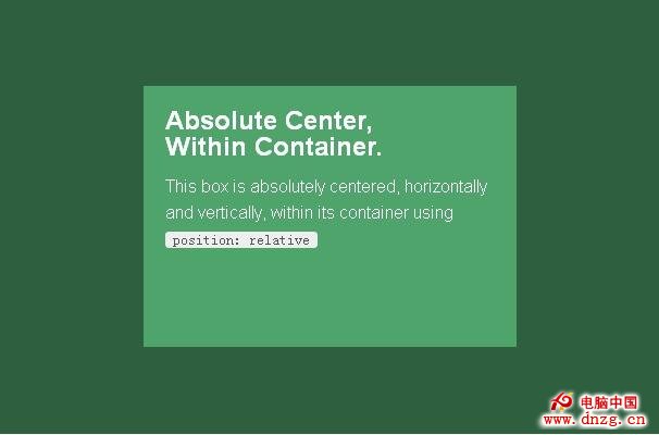
在容器中居中
給父容器加 position:relative 即可:
.Center-Container {
    position: relative;
}

.Absolute-Center {
    width: 50%;
    height: 50%;
    overflow: auto;
    margin: auto;
    position: absolute;
    top: 0;
    left: 0;
    bottom: 0;
    right: 0;
}
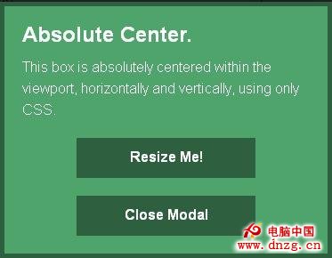
在可視區域內居中
把定位改為 fixed 並給足 z-index:
.Absolute-Center.is-Fixed {
    position: fixed;
    z-index: 999;
}
移動版 Safari 提示:若外層沒有一個 position:relative 容器,內容會以整個文檔高度的中心為基準居中,而非可視區域中心。
偏移值
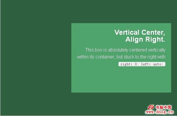
若頁面有固定頭部,直接把 top:70px 之類的偏移寫進樣式即可,margin:auto 會把四個方向的約束一并納入計算。想讓內容貼側居中,可用 right:0; left:auto; 靠右,或 left:0; right:auto; 靠左。
響應式
absolute 的最大好處是能完美配合百分比寬高,min-width/max-width、min-height/max-height 也如預期工作,加上 padding 同樣不會破壞居中:
.Absolute-Center.is-Responsive {
    width: 60%;
    height: 60%;
    min-width: 200px;
    max-width: 400px;
    padding: 40px;
}
內容溢出
內容高於容器時,只要沒超出包含塊(必要時加 max-height:100%),容器內就會出現滾動條:
.Absolute-Center.is-Overflow {
    overflow: auto;
}
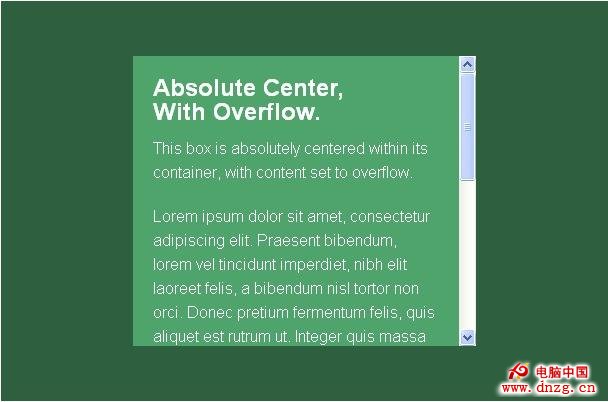
大小可調整
配合 resize,用戶可自行拖動改變尺寸,居中狀態不會被破壞;min-/max- 屬性可用來限制範圍:
.Absolute-Center.is-Resizable {
    min-width: 20%;
    max-width: 80%;
    min-height: 20%;
    max-height: 80%;
    resize: both;
    overflow: auto;
}
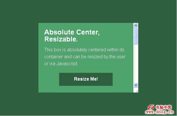
注意:resize 不支援移動版瀏覽器與 IE8-10;resize 與 transition 同用時,開始拖動會產生等於過渡時長的延遲。這是唯一支援 resize:both 的居中方案。
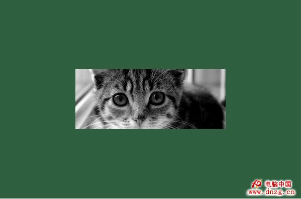
圖像
指定 height:auto 即可得到隨容器縮放的響應式圖片:
<img src="https://placekitten.com/g/500/200" alt="" />

.Absolute-Center.is-Image {
    height: auto;
}

.Absolute-Center.is-Image img {
    width: 100%;
    height: auto;
}
可變高度
「完全居中」要求聲明高度,但高度可以是百分比或受 max-height 約束,這已能覆蓋多數響應式場景。
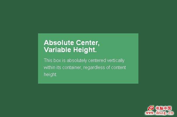
另一種替代方案是 display:table 居中,不依賴內容長度,但在部分瀏覽器(主要是 IE 與 Firefox)有問題。可用 Modernizr 做特性檢測以實現漸進增強:
/* Modernizr 檢測可變高度內容 */
Modernizr.testStyles('#modernizr { display: table; height: 50px; width: 50px; margin: auto; position: absolute; top: 0; left: 0; bottom: 0; right: 0; }', function(elem, rule) {
    Modernizr.addTest('absolutecentercontent', Math.round(window.innerHeight / 2 - 25) === elem.offsetTop);
});

.absolutecentercontent .Absolute-Center.is-Variable {
    display: table;
    height: auto;
}
已知問題:與 resize 方案互不兼容;Firefox/IE8 中內容垂直靠上、水平居中;IE9/10 中內容跑到左上角;移動版 Safari 使用百分比寬度時會略偏離中心。
其他居中方案對比
負 margin 值
配合 top:50%; left:50%,設置等於寬高一半的負 margin:
.is-Negative {
    width: 300px;
    height: 200px;
    padding: 20px;
    position: absolute;
    top: 50%;
    left: 50%;
    margin-left: -170px;  /* (width + padding)/2 */
    margin-top: -120px;   /* (height + padding)/2 */
}
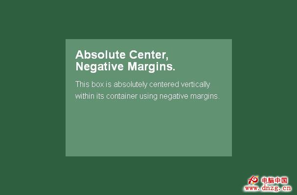
優點是兼容性極好,甚至支持 IE6-7,代碼量小;缺點是非響應式,尺寸必須手算,可能溢出容器,且需為 padding 預留空間。
transform 法
.is-Transformed {
    width: 50%;
    margin: auto;
    position: absolute;
    top: 50%;
    left: 50%;
    -webkit-transform: translate(-50%, -50%);
    -ms-transform: translate(-50%, -50%);
    transform: translate(-50%, -50%);
}
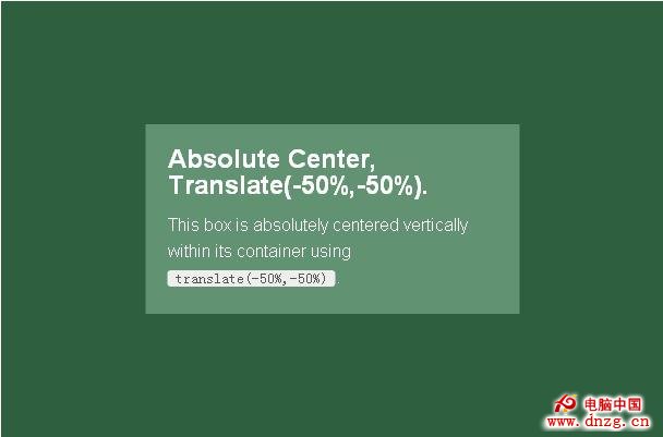
優點是支持可變高度、代碼少;缺點是不支持 IE8、需寫廠商前綴、與其他 transform 衝突、極少數情況下影響邊緣與字體渲染。
table-cell 法
<div class="Center-Container is-Table">
  <div class="Table-Cell">
    <div class="Center-Block">
      <!-- 內容 -->
    </div>
  </div>
</div>

.Center-Container.is-Table { display: table; }
.is-Table .Table-Cell {
    display: table-cell;
    vertical-align: middle;
}
.is-Table .Center-Block {
    width: 50%;
    margin: 0 auto;
}
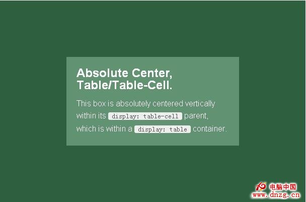
優點是高度可變、溢出會自動撐開父元素、兼容性不錯;缺點是每個居中元素要多三層標簽。
inline-block 法
<div class="Center-Container is-Inline">
  <div class="Center-Block">
    <!-- 內容 -->
  </div>
</div>

.Center-Container.is-Inline {
    text-align: center;
    overflow: auto;
}

.Center-Container.is-Inline:after,
.is-Inline .Center-Block {
    display: inline-block;
    vertical-align: middle;
}

.Center-Container.is-Inline:after {
    content: '';
    height: 100%;
    margin-left: -0.25em; /* 抵消空白間距,隨字體可能微調 */
}

.is-Inline .Center-Block {
    max-width: 99%; /* 防止長內容被推到頂部 */
}
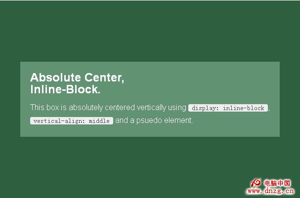
優點與 table-cell 相近,兼容性甚至可調至 IE7;缺點是需要額外容器、依賴 -0.25em 的負邊距、內容寬度不能超過容器寬度減去 0.25em。
Flexbox 法
.Center-Container.is-Flexbox {
    display: -webkit-box;
    display: -moz-box;
    display: -ms-flexbox;
    display: -webkit-flex;
    display: flex;
    -webkit-box-align: center;
    -moz-box-align: center;
    -ms-flex-align: center;
    -webkit-align-items: center;
    align-items: center;
    -webkit-box-pack: center;
    -moz-box-pack: center;
    -ms-flex-pack: center;
    -webkit-justify-content: center;
    justify-content: center;
}
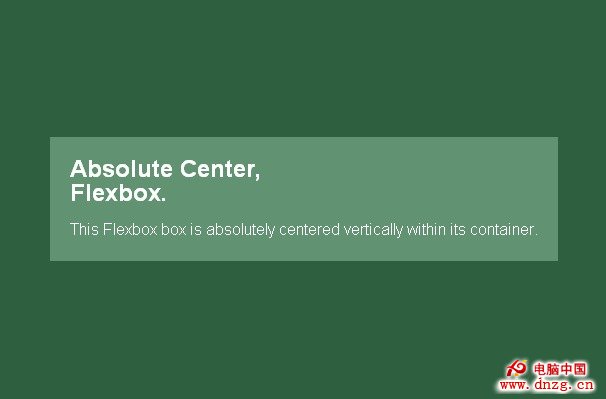
優點是內容尺寸任意、溢出表現良好,且能用於各類高級布局;缺點是不支持 IE8-9、可能需要額外容器與大量前綴,並存在潛在性能開銷。
選擇建議
沒有唯一正解,取決於需要支持的瀏覽器範圍與現有標簽結構。「完全居中」簡潔迅速,過去寫負 margin 的地方都可以改用它,省掉手算與額外標簽;需要可變高度又要兼顧兼容性時,可選 table-cell 或 inline-block;願意擁抱新技術就用 Flexbox。
- 上一篇文章: IE CSS Bug:line-height 無法讓圖片垂直居中
- 下一篇文章: CSS 實現隔行換色的四種方法對比