rgba 半透明背景與半透明邊框疊色問題及解法
編輯:CSS詳解
同時使用 rgba 半透明背景與半透明邊框時,會發現邊框區域的顏色跟預期不同,比背景更濃。這不是瀏覽器的 bug,而是渲染順序造成的必然結果。
問題重現
.box3 {
  width: 250px; height: 250px;
  background-color: rgba(255, 255, 255, 0.5);
  border: 5px solid rgba(0, 0, 0, 0.5);
}
.box2 {
  width: 250px; height: 250px;
  background-color: rgba(0, 0, 0, 0.5);
  border: 5px solid rgba(0, 0, 0, 0.5);
}
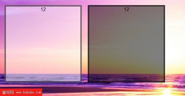
原因很單純:背景的預設繪製範圍是 border-box,也就是從邊框外緣開始鋪。於是邊框區域同時有半透明背景色與半透明邊框色,兩層疊在一起,視覺上自然更深。
解法:用 background-clip 改裁剪起點
.box3 {
  width: 250px; height: 250px;
  background-color: rgba(255, 255, 255, 0.5);
  border: 5px solid rgba(0, 0, 0, 0.5);
  background-clip: content-box;
}
.box2 {
  width: 250px; height: 250px;
  background-color: rgba(0, 0, 0, 0.5);
  border: 5px solid rgba(0, 0, 0, 0.5);
  background-clip: content-box;
}
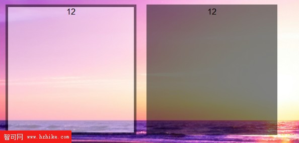
加上 background-clip: content-box 之後,背景改從內容區向外裁剪,邊框區域不再被背景覆蓋,兩者互不干擾,顏色就回到各自該有的樣子。
順帶記一下其他取值
background-clip 除了 content-box,還常用 border-box(預設,鋪滿整個邊框盒)與 padding-box(鋪到內距外緣,剛好避開 border)。三者的差別只在裁剪起點,選哪個取決於你希望背景延伸到哪裡。這個屬性也可以搭配 background-origin 一起理解:origin 決定背景圖的起始定位,clip 決定背景的最終裁切範圍,兩者常被搞混。
- 上一篇文章: 用偽元素替網頁頂部加一道柔和陰影
- 下一篇文章: DIV+CSS 排版的十個常見錯誤與排查順序