核取方塊(checkbox)大概是每個網站都會用到的表單元素,但正因為太理所當然,幾乎沒有人幫它改樣式,於是看起來千篇一律。本文示範五種做法,全都只用 CSS,不需要任何 JavaScript。

共同起手式:把原生方塊藏起來
第一步永遠一樣——先隱藏系統原生的 checkbox:
input[type=checkbox] {
  visibility: hidden;
}
接著加上一個 <label>。因為帶 for 屬性的 label 被點擊時,對應的 checkbox 會被勾選,所以我們實際上是用 label 的點擊行為來操作 checkbox,再用 input:checked + label 這個相鄰選擇器把狀態「傳」給 label 去改變外觀。
樣式一:滑柄式開關
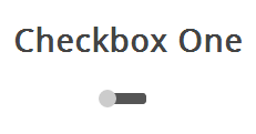
外觀像一個小型的滑動開關,勾選後滑塊移到另一端。
<section>
  <h3>Checkbox One</h3>
  <div class="checkboxOne">
    <input type="checkbox" value="1" id="checkboxOneInput" name="" />
    <label for="checkboxOneInput"></label>
  </div>
</section>
因為 label 一個元素不夠用,我們用 div 充當黑色軌道:
.checkboxOne {
  width: 40px;
  height: 10px;
  background: #555;
  margin: 20px 80px;
  position: relative;
  border-radius: 3px;
}
.checkboxOne label {
  display: block;
  width: 16px;
  height: 16px;
  border-radius: 50%;
  -webkit-transition: all .5s ease;
  -moz-transition: all .5s ease;
  -o-transition: all .5s ease;
  transition: all .5s ease;
  cursor: pointer;
  position: absolute;
  top: -3px;
  left: -3px;
  background: #ccc;
}
.checkboxOne input[type=checkbox]:checked + label {
  left: 27px;
}
滑塊初始位於關閉端,勾選後 left 變成 27px,加上 transition 就有了滑動動畫。
樣式二:滑塊會變色
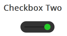
HTML 結構與樣式一完全相同,只是尺寸放大,並在中間畫一條溝槽。
<section>
  <h3>Checkbox Two</h3>
  <div class="checkboxTwo">
    <input type="checkbox" value="1" id="checkboxTwoInput" name="" />
    <label for="checkboxTwoInput"></label>
  </div>
</section>
.checkboxTwo {
width: 120px;
height: 40px;
background: #333;
margin: 20px 60px;
border-radius: 50px;
position: relative;
}
/* 用偽元素畫中間的溝槽 */
.checkboxTwo:before {
content: '';
position: absolute;
top: 19px;
left: 14px;
height: 2px;
width: 90px;
background: #111;
}
.checkboxTwo label {
display: block;
width: 22px;
height: 22px;
border-radius: 50%;
-webkit-transition: all .5s ease;
-moz-transition: all .5s ease;
transition: all .5s ease;
cursor: pointer;
position: absolute;
top: 9px;
z-index: 1;
left: 12px;
background: #ddd;
}
.checkboxTwo input[type=checkbox]:checked + label {
left: 84px;
background: #26ca28;
}div 已被軌道佔用,所以溝槽用 :before 偽元素畫出來。勾選時滑塊右移並轉為綠色。
樣式三:帶 ON / OFF 字樣
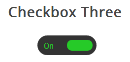
比樣式二更進一步:滑塊移動的同時,兩側分別顯示 ON 與 OFF。
<section>
  <h3>Checkbox Three</h3>
  <div class="checkboxThree">
    <input type="checkbox" value="1" id="checkboxThreeInput" name="" />
    <label for="checkboxThreeInput"></label>
  </div>
</section>
.checkboxThree {
width: 120px;
height: 40px;
background: #333;
margin: 20px 60px;
border-radius: 50px;
position: relative;
}
.checkboxThree:before {
content: 'On';
position: absolute;
top: 12px;
left: 13px;
color: #26ca28;
font-size: 16px;
}
.checkboxThree:after {
content: 'Off';
position: absolute;
top: 12px;
left: 84px;
color: #ddd;
font-size: 16px;
}
.checkboxThree label {
display: block;
width: 52px;
height: 22px;
border-radius: 50px;
-webkit-transition: all .5s ease;
-moz-transition: all .5s ease;
transition: all .5s ease;
cursor: pointer;
position: absolute;
top: 9px;
z-index: 1;
left: 12px;
background: #ddd;
}
.checkboxThree input[type=checkbox]:checked + label {
left: 60px;
background: #26ca28;
}:before 放 ON、:after 放 OFF,滑塊(label)蓋在中間,移動後自然露出另一側文字。這是偽元素最經典的用法之一:在不增加 HTML 的前提下擴充可視元素數量。
樣式四:雙圓圈指示
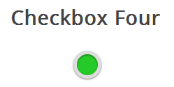
外圈一個空心圓,內圈一個實心圓,勾選時內圈變色。
<section>
  <h3>Checkbox Four</h3>
  <div class="checkboxFour">
    <input type="checkbox" value="1" id="checkboxFourInput" name="" />
    <label for="checkboxFourInput"></label>
  </div>
</section>
/* 外圈:border-radius 設 100% 即得正圓 */
.checkboxFour div,
.checkboxFour {
width: 40px;
height: 40px;
border-radius: 100px;
background: #ddd;
position: relative;
}
.checkboxFour label {
display: block;
width: 30px;
height: 30px;
border-radius: 100px;
-webkit-transition: all .5s ease;
-moz-transition: all .5s ease;
transition: all .5s ease;
cursor: pointer;
position: absolute;
top: 5px;
left: 5px;
z-index: 1;
background: #333;
-webkit-box-shadow: inset 0px 1px 3px rgba(0,0,0,0.5);
-moz-box-shadow: inset 0px 1px 3px rgba(0,0,0,0.5);
box-shadow: inset 0px 1px 3px rgba(0,0,0,0.5);
}
.checkboxFour input[type=checkbox]:checked + label {
background: #26ca28;
}內圈的 inset 陰影讓圓點有凹陷的手感,勾選後轉綠。
樣式五:自訂打勾方塊
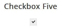
最後一種最接近原生外觀,只是外框與勾選標記完全自訂。
<section>
  <h3>Checkbox Five</h3>
  <div class="checkboxFive">
    <input type="checkbox" value="1" id="checkboxFiveInput" name="" />
    <label for="checkboxFiveInput"></label>
  </div>
</section>
.checkboxFive {
width: 25px;
margin: 20px 100px;
position: relative;
}
.checkboxFive label {
cursor: pointer;
position: absolute;
width: 25px;
height: 25px;
top: 0;
left: 0;
background: #eee;
border: 1px solid #ddd;
}
/* 用去掉兩條邊的長方形旋轉 45 度,看起來就是一個勾 */
.checkboxFive label:after {
opacity: 0.2;
content: '';
position: absolute;
width: 9px;
height: 5px;
background: transparent;
top: 6px;
left: 7px;
border: 3px solid #333;
border-top: none;
border-right: none;
-webkit-transform: rotate(-45deg);
-moz-transform: rotate(-45deg);
transform: rotate(-45deg);
}
.checkboxFive label:hover::after { opacity: 0.5; }
.checkboxFive input[type=checkbox]:checked + label:after { opacity: 1; }這個小技巧很值得記住:一個 9×5px 的矩形,只留左邊與下邊的 3px 邊框,形狀像字母 L,再旋轉 -45 度就是一個勾。平時半透明當提示,滑過加深,勾選後完全不透明。
無障礙上的提醒
用 visibility:hidden 隱藏原生控制項時,它仍會參與鍵盤 focus 順序,這點比 display:none 友善。若改用 opacity:0 搭配絕對定位覆蓋在 label 上,也能保留焦點輪廓,實務上更容易加上 :focus-visible 樣式。記得別忘了幫自訂樣式補上鍵盤操作的視覺回饋。