用 SVG mask 與 box-shadow 實作中間鏤空的圖片遮罩
編輯:CSS詳解
「中間鏤空的圖片遮罩」說的是這種效果:一張灰底的遮罩蓋在圖片上,中間開一個(或數個)圓形視窗,讓底下的影像露出來。常見於 spotlight 式的引導教學、產品局部放大等情境。
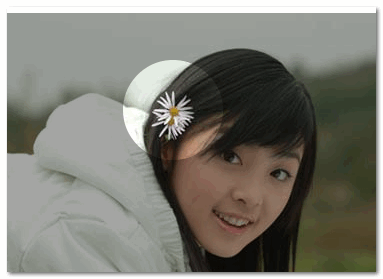
做法一:SVG mask 開一個洞
用 SVG 的 <mask> 定義遮罩:先鋪一層灰色矩形(fill:#ccc),再用黑色圓形「挖」掉中間——在遮罩的語意裡,白色代表可見、黑色代表剔除。
<div id="container" style="position: relative; margin: 550px 0 0 50px;">
  <svg style="position: absolute;" width="400" height="280">
    <defs>
      <mask id="mask3">
        <rect x="0" y="0" width="100%" height="100%"
              style="stroke:none; fill: #ccc"></rect>
        <circle id="circle1" cx="100" cy="100" r="50" style="fill: #000" />
      </mask>
    </defs>
    <rect x="0" y="0" width="100%" height="100%"
          style="stroke: none; fill: #ccc; mask: url(#mask3)"></rect>
  </svg>
  <img src="photo.jpg" />
</div>
結構邏輯是:SVG 絕對定位鋪在圖片上方充當遮罩層,圖片則在下方正常佔位。
做法二:開多個洞
只要在同一個 mask 裡多放幾個黑色圓形即可,這正是 SVG 方案最大的優勢。
<div id="container" style="position: relative;">
  <svg style="position: absolute;" width="400" height="280">
    <defs>
      <mask id="mask3">
        <rect x="0" y="0" width="100%" height="100%"
              style="stroke:none; fill: #ccc"></rect>
        <circle cx="100" cy="50"  r="50" style="fill: #000" />
        <circle cx="300" cy="100" r="50" style="fill: #000" />
        <circle cx="100" cy="200" r="50" style="fill: #000" />
      </mask>
    </defs>
    <rect x="0" y="0" width="100%" height="100%"
          style="stroke: none; fill: #ccc; mask: url(#mask3)"></rect>
  </svg>
  <img src="photo.jpg" />
</div>
孔洞不一定是圓形,把 <circle> 換成 <rect>、<path> 甚至 <text>,就能做出方形、任意形狀或文字形的視窗。
做法三:純 CSS 的 box-shadow 版本
如果只需要一個圓洞,用 box-shadow 的「超大擴散半徑」會更快:
.hole {
  position: fixed;
  left: 150px;
  top: 35px;
  width: 100px;
  height: 100px;
  border-radius: 100px;
  box-shadow: rgba(0, 0, 0, .8) 0px 0px 0px 2005px;
  z-index: 100;
}
原理是讓一個透明的小圓投出半徑 2005px 的陰影,陰影填滿整個視口,中間那個圓則保持透明,於是就成了一個洞。z-index:100 確保它蓋在內容之上。
缺點很明顯:只能開一個洞。而且因為陰影是「填滿外部」而非「挖空內部」,若頁面上有其他需要點擊的元素會被陰影層擋住,實作時通常還要搭配 pointer-events 的處理。
怎麼選
單洞、快速、不想引入 SVG:用 box-shadow。多洞、需要非圓形視窗、或需要邊框與羽化:用 SVG mask。若再加上 clip-path(例如 circle()、polygon() 搭配 evenodd 填滿規則),也能在不使用 SVG 的情況下做出多洞遮罩,是另一條值得嘗試的路。
- 上一篇文章: 用 CSS filter 實作毛玻璃效果:inherit 與 background-attachment 的巧妙組合
- 下一篇文章: Data URI scheme 是什麼?在 CSS 中內嵌圖片的用法與限制