關於「用 CSS 處理圓角」的教學,網路上已經多到數不清,但我仍想把這一篇分享給你,因為它示範的是一個至今仍完全有效的通用做法。這篇教學大量運用進階 CSS 技巧,我會盡量讓初學者也能跟上。由於 CSS3 尚未普及,全程都以通過 W3C 驗證為前提。
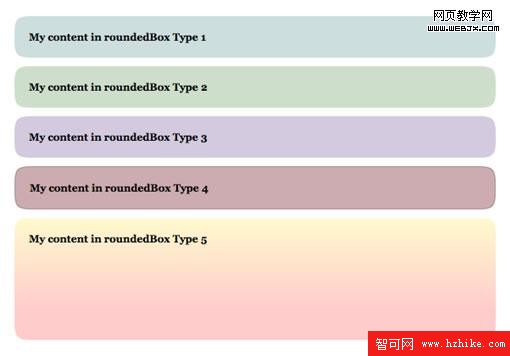
核心思路
我的做法由一個容器加上四個絕對定位的 div 組成,每個 div 各自負責一個圓角,並共用同一張 Sprite 作為背景。
這項技術厲害在哪裡?在於它能做出寬高完全自由變化的圓角元素——沒有任何尺寸限制。而它之所以能成立,關鍵正是與 CSS Sprite 的搭配。如果你還不熟悉 Sprite,建議先補上這堂課再回來。
第一步:製作 Sprite
1. 選一款編輯器處理矩形圓角圖(本例使用 Fireworks)。
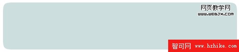
2. 切割並將圓角導出到臨時位置,稍後會用到。

3. 新建一個檔案,把圓角匯入,複製三次並分別旋轉,得到另外三個角。
4. 把四個圓角合成一張圖片,並用 1px 的紅線 在它們之間做區隔(這條線稍後會成為 Sprite 的緩衝區)。

5. 導出合成圖,Sprite 就完成了。
第二步:HTML 結構
先給容器 div 一個 .roundedBox 類別:
<div class="roundedBox"></div>
接著在內部增加四個 div,未來用來承載圓角。每個都要掛上 .corner 類別,再各自標示一個指定位置的類別:
<div class="roundedBox">
  <strong>My content in roundedBox Type 1</strong>

  <div class="corner topLeft"></div>
  <div class="corner topRight"></div>

  <div class="corner bottomLeft"></div>
  <div class="corner bottomRight"></div>
</div>
結構搞定,接下來把注意力移到 CSS。
第三步:基礎 CSS
絕對定位元素通常會依據「最近的相對定位父元素」來定位;若找不到,則一路往上直到 body。這是整個技巧的立足點。
先定義所有圓角的共同樣式——絕對定位,並標明寬高。本例的圓角寬高皆為 17px:

.corner {
  position: absolute;
  width: 17px;
  height: 17px;
}
如果你是第一次切割矩形圓角,寬高很可能不相等,記得依實際情況調整。
接著定義容器:
.roundedBox { position: relative; }
有了 relative,任何掛上 .roundedBox 的元素內部,絕對定位元素都會以它為參考,而不是 body。此外必須設定 padding,否則圓角會直接壓在文字上——這肯定不是我們想要的。
重要:top 與 bottom 的 padding 值必須等於圓角的高度;left 與 right 的 padding 值必須等於圓角的寬度。本例圓角寬高相等,因此四邊 padding 也相同:
.roundedBox { position: relative; padding: 17px; margin: 10px 0; }
margin 則是為了讓各個方塊之間留出呼吸空間。
最後,為四個角分別定義定位與背景位置:
.roundedBox { position: relative; padding: 17px; margin: 10px 0; }

.corner { position: absolute; width: 17px; height: 17px; }

.topLeft     { top: 0;    left: 0;    background-position: -1px  -1px; }
.topRight    { top: 0;    right: 0;   background-position: -19px -1px; }
.bottomLeft  { bottom: 0; left: 0;    background-position: -1px  -19px; }
.bottomRight { bottom: 0; right: 0;   background-position: -19px -19px; }
你可能注意到,這裡還沒有載入 Sprite。這是刻意的——我們會用另一種方式掛上它,好讓同一套結構能輕鬆換成不同配色。
模型 1(藍色)
HTML:
<div class="roundedBox" id="type1">
  <strong>My content in roundedBox Type 1</strong>

  <div class="corner topLeft"></div>
  <div class="corner topRight"></div>
  <div class="corner bottomLeft"></div>
  <div class="corner bottomRight"></div>
</div>
我們為容器加上 id="type1",用來套用專屬背景。CSS 分兩步:
#type1 { background-color: #CCDEDE; }

背景色必須與 Sprite 中圓角的顏色完全一致,兩者才能無縫融合。接著透過 .corner 類別載入 Sprite:
#type1 { background-color: #CCDEDE; }
#type1 .corner { background-image: url(../images/corners-type1.gif); }

第一個圓角矩形完成。
模型 2(綠色)與模型 3(紫色)
模型 1、2、3 之間唯一的差別只有顏色,所以我們也只改顏色。
模型 2(綠色)HTML:
<div class="roundedBox" id="type2">
  <strong>My content in roundedBox Type 2</strong>

  <div class="corner topLeft"></div>
  <div class="corner topRight"></div>
  <div class="corner bottomLeft"></div>
  <div class="corner bottomRight"></div>
</div>
CSS(僅調整 Sprite 與背景色):

#type2 { background-color: #CDDFCA; }
#type2 .corner { background-image: url(../images/corners-type2.gif); }
模型 3(紫色)HTML:
<div class="roundedBox" id="type3">
  <strong>My content in roundedBox Type 3</strong>

  <div class="corner topLeft"></div>
  <div class="corner topRight"></div>
  <div class="corner bottomLeft"></div>
  <div class="corner bottomRight"></div>
</div>
CSS:

#type3 { background-color: #D3CADF; }
#type3 .corner { background-image: url(../images/corners-type3.gif); }
到這裡,你已經掌握了「同一結構、多種配色」的做法。接下來才是真正的挑戰。
模型 4(紅色邊框)
模型 4 與前三者的差別在於多了邊框。HTML 不變,只換 id:
<div class="roundedBox" id="type4">
  <strong>My content in roundedBox Type 4</strong>

  <div class="corner topLeft"></div>
  <div class="corner topRight"></div>
  <div class="corner bottomLeft"></div>
  <div class="corner bottomRight"></div>
</div>
CSS 需在 Sprite 中為四個角加上邊框,並讓 .roundedBox 的背景與邊框與 Sprite 融合:

#type4 {
  background-color: #CCACAE;
  border: 1px solid #AD9396;
}
#type4 .corner { background-image: url(../images/corners-type4.gif); }

問題來了:四個角沒有正確對齊 #type4 的邊框。解法是把定位向外各挪 1px,抵銷邊框造成的位移:
#type4 { background-color: #CCACAE; border: 1px solid #AD9396; }
#type4 .corner { background-image: url(../images/corners-type4.gif); }

#type4 .topLeft     { top: -1px;    left: -1px; }
#type4 .topRight    { top: -1px;    right: -1px; }
#type4 .bottomLeft  { bottom: -1px; left: -1px; }
#type4 .bottomRight { bottom: -1px; right: -1px; }
這就是模型 4。快完成了,別在此刻放棄。
模型 5(垂直漸層)
這個模型需要多幾道工序:
- 調整上下邊角的高度(依你的漸層範圍而定)。
- 調整上下邊角的背景圖定位(同樣依漸層而定)。
- 用 1px 寬的背景圖沿橫向重複平鋪,做出容器的漸層效果。
- 為內容設定固定高度,或為容器設定最小高度(依漸層而定),否則漸層會被撐破。
HTML 與前面完全相同,只換 id:
<div class="roundedBox" id="type5">
  <strong>My content in roundedBox Type 5</strong>

  <div class="corner topLeft"></div>
  <div class="corner topRight"></div>
  <div class="corner bottomLeft"></div>
  <div class="corner bottomRight"></div>
</div>
我的漸層是從上到下垂直變化,所以必須增加上邊角的高度,並更改下邊角的背景圖位置。看到新的 Sprite 你就會明白為什麼:
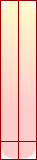
div 內使用的背景圖是這樣的:

寬度 1px,它是靠橫向重複來鋪滿的
我的下邊角帶有一條實心色,剛好能與 div 的背景色相銜接。少說話,直接看程式碼。先定義容器:
#type5 {
  background: #FECBCA url(../images/roundedbox-type5-bg.png) repeat-x 0 0;
  min-height: 110px;
}
背景色是從底部邊角吸取出來的,接著讓背景圖沿 X 軸重複,最後設定最小高度以守住漸層。然後掛上四個角(這裡改用 .png 以取得更好的漸層品質):
#type5 { background: #FECBCA url(../images/roundedbox-type5-bg.png) repeat-x 0 0; min-height: 110px; }
#type5 .corner { background-image: url(../images/corners-type5.png); }
接著增加上邊角的高度(數值取決於漸層何時抵達終端顏色):
#type5 .topLeft,
#type5 .topRight { height: 140px; }
最後修正下邊角的背景圖定位:
#type5 { background: #FECBCA url(../images/roundedbox-type5-bg.png) repeat-x 0 0; min-height: 110px; }
#type5 .corner { background-image: url(../images/corners-type5.png); }
#type5 .topLeft,
#type5 .topRight { height: 140px; }
#type5 .bottomLeft  { background-position: -1px  -142px; }
#type5 .bottomRight { background-position: -19px -142px; }
完成!這就是模型 5——垂直漸層的圓角盒。
IE6 的處理
這項技術在這個惱人的瀏覽器上會出問題:你必須為容器(.roundedBox,或 #type1、#type2……)明確指定寬度與高度,否則內容會溢出到盒模型之外。建議用 IE6 的條件式註解單獨餵它一份修正樣式,不要污染主樣式表。
最後的想法
希望這套做法對你有所幫助,也別被它嚇退了。垂直漸層、透明圓角這些變化,只要多練習幾次,大腦就會開始自動拆解——你會自然而然知道哪個角該調高度、哪個位置該補幾像素。到那時候,CSS Sprite 就不再是一堆魔法數字,而是一套你能自由組合的積木。
- 上一篇文章: 網站柵格化設計:一套好讀又好用的柵格命名方案
- 下一篇文章: 網頁表單反饋設計的常見問題與改進思路