CSS clip-path 圖形裁切完全攻略
編輯:布局實例
場景:裁切過的導覽列
曾經接到一個需求:把導覽列底部做成斜切造型。最直覺的做法是切一張對應形狀的背景圖,再掛到 :after 上。但這麼一來,響應式就完全失控了。
clip-path 才是正解。
屬性概要
clip-path 屬於工作草案,透過遮罩與裁切隱藏元素的一部分。它的原理是提供一系列 X、Y 座標構成路徑,瀏覽器依路徑內部的範圍裁切元素。
除了多邊形,它也能建立圓形與橢圓,可以說唯一的限制就是想像力。使用時記得加上 -webkit- 前綴。
三角形
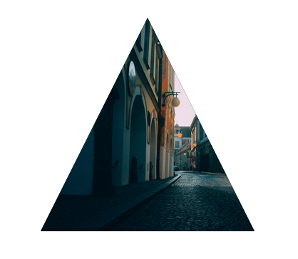
.clipClass {
  -webkit-clip-path: polygon(0 100%, 50% 0, 100% 100%);
}
座標的判讀方式與定位屬性類似:X:0、Y:0 是左上角,X:100% 是右邊,Y:100% 是底部。這條路徑實際上經過三個點:
x: 0,    y: 100%
x: 50%,  y: 0
x: 100%, y: 100%
從左下角出發,水平移 50% 抵達頂端,再水平移到 100% 並垂直向下回到達底部,三角形於焉成形。
圓形

.clipClass {
  -webkit-clip-path: circle(50% at 50% 50%);
}
需要三個值:半徑、以及用 at 關鍵字引出的圓心座標。
橢圓
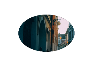
.clipClass {
  -webkit-clip-path: ellipse(30% 20% at 50% 50%);
}
四個值:X 軸半徑、Y 軸半徑,再加上以 at 分隔的 X/Y 座標。
圓角矩形(inset)
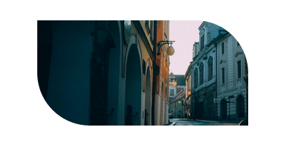
多邊形邊緣銳利,若你要的是圓角矩形,用 inset:
-webkit-clip-path: inset(25% 0 25% 0 round 0 25% 0 25%);完整結構為:
inset(<top> <right> <bottom> <left>
      round <top-radius> <right-radius> <bottom-radius> <left-radius>)
可簡寫為:
-webkit-clip-path: inset(25% 0 round 0 25%);快速參考
Circle:  circle(radius at x-axis y-axis)
Ellipse: ellipse(x-rad y-rad at x-axis y-axis)
Polygon: polygon(x-axis y-axis, x-axis y-axis, ... )
Inset:   inset(top right bottom left
               round top-radius right-radius bottom-radius left-radius)
用 polygon 拼複雜圖形
原型與圓角圖形的可調參數有限,真要畫複雜形狀,polygon 才是首選——它能定義任意多組座標點。
漫畫對話框

.clipClass {
  -webkit-clip-path: polygon(0% 0%, 100% 0%, 100% 75%, 75% 75%,
                             75% 100%, 50% 75%, 0% 75%);
}
星形

.clipClass {
  -webkit-clip-path: polygon(50% 0%, 63% 38%, 100% 38%, 69% 59%,
                             82% 100%, 50% 75%, 18% 100%, 31% 59%,
                             0 38%, 37% 38%);
}
加上動畫
形狀畫好之後,替它掛上 hover 並用 transition 銜接,就能做出平滑變形。
唯一要牢記的規則:起始狀態與所有 hover 狀態必須使用相同數量的座標點,否則瀏覽器無法在兩者之間插值,動畫會直接跳變。
.animateClass {
  -webkit-clip-path: polygon(20% 0%, 0% 0%, 0% 50%, 0% 80%,
                             0% 100%, 50% 100%, 80% 100%, 100% 100%,
                             100% 50%, 100% 0, 80% 0, 50% 0);
}

.animateClass:hover {
  -webkit-clip-path: polygon(50% 0%, 0% 20%, 30% 50%, 0% 80%,
                             20% 100%, 50% 70%, 80% 100%, 100% 80%,
                             70% 50%, 100% 20%, 80% 0%, 50% 30%);
}
仔細數會發現兩組都是 12 個點,這正是變形動畫得以成立的前提。
- 上一篇文章: CSS3 @media 媒體查詢語法與實戰寫法
- 下一篇文章: 用 CSS3 :target 偽類實現無 JS 選項卡切換