這個菜單能居左、居中和居右對齊,不像有些菜單需要靠點擊在顯示與隱藏間切換。它還有一個標記來顯示激活/當前菜單項,並且能作用在所有移動平台以及包括 IE 在內的桌面瀏覽器上。
一、目的
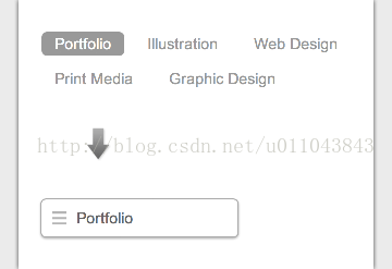
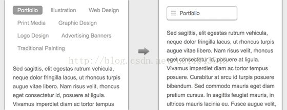
本教程要展示的,是如何把一個規律的列表菜單,變成一個在窄屏下更小的下拉菜單。這個技巧在由眾多鏈接組成的導航上特別有用,能把所有按鈕優雅地壓縮成一個下拉。
二、Nav HTML 標記
- <nav class="nav">
- <ul>
- <li class="current"><a href="#">Portfolio</a></li>
- <li><a href="#">Illustration</a></li>
- <li><a href="#">Web Design</a></li>
- <li><a href="#">Print Media</a></li>
- <li><a href="#">Graphic Design</a></li>
- </ul>
- </nav>
三、CSS
/* nav */
.nav {
position: relative;
margin: 20px 0;
}

.nav ul {
margin: 0;
padding: 0;
}

.nav li {
margin: 0 5px 10px 0;
padding: 0;
list-style: none;
display: inline-block;
}

.nav a {
padding: 3px 12px;
text-decoration: none;
color: #999;
line-height: 100%;
}

.nav a:hover {
color: #000;
}

.nav .current a {
background: #999;
color: #fff;
border-radius: 5px;
}
四、居中和右對齊
正如前面提到的,可以通過 text-align 屬性改變對齊方式。
/* right nav */
.nav.rightright ul {
text-align: rightright;
}

/* center nav */
.nav.center ul {
text-align: center;
}
五、IE 的支持
IE 8 及更早版本不支持 HTML5 的 nav 標籤和媒體查詢,可以引入 css3-mediaqueries.js(或 respond.js)和 html5shim.js 做兼容處理。如果你不想用 html5shim.js,也可以直接用 div 代替 nav:
- <!--[if lt IE 9]>
- <script src="https://css3-mediaqueries-js.googlecode.com/files/css3-mediaqueries.js"></script>
- <script src="https://html5shim.googlecode.com/svn/trunk/html5.js"></script>
- <![endif]-->
六、響應式
現在來到有趣的部分——用媒體查詢讓菜單具備響應性。在 600px 斷點,我把 nav 元素設為相對定位,這樣就能對 ul 元素進行絕對定位;再用 display:none 隱藏所有 li,但保留當前 li 以塊元素顯示;然後當鼠標懸浮於 nav 元素時,把所有 li 設為 display:block。為了標記當前 li,我會加一個圖標。對於居中和右對齊,則對定位的 ul 元素分別使用 left 和 right 屬性:
@media screen and (max-width: 600px) {
.nav {
position: relative;
min-height: 40px;
}

.nav ul {
width: 180px;
padding: 5px 0;
position: absolute;
top: 0;
left: 0;
border: solid 1px #aaa;
background: #fff url(images/icon-menu.png) no-repeat 10px 11px;
border-radius: 5px;
box-shadow: 0 1px 2px rgba(0,0,0,.3);
}

.nav li {
display: none; /* hide all items */
margin: 0;
}

.nav .current {
display: block; /* show only current item */
}

.nav a {
display: block;
padding: 5px 5px 5px 32px;
text-align: left;
}

.nav .current a {
background: none;
color: #666;
}

/* on nav hover */
.nav ul:hover {
background-image: none;
}

.nav ul:hover li {
display: block;
margin: 0 0 5px;
}

.nav ul:hover .current {
background: url(images/icon-check.png) no-repeat 10px 7px;
}

/* right nav */
.nav.rightright ul {
left: auto;
rightright: 0;
}

/* center nav */
.nav.center ul {
left: 50%;
margin-left: -90px;
}
}
- 上一篇文章: 詳解 CSS 中的規則聲明:文本值、數字值與顏色值
- 下一篇文章: CSS 單位 px、em、rem 的區別與換算