純 CSS 打造全相容的 Tooltip 提示框
編輯:布局實例
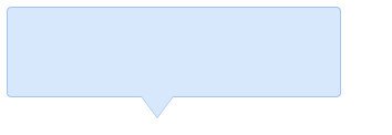
最終效果如下:
基本原理
做法並不複雜:先建立一個帶背景色的普通 DIV 盒子,接著用純 CSS 畫出一個三角形作為指示箭頭。將盒子設為相對定位,箭頭設為絕對定位並相對盒子偏移到合適位置,一個基礎的 tooltip 就成型了。
不過若沒有邊框,提示框在與背景重疊時會顯得渾然一體。給盒子加邊框很簡單,難點在於三角形如何也擁有邊框。這裡用了一個取巧技巧:讓兩個顏色不同的三角形上下錯開 1px 疊放,下層三角形只露出左右兩側的邊,合在一起就形成一個看似帶描邊的箭頭。
Step by step
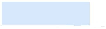
1. 定義相對定位的盒子
<div class="tooltips">
</div>
.tooltips{
position:relative;
width:300px;
height:80px;
line-height:60px;
background:#D7E7FC;
border-radius:4px;
}
2. 為盒子加上三角形箭頭
<div class="tooltips">
  <div class="arrow"></div>
</div>
.arrow{
position:absolute;
color: #D7E7FC;
width: 0px;
height:0px;
line-height: 0px;
border-width: 20px 15px 0;
border-style: solid dashed dashed dashed;
border-left-color: transparent;
border-right-color: transparent;
bottom: -20px;
right: 50%;
}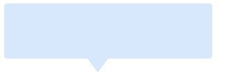
此時雛形已成,但若 tooltip 的背景色與頁面背景相同,就難以分辨輪廓,因此需要加上邊框。
3. 為盒子添加邊框
.tooltips{
  position:relative;
  width:300px;
  height:80px;
  line-height:60px;
  background:#D7E7FC;
  border:1px solid #A5C4EC;
  border-radius:4px;
}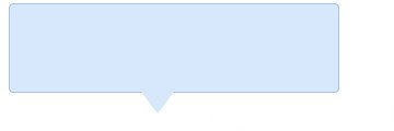
盒子有了邊框,但下方的小三角還沒有相應的描邊。
4. 給小三角加上描邊
依據前面的原理,用兩個三角形疊放:一個顏色與盒子邊框一致,一個與盒子背景一致。
<div class="tooltips">
  <div class="arrow arrow-border"></div>
  <div class="arrow arrow-bg"></div>
</div>
.arrow{
position:absolute;
width: 0px;
height:0px;
line-height: 0px;
border-width: 20px 15px 0;
border-style: solid dashed dashed dashed;
border-left-color: transparent;
border-right-color: transparent;
}
.arrow-border{
color: #A5C4EC;
bottom: -20px;
right: 50%;
}
.arrow-bg{
color: #D7E7FC;
bottom: -19px;
right: 50%;
}特別注意:.arrow-bg 與 .arrow-border 的 bottom 相差 1px(可依邊框寬度調整),且兩個 DIV 的的先後順序不可顛倒。
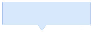
至此,一個帶描邊、相容性良好的純 CSS tooltip 就完成了。