純 CSS 實現的滑鼠懸停按鈕邊框動畫特效
編輯:布局實例
今天再為大家帶來一款用 CSS 實現的按鈕懸停特效。按鈕初始狀態邊框是斷開的,當滑鼠移入時,動畫會讓邊框逐漸閉合成完整的一圈。效果如下:
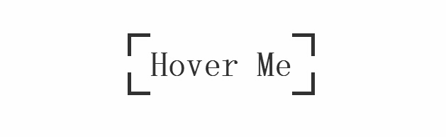
先來看 HTML:
<body>
  <a target="_blank" class="btn-edge" href="https://www.jb51.net">Hover Me</a>
</body>
再來看核心的 CSS:
*, *:before, *:after {
  margin: 0;
  padding: 0;
  -webkit-box-sizing: border-box;
  -moz-box-sizing: border-box;
  box-sizing: border-box;
}
body {
  padding-top: 10%;
  text-align: center;
  overflow-x: hidden;
}
.btn-edge {
  position: relative;
  display: inline-block;
  padding: 1rem 2rem;
  font-family: 'Titillium Web', sans-serif;
  font-weight: 700;
  text-decoration: none;
  font-size: 3rem;
  color: #333;
  background-image: -webkit-gradient(linear, left top, left bottom, from(#333), to(#333)), -webkit-gradient(linear, left top, left bottom, from(#333), to(#333)), -webkit-gradient(linear, left top, left bottom, from(#333), to(#333)), -webkit-gradient(linear, left top, left bottom, from(#333), to(#333)), -webkit-gradient(linear, left top, left bottom, from(#333), to(#333)), -webkit-gradient(linear, left top, left bottom, from(#333), to(#333)), -webkit-gradient(linear, left top, left bottom, from(#333), to(#333)), -webkit-gradient(linear, left top, left bottom, from(#333), to(#333));
  background-image: -webkit-linear-gradient(#333, #333), -webkit-linear-gradient(#333, #333), -webkit-linear-gradient(#333, #333), -webkit-linear-gradient(#333, #333), -webkit-linear-gradient(#333, #333), -webkit-linear-gradient(#333, #333), -webkit-linear-gradient(#333, #333), -webkit-linear-gradient(#333, #333);
  background-image: linear-gradient(#333, #333), linear-gradient(#333, #333), linear-gradient(#333, #333), linear-gradient(#333, #333), linear-gradient(#333, #333), linear-gradient(#333, #333), linear-gradient(#333, #333), linear-gradient(#333, #333);
  background-repeat: no-repeat;
  -webkit-background-size: 2rem 5px, 2rem 5px, 2rem 5px, 2rem 5px, 5px 2rem, 5px 2rem, 5px 2rem, 5px 2rem;
  background-size: 2rem 5px, 2rem 5px, 2rem 5px, 2rem 5px, 5px 2rem, 5px 2rem, 5px 2rem, 5px 2rem;
  background-position: 0 0, 100% 0, 0 100%, 100% 100%;
  -webkit-box-shadow: inset 0 0 0 5px rgba(255, 99, 71, 0);
  box-shadow: inset 0 0 0 5px rgba(255, 99, 71, 0);
  -webkit-transition: background-size 1s .4s, -webkit-box-shadow .4s, color .4s;
  transition: background-size 1s .4s, box-shadow .4s, color .4s;
  -webkit-transform: translateZ(0);
  transform: translateZ(0);
}
.btn-edge:hover {
  color: tomato;
  -webkit-background-size: 100% 5px, 100% 5px, 100% 5px, 100% 5px, 5px 100%, 5px 100%, 5px 100%, 5px 100%;
  background-size: 100% 5px, 100% 5px, 100% 5px, 100% 5px, 5px 100%, 5px 100%, 5px 100%, 5px 100%;
  -webkit-box-shadow: inset 0 0 0 5px tomato;
  box-shadow: inset 0 0 0 5px tomato;
  -webkit-transition: background-size 1s, -webkit-box-shadow .4s .6s, color .4s .6s;
  transition: background-size 1s, box-shadow .4s .6s, color .4s .6s;
}
這裡的巧思在於:用八段 linear-gradient 分別對應按鈕的四個邊與四個角,透過 background-size 控制線段長度,再配合 transition 讓線段在懸停時延展、閉合,最終呈現出邊框逐筆描繪的動畫質感。
- 上一篇文章: 用 DIV+CSS 讓內部元素(如單選按鈕)均匀分布
- 下一篇文章: DIV+CSS 垂直居中的五種經典實現方法