CSS3 仿微信聊天小氣泡:偽元素妙用實例
編輯:關於CSS
做項目時遇到一個聊天頁面的需求,最初的 UI 實在拿不出手。於是用 CSS3 重新做了一版微信風格的對話界面,效果還不錯,這裡把思路和代碼分享出來。
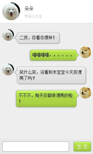
效果預覽
第一部分:HTML 結構
整體思路很簡單:每條消息由「頭像 + 氣泡」組成,用 leftd 和 rightd 區分左右兩方。
<div class="leftd">
  <span ng-class="leftd_h">
    <img ng-src="./img/c_pic.png" />
  </span>
  <div class="speech left" ng-class="speech left">
    二貨,你看你傻樣!
  </div>
</div>

<div class="rightd">
  <span ng-class="rightd_h">
    <img ng-src="./img/u_pic.png" />
  </span>
  <div class="speech right" ng-class="speech left">
    嘻嘻嘻嘻。。。。。。
  </div>
</div>

<div class="leftd">
  <span ng-class="leftd_h">
    <img ng-src="./img/c_pic.png" />
  </span>
  <div class="speech left" ng-class="speech left">
    笑什麼笑,沒看到本寶寶今天變漂亮了嗎?
  </div>
</div>

<div class="rightd">
  <span ng-class="rightd_h">
    <img ng-src="./img/u_pic.png" />
  </span>
  <div class="speech right" ng-class="speech left">
    不不不,每天你都很漂亮的啦!
  </div>
</div>
第二部分:CSS3 樣式
這部分是重點,全部代碼如下:
/* 微信氣泡 */
div.speech {
  float: left;
  margin: 10px 0;
  padding: 8px;
  table-layout: fixed;
  word-break: break-all;
  position: relative;
  background: -webkit-gradient( linear, 50% 0%, 50% 100%,
    from(#ffffff), color-stop(0.1, #ececec), color-stop(0.5, #dbdbdb),
    color-stop(0.9, #dcdcdc), to(#8c8c8c) );
  border: 1px solid #989898;
  border-radius: 8px;
}
/* 左側氣泡的小尖角 */
div.speech:before {
  content: '';
  position: absolute;
  width: 0;
  height: 0;
  left: 15px;
  top: -20px;
  border: 10px solid;
  border-color: transparent transparent #989898 transparent;
}
div.speech:after {
  content: '';
  position: absolute;
  width: 0;
  height: 0;
  left: 17px;
  top: -16px;
  border: 8px solid;
  border-color: transparent transparent #ffffff transparent;
}

div.speech.right {
  display: inline-block;
  box-shadow: -2px 2px 5px #CCC;
  margin-right: 10px;
  max-width: 75%;
  float: right;
  background: -webkit-gradient( linear, 50% 0%, 50% 100%,
    from(#e4ffa7), color-stop(0.1, #bced50), color-stop(0.4, #aed943),
    color-stop(0.8, #a7d143), to(#99BF40) );
}
/* 右側氣泡的尖角朝右 */
div.speech.right:before {
  content: '';
  position: absolute;
  width: 0;
  height: 0;
  top: 9px;
  bottom: auto;
  left: auto;
  right: -10px;
  border-width: 9px 0 9px 10px;
  border-color: transparent #989898;
}
div.speech.right:after {
  content: '';
  position: absolute;
  width: 0;
  height: 0;
  top: 10px;
  bottom: auto;
  left: auto;
  right: -8px;
  border-width: 8px 0 8px 9px;
  border-color: transparent #bced50;
}

div .left {
  display: inline-block;
  box-shadow: 2px 2px 2px #CCCCCC;
  margin-left: 10px;
  max-width: 75%;
  position: relative;
  background: -webkit-gradient( linear, 50% 0%, 50% 100%,
    from(#ffffff), color-stop(0.1, #eae8e8), color-stop(0.4, #E3E3E3),
    color-stop(0.8, #DFDFDF), to(#D9D9D9) );
}
div .left:before {
  content: '';
  position: absolute;
  width: 0;
  height: 0;
  top: 9px;
  bottom: auto;
  left: -10px;
  border-width: 9px 10px 9px 0;
  border-color: transparent #989898;
}
div .left:after {
  content: '';
  position: absolute;
  width: 0;
  height: 0;
  top: 10px;
  bottom: auto;
  left: -8px;
  border-width: 8px 9px 8px 0;
  border-color: transparent #eae8e8;
}

.leftimg  { float: left;  margin-top: 10px; }
.rightimg { float: right; margin-top: 10px; }

.leftd  { clear: both; float: left;  margin-left: 10px; }
.rightd { clear: both; float: right; margin-right: 10px; }

.leftd_h{
  width: 39px;
  height: 39px;
  border-radius: 100%;
  display: block;
  float: left;
  overflow: hidden;
}
.leftd_h img{ display: block; width: 100%; height: auto; }

.rightd_h{
  width: 39px;
  height: 39px;
  border-radius: 100%;
  display: block;
  float: right;
  overflow: hidden;
}
.rightd_h img{ display: block; width: 100%; height: auto; }
要點說明
整個小氣泡的核心是用 CSS 偽元素 :before 與 :after 疊加兩個三角形來做出帶描邊的尖角:外層三角形用邊框色 #989898 模擬描邊,內層三角形用氣泡本身的填充色蓋上去,兩者錯開 1 到 2 像素,就得到了「帶邊框的小尾巴」。
網上不少案例喜歡把用戶頭像做成氣泡的背景圖,這樣在實際項目中並不合適——頭像和文案的內容長度是變量,寫死背景會導致變形。因此這裡把頭像獨立成 span 容器,並用 border-radius: 100% 加 overflow: hidden 裁成圓形,實用性要好得多。
- 上一篇文章: CSS3 純代碼實現 5 種炫酷預載動畫
- 下一篇文章: CSS3 自定義「W」形運動軌跡動畫實例