左中右自適應三欄布局:calc 表達式與 JS 兩種實作
編輯:前端技巧
HTML 標準新增了 calc() 表達式,可以直接在 CSS 裡做加減運算,寫三欄自適應變得非常輕鬆:
#center { width: calc(100% - 400px); }
問題是舊版 IE 完全不認 calc。為了讓所有瀏覽器都能跑,這裡改用 JS 動態計算中欄寬度。
效果如下:
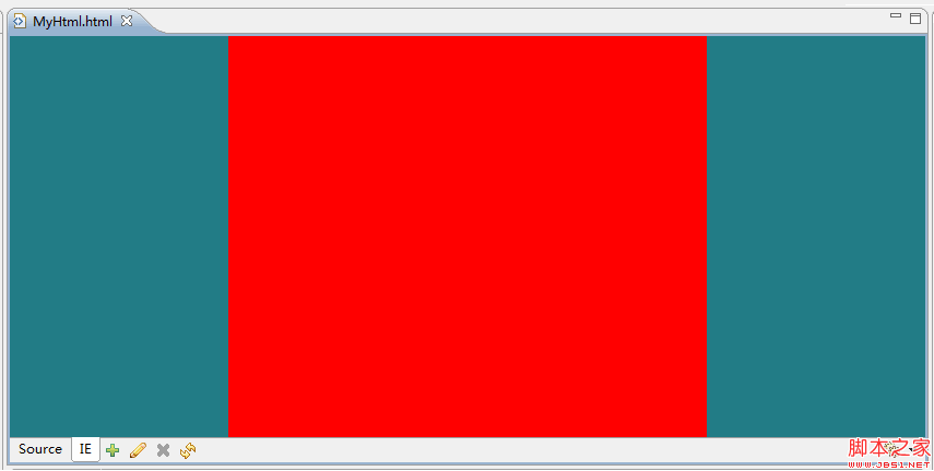
核心想法是:左右兩欄固定寬度並浮動,中欄寬度等於視窗寬度減去左右兩欄,並在 resize 時重新計算。
<script>
var left, center, right, width;
window.onload = function() {
  left   = $('left');
  center = $('center');
  right  = $('right');
  onresize();
};
window.onresize = function() {
  try {
    width = document.body.clientWidth;
    center.style.width = (width - left.clientWidth - right.clientWidth) + "px";
  } catch(e) {
    // 視窗過窄時寬度會變成負數而報錯,這裡直接忽略
  }
};
function $(id) { return document.getElementById(id); }
</script>
<style>
body, html { height: 100%; margin: 0; padding: 0; overflow: hidden; }
#left, #center, #right {
  width: 200px;
  height: 100%;
  background-color: rgb(34, 124, 134);
  float: left;
}
#center { background-color: red; }
</style>

<body>
  <div id="left"></div>
  <div id="center"></div>
  <div id="right"></div>
</body>
如果不必理會舊 IE,直接用 calc 甚至 flex 會乾淨得多;上述 JS 方案才是真正的向下相容手段。另外提醒,靠 JS 排版會讓首屏在腳本執行前閃一下,若對視覺穩定度有要求,可先給中欄一個預設寬度當 fallback。
- 上一篇文章: div 與 table 到底差在哪?從載入機制談到大型網站的取捨
- 下一篇文章: 防止網頁被輕易「另存新檔」或整站仿製的小技巧