純 HTML5 + CSS3 製作生日蛋糕(程式碼易懂)
編輯:HTML5教程
先來看成果:
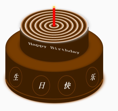
整個蛋糕可以拆成三個部分:底部蛋糕、頂層蛋糕,以及插在上面的蠟燭。HTML 的結構就照這三部分來組織,剩下的全靠 CSS 定位與 CSS3 的 rotateX、rotate、內外陰影等效果調整各個元素的樣式。思路不複雜,熟悉 CSS 的人一看就懂。
關鍵技巧在於:用 border-radius 做出圓形,再用 transform: rotateX(60deg) 把圓壓扁成橢圓,就能模擬出蛋糕「頂面」的透視效果;接著在頂面與底面之間補上一塊矩形作為「側面」,加上邊框與陰影,立體感就出來了。蠟燭的火苗則是簡單的方形元素旋轉 45 度,再搭配 box-shadow 製造發光感。
以下是完整的 HTML 與 CSS:
<!DOCTYPE html>
<html>
<head lang="en">
<meta charset="UTF-8">
<title></title>
<style>
.birthday .container {
  width: 600px;
  height: 600px;
  margin: 0px auto;
  background: #fafafa;
  border-radius: 5px;
  position: relative;
}

/** 頂層的 **/
.birthday .top-one {
  position: absolute;
  width: 280px;
  height: 280px;
  bottom: 200px;
  left: 160px;
}
.birthday .top-one .bottom {
  position: absolute;
  width: 280px;
  height: 280px;
  bottom: -30px;
  border: 1px solid #3e2001;
  border-radius: 140px;
  transform: rotateX(60deg);
  z-index: 4;
  background: #3e2001;
  box-shadow: 0px 0px 20px #3e2001;
}
.birthday .top-one .top {
  position: absolute;
  width: 280px;
  height: 280px;
  top: -50px;
  border-radius: 140px;
  background: #FFFFFF;
  transform: rotateX(60deg);
  box-shadow: 2px 2px 20px #b7b7b7;
  z-index: 6;
  background: -webkit-repeating-radial-gradient(circle,
    #783d01, #3e2001 10px, #914909 10px, white 20px);
  background: -moz-repeating-radial-gradient(circle,
    #783d01, #3e2001 10px, #914909 10px, white 20px);
}
.birthday .top-one .side {
  position: absolute;
  top: 95px;
  width: 280px;
  height: 70px;
  border: 1px solid #3e2001;
  border-top-width: 0px;
  border-bottom-width: 0px;
  background: #FFFFFF;
  z-index: 5;
  background: #3e2001;
}

/** 底層的 **/
.birthday .bottom-one {
  position: absolute;
  width: 400px;
  height: 400px;
  bottom: 0px;
  left: 100px;
}
.birthday .bottom-one .bottom {
  position: absolute;
  width: 400px;
  height: 400px;
  bottom: -30px;
  border: 1px solid #914909;
  border-radius: 200px;
  transform: rotateX(60deg);
  box-shadow: 2px 2px 20px #914909;
  z-index: 1;
  background: #3e2001;
  overflow: hidden;
}
.birthday .bottom-one .line {
  position: absolute;
  width: 400px;
  height: 400px;
  border-radius: 200px;
  z-index: 1;
}
.birthday .bottom-one .line1 {
  bottom: 30px;
  border: 5px solid #783d01;
  left: -5px;
  z-index: 1;
}
.birthday .bottom-one .top {
  position: absolute;
  width: 400px;
  height: 400px;
  top: -100px;
  border: 1px solid #3e2001;
  border-radius: 200px;
  background: #FFFFFF;
  transform: rotateX(60deg);
  z-index: 3;
  background: #783d01;
  box-shadow: inset 0px 0px 20px #3e2001;
}
.birthday .bottom-one .side {
  position: absolute;
  top: 100px;
  width: 400px;
  height: 130px;
  border: 1px solid #3e2001;
  border-top-width: 0px;
  border-bottom-width: 0px;
  background: #3e2001;
  z-index: 2;
}

/** 底層的文字 **/
.birthday .flower {
  position: relative;
  text-align: justify;
  z-index: 9;
  top: 200px;
  font-size: 32px;
  font-family: "Helvetica Neue", "Noto Sans CJK SC", "Source Han Sans CN";
  color: #FFFFFF;
  font-weight: bold;
}
.birthday .flower:after {
  content: "";
  display: inline-block;
  position: relative;
  width: 100%;
}
.birthday .flower i {
  position: relative;
  width: 80px;
  line-height: 80px;
  display: inline-block;
  border-radius: 50%;
  border: 2px solid #783d01;
  text-align: center;
}

/** 頂層的文字 **/
.birthday .top-one .text {
  width: 100%;
  text-align: center;
  position: absolute;
  top: 165px;
  z-index: 9;
  margin: 0px auto;
  font-size: 30px;
  color: #FFFFFF;
  transform: rotateX(60deg) skew(10deg, 20deg);
}

/** 蠟燭 **/
.birthday .candle {
  width: 10px;
  height: 80px;
  margin: 0px auto;
  position: absolute;
  left: 295px;
  top: 130px;
  z-index: 9;
}
.birthday .candle .body {
  width: 10px;
  height: 70px;
  margin: 0px auto;
  background: red;
  border-bottom-width: 0px;
}
.birthday .candle .top {
  width: 10px;
  height: 10px;
  border-radius: 5px;
  transform: rotateX(60deg);
  position: relative;
  top: 5px;
  background: red;
}
.birthday .candle .bottom {
  width: 10px;
  height: 10px;
  border-radius: 5px;
  transform: rotateX(60deg);
  position: relative;
  bottom: 5px;
  background: red;
  box-shadow: 1px 1px 10px red;
}
.birthday .candle .fire {
  position: absolute;
  width: 6px;
  height: 6px;
  left: 2px;
  transform: rotate(45deg);
  background: #ffd507;
  box-shadow: 0px 0px 20px #ffff00, 2px 2px 10px red;
}
</style>
</head>
<body>
  <div class="birthday">
    <div class="container">

      <div class="candle">
        <div class="fire"></div>
        <div class="top"></div>
        <div class="body"></div>
        <div class="bottom"></div>
      </div>

      <div class="top-one">
        <div class="top"></div>
        <div class="side"></div>
        <div class="bottom"></div>
        <div class="text">Happy Birthday</div>
      </div>

      <div class="bottom-one">
        <div class="top"></div>
        <div class="side"></div>
        <div class="bottom">
          <div class="line line1"></div>
        </div>
        <div class="flower">
          <i style="top:-20px;transform: rotateY(50deg)">生</i>
          <i style="top:15px;transform: rotateY(30deg)">日</i>
          <i style="top:15px;transform: rotateY(30deg)">快</i>
          <i style="top:-20px;transform: rotateY(50deg)">樂</i>
        </div>
      </div>

    </div>
  </div>
</body>
</html>幾個值得留意的細節:z-index 在此扮演關鍵角色,頂面必須蓋在側面之上、文字又必須蓋在頂面之上,層級錯了透視感就破功;repeating-radial-gradient 用來畫出蛋糕切面的同心圓紋理;而「生日快樂」四個字各自帶不同的 rotateY 與 top 偏移,模擬出沿著圓弧排布的視覺效果。
- 上一篇文章: HTML5 div 布局與 table 布局詳解
- 下一篇文章: HTML5 製作精緻表格樣式