HTML5 製作精緻表格樣式
編輯:HTML5教程
先看成品的樣子:
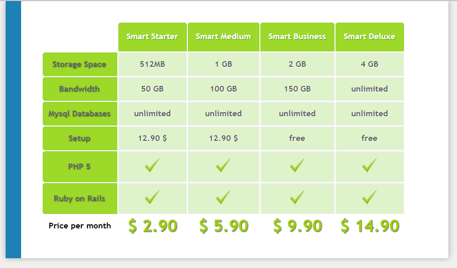
這是一個典型的方案比較表。它好看的地方不在於用了什麼特殊技術,而在於幾個細節的處理:表頭用圓角與內陰影做出立體感、行首欄反白強調、內容格用淡綠底色與細邊框分隔,最後以較大的字級與綠色文字收在頁腳作為價格總結。
完整程式碼如下:
<!DOCTYPE html>
<html>
<head>
<meta charset="utf-8">
<title>表格</title>
<style type="text/css">
* {
  margin: 0;
  padding: 0;
}
body {
  font: italic 20px Georgia, serif;
  letter-spacing: normal;
  background-color: #f0f0f0;
}
#content {
  width: 750px;
  padding: 40px;
  margin: 0 auto;
  background-color: #fff;
  border-left: 30px solid #1D81B6;
  border-right: 1px solid #ddd;
  box-shadow: 0px 0px 16px #aaa;
}
#table1 {
  font: bold 16px/1.4em "Trebuchet MS", sans-serif;
}
#table1 thead th {
  padding: 15px;
  border: 1px solid #93CE37;
  border-bottom: 3px solid #9ED929;
  text-shadow: 1px 1px 1px #568F23;
  color: #fff;
  background-color: #9DD929;
  border-radius: 5px 5px 0px 0px;
}
#table1 thead th:empty {
  background-color: transparent;
  border: none;
}
#table1 tbody th {
  padding: 0px 10px;
  border: 1px solid #93CE37;
  border-right: 3px solid #9ED929;
  text-shadow: 1px 1px 1px #568F23;
  color: #666;
  background-color: #9DD929;
  border-radius: 5px 0px 0px 5px;
}
#table1 tbody td {
  padding: 10px;
  border: 2px solid #E7EFE0;
  text-align: center;
  text-shadow: 1px 1px 1px #fff;
  color: #666;
  background-color: #DEF3CA;
  border-radius: 2px;
}
#table1 tbody span.check::before {
  content: url(images/check0.png);
}
#table1 tfoot td {
  padding: 10px 0px;
  font-size: 32px;
  color: #9CD009;
  text-align: center;
  text-shadow: 1px 1px 1px #444;
}
</style>
</head>
<body>
  <div id="content">
    <table id="table1">
      <thead>
        <tr>
          <th></th>
          <th scope="col" abbr="Starter">Smart Starter</th>
          <th scope="col" abbr="Medium">Smart Medium</th>
          <th scope="col" abbr="Business">Smart Business</th>
          <th scope="col" abbr="Deluxe">Smart Deluxe</th>
        </tr>
      </thead>
      <tfoot>
        <tr>
          <th scope="row">Price per month</th>
          <td>$ 2.90</td>
          <td>$ 5.90</td>
          <td>$ 9.90</td>
          <td>$ 14.90</td>
        </tr>
      </tfoot>
      <tbody>
        <tr>
          <th scope="row">Storage Space</th>
          <td>512MB</td>
          <td>1 GB</td>
          <td>2 GB</td>
          <td>4 GB</td>
        </tr>
        <tr>
          <th scope="row">Bandwidth</th>
          <td>50 GB</td>
          <td>100 GB</td>
          <td>150 GB</td>
          <td>unlimited</td>
        </tr>
        <tr>
          <th scope="row">Mysql Databases</th>
          <td>unlimited</td>
          <td>unlimited</td>
          <td>unlimited</td>
          <td>unlimited</td>
        </tr>
        <tr>
          <th scope="row">Setup</th>
          <td>12.90 ___FCKpd___0</td>
          <td>12.90 ___FCKpd___0</td>
          <td>free</td>
          <td>free</td>
        </tr>
        <tr>
          <th scope="row">PHP 5</th>
          <td><span class="check"></span></td>
          <td><span class="check"></span></td>
          <td><span class="check"></span></td>
          <td><span class="check"></span></td>
        </tr>
        <tr>
          <th scope="row">Ruby on Rails</th>
          <td><span class="check"></span></td>
          <td><span class="check"></span></td>
          <td><span class="check"></span></td>
          <td><span class="check"></span></td>
        </tr>
      </tbody>
    </table>
  </div>
</body>
</html>
幾個值得學的技巧:
用 th:empty 處理左上角空格。表頭第一格是空的,若沿用表頭樣式會出現一塊突兀的綠色。加上 #table1 thead th:empty 讓它透明無邊框,視覺上就乾淨了。
用 ::before 加 content: url() 插入小圖示。「PHP 5」、「Ruby on Rails」這兩列不需要文字,只要一個勾選標記。透過 span.check::before 注入圖片,HTML 結構保持單純,樣式也集中管理。
用 scope 與 abbr 提升無障礙性。scope="col" 與 scope="row" 明確告訴螢幕閱讀器每個標題格是列還是欄標題,abbr 則提供較短的替代讀法。這些屬性不影響視覺,卻讓表格對輔助技術友善得多。
用 thead/tbody/tfoot 分區。除了語意清楚,這種結構也讓 CSS 能針對三個區域分別設計——價格被放進 tfoot 並放大字級,正是靠這個分區才做得到。
- 上一篇文章: 純 HTML5 + CSS3 製作生日蛋糕(程式碼易懂)
- 下一篇文章: 詳解 HTML5 中的拖放事件(Drag 和 drop)